BREAKING: for style guide enum consistency, we have renamed the corner values START_START etc. to be lowercase with dashes. e.g. start-start. The same has been done with MdMenu.defaultFocus' values.
PiperOrigin-RevId: 566454879
12 KiB
Menus
This documentation is fully rendered on the Material Web catalog.
Menus display a list of choices on a temporary surface.
Usage
When opened, menus position themselves to an anchor. Thus, either anchor or
anchorElement must be supplied to md-menu before opening. Additionally, a
shared parent of position:relative should be present around the menu and it's
anchor.
Menus also render menu items such as md-menu-item and handle keyboard
navigation between md-menu-items as well as typeahead functionality.
Additionally, md-menu interacts with md-menu-items to help you determine how
a menu was closed. Listen for and inspect the close-menu custom event's
details to determine what action and items closed the menu.
<!-- Note the position: relative style -->
<span style="position: relative">
  <md-filled-button id="usage-anchor">Set with idref</md-filled-button>
  <md-menu id="usage-menu" anchor="usage-anchor">
    <md-menu-item headline="Apple"></md-menu-item>
    <md-menu-item headline="Banana"></md-menu-item>
    <md-menu-item headline="Cucumber"></md-menu-item>
  </md-menu>
</span>

<script type="module">
  // This example uses anchor as an ID reference
  const anchorEl = document.body.querySelector('#usage-anchor');
  const menuEl = document.body.querySelector('#usage-menu');

  anchorEl.addEventListener('click', () => { menuEl.show(); });
</script>

<span style="position: relative">
  <md-filled-button id="usage-anchor-2">Set with element ref</md-filled-button>
  <md-menu id="usage-menu-2">
    <md-menu-item headline="Apple"></md-menu-item>
    <md-menu-item headline="Banana"></md-menu-item>
    <md-menu-item headline="Cucumber"></md-menu-item>
  </md-menu>
</span>

<script type="module">
  // This example uses MdMenu.prototype.anchorElement to set the anchor as an
  // HTMLElement reference.
  const anchorEl = document.body.querySelector('#usage-anchor-2');
  const menuEl = document.body.querySelector('#usage-menu-2');
  menuEl.anchorElement = anchorEl;

  anchorEl.addEventListener('click', () => { menuEl.show(); });
</script>
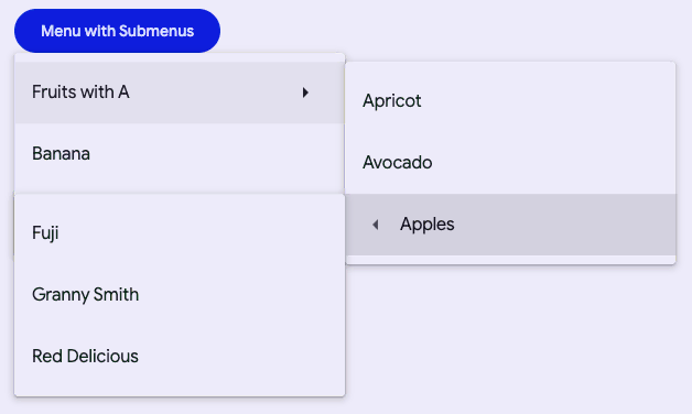
Submenus
You can compose submenus inside of an <md-sub-menu-item>'s submenu slot, but
first the has-overflow attribute must be set on the root <md-menu> to
disable overflow scrolling and display the nested submenus.
<!-- Note the position: relative style -->
<span style="position: relative">
  <md-filled-button id="usage-submenu-anchor">
    Menu with Submenus
  </md-filled-button>
  <!-- Note the has-overflow attribute -->
  <md-menu has-overflow id="usage-submenu" anchor="usage-submenu-anchor">
    <md-sub-menu-item headline="Fruits with A">
      <!-- Submenu must be slotted into sub-menu-item's submenu slot -->
      <md-menu slot="submenu">
        <md-menu-item headline="Apricot"></md-menu-item>
        <md-menu-item headline="Avocado"></md-menu-item>

        <!-- Nest as many as you want and control menu anchoring -->
        <md-sub-menu-item
            headline="Apples"
            menu-corner="start-end"
            anchor-corner="start-start">
          <md-menu slot="submenu">
            <md-menu-item headline="Fuji"></md-menu-item>
            <md-menu-item headline="Granny Smith"></md-menu-item>
            <md-menu-item headline="Red Delicious"></md-menu-item>
          </md-menu>

          <!-- Arrow icons are helpful affordances -->
          <md-icon
              slot="start-icon"
              style="font-size: 24px;height:24px;">
            arrow_left
          </md-icon>
        </md-sub-menu-item>
      </md-menu>

      <!-- Arrow icons are helpful affordances -->
      <md-icon slot="end">arrow_right</md-icon>
    </md-sub-menu-item>

    <md-menu-item headline="Banana"></md-menu-item>
    <md-menu-item headline="Cucumber"></md-menu-item>
  </md-menu>
</span>

<script type="module">
  const anchorEl = document.body.querySelector('#usage-submenu-anchor');
  const menuEl = document.body.querySelector('#usage-submenu');

  anchorEl.addEventListener('click', () => { menuEl.show(); });
</script>
Fixed menus
Internally menu uses position: absolute by default. Though there are cases
when the anchor and the node cannot share a common ancestor that is position: relative, or sometimes, menu will render below another item due to limitations
with position: absolute. In most of these cases, you would want to use the
fixed attribute to position the menu relative to the window instead of
relative to the parent.
Note: Fixed menu positions are positioned relative to the window and not the document. This means that the menu will not scroll with the anchor as the page is scrolled.
<!-- Note the lack of position: relative parent. -->
<div style="margin: 16px;">
  <md-filled-button id="usage-fixed-anchor">Open fixed menu</md-filled-button>
</div>

<!-- Fixed menus do not require a common ancestor with the anchor. -->
<md-menu fixed id="usage-fixed" anchor="usage-fixed-anchor">
  <md-menu-item headline="Apple"></md-menu-item>
  <md-menu-item headline="Banana"></md-menu-item>
  <md-menu-item headline="Cucumber"></md-menu-item>
</md-menu>

<script type="module">
  const anchorEl = document.body.querySelector('#usage-fixed-anchor');
  const menuEl = document.body.querySelector('#usage-fixed');

  anchorEl.addEventListener('click', () => { menuEl.show(); });
</script>
Accessibility
By default Menu is set up to function as a role="menu" with children as
role="menuitem". A common use case for this is the menu button example, where
you would need to add keyboard interactions to the button to open the menu
(see W3C example).
Menu can also be adapted for other use cases.
The role of the md-list inside the menu can be set with the type attribute.
The role of each individual md-menu-item can also be set with the type
attribute. Anything else slotted into the menu that is not a list item in most
cases should be set to role="none", and md-divider should have
role="separator".
<!--
  A simplified example of an autocomplete component – missing javascript logic for interaction.
-->
<md-filled-text-field
    id="textfield"
    type="combobox"
    aria-controls="menu"
    aria-autocomplete="list"
    aria-expanded="true"
    aria-activedescendant="1"
    value="Ala">
</md-filled-textfield>
<md-menu
    id="menu"
    anchor="textfield"
    role="listbox"
    aria-label="states"
    open>
  <md-menu-item type="option" id="0" headline="Alabama"></md-menu-item>
  <md-divider role="separator"></md-divider>
  <md-menu-item type="option" id="1" headline="Alaska" aria-selected="true">
  </md-menu-item>
</md-menu>
Theming
Menus support Material theming and can be customized in
terms of color. Additionally, md-menu composes md-list, and each menu item
extends md-list-item (see theming documentation), so most
the tokens for those components can also be used for Menu.
Menu Tokens
| Token | Default value |
|---|---|
--md-menu-container-color |
--md-sys-color-surface-container |
--md-menu-container-shape |
4px |
--md-menu-item-container-color |
--md-sys-color-surface-container |
--md-menu-item-selected-container-color |
--md-sys-color-secondary-container |
Example
<style>
  ::root {
    background-color: #f4fbfa;
    --md-menu-container-color: #f4fbfa;
    --md-menu-container-shape: 0px;
    --md-menu-item-container-color: transparent;
    --md-list-item-container-shape: 28px;
    --md-list-item-label-text-color: #161d1d;
    --md-list-item-supporting-text-color: #3f4948;
    --md-list-item-trailing-supporting-text-color: #3f4948;
    --md-list-item-label-text-type: system-ui;
    --md-list-item-supporting-text-type: system-ui;
    --md-list-item-trailing-supporting-text-type: system-ui;
  }
  /* Styles for button and not relevant to menu */
  md-filled-button {
    --md-sys-color-primary: #006a6a;
    --md-sys-color-on-primary: #ffffff;
  }
</style>

<span style="position: relative">
  <md-filled-button id="theming-anchor">Themed menu</md-filled-button>
  <md-menu id="theming-menu" anchor="theming-anchor">
    <md-menu-item headline="Apple"></md-menu-item>
    <md-menu-item headline="Banana"></md-menu-item>
    <md-menu-item headline="Cucumber"></md-menu-item>
  </md-menu>
</span>

<script type="module">
  const anchorEl = document.body.querySelector("#theming-anchor");
  const menuEl = document.body.querySelector("#theming-menu");

  anchorEl.addEventListener("click", () => {
    menuEl.show();
  });
</script>


