7.5 KiB
Selection controls: checkboxes
Selection controls allow the user to select options.
Use checkboxes to:
- Select one or more options from a list
- Present a list containing sub-selections
- Turn an item on or off in a desktop environment

Contents
Using checkboxes
Checkboxes allow the user to select one or more items from a set. Checkboxes can be used to turn an option on or off.
Making checkboxes accessible
Flutter's APIs support accessibility setting for large fonts, screen readers, and sufficient contrast. For more information, go to Flutter's accessibility and internationalization pages.
Checkboxes
Checkboxes example
CheckBox
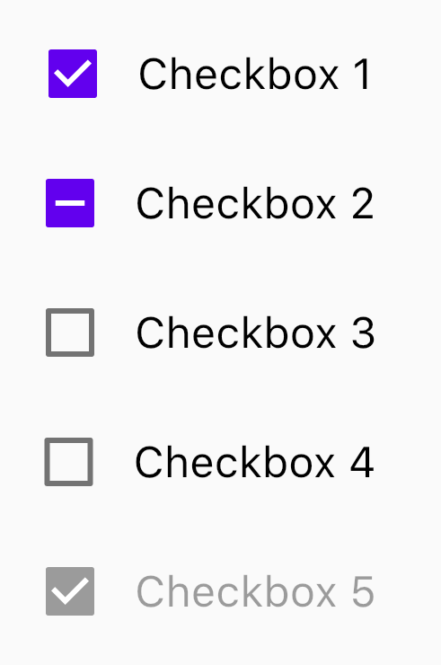
The following example should five checkboxes. The first one is enabled, the second one has tristate enabled, and the last one is disabled.
Column(
  children: [
    for (var i = 0; i < 5; i += 1)
      Row(
        children: [
          Checkbox(
            onChanged: i == 4 ? null : (bool value) {
              setState(() {
                checked[i] = value;
              });
            },
            tristate: i == 1,
            value: checked[i],
            activeColor: Color(0xFF6200EE),
          ),
          Text(
            'Checkbox ${i + 1}',
            style: Theme.of(context).textTheme.subtitle1.copyWith(color: i == 4 ? Colors.black38 : Colors.black),
          ),
        ],
        mainAxisAlignment: MainAxisAlignment.center,
      ),
  ],
)
Checkbox states
Checkboxes can be selected, unselected, or indeterminate. Checkboxes have enabled, disabled, hover, focused, and pressed states.

Checkbox key properties
Checkbox attributes
| Property | |
|---|---|
| Color | activeColor on Checkbox |
| Checked | value on Checkbox |
| Tristate | tristate on Checkbox |
| Disabled | pass null to onChanged on Checkbox |
Theming
Checkboxes support Material Theming and can be customized in terms of color, typography and shape.
The following example shows checkboxes with the Material Shrine Theme.

import 'package:flutter/material.dart';

void main() {
  runApp(App());
}

class App extends StatelessWidget {
  @override
  Widget build(BuildContext context) {
    return MaterialApp(
      title: 'Checkboxes Demo',
      debugShowCheckedModeBanner: false,
      home: CheckboxesDemo(),
      theme: _buildShrineTheme(),
    );
  }
}

class CheckboxesDemo extends StatefulWidget {
  @override
  _CheckboxesDemoState createState() => _CheckboxesDemoState();
}

class _CheckboxesDemoState extends State<CheckboxesDemo> {
  List<bool> checked = [true, true, false, false, true];

  @override
  Widget build(BuildContext context) {
    return Scaffold(
      appBar: AppBar(
        title: Text('Checkboxes Demo'),
      ),
      body: Container(
        margin: EdgeInsets.symmetric(vertical: 40),
        child: Column(
          children: [
            for (var i = 0; i < 5; i += 1)
              Row(
                children: [
                  Checkbox(
                    onChanged: i == 4
                        ? null
                        : (bool value) {
                      setState(() {
                        checked[i] = value;
                      });
                    },
                    tristate: i == 1,
                    value: checked[i],
                  ),
                  Text(
                    'Checkbox ${i + 1}',
                    style: Theme.of(context).textTheme.subtitle1.copyWith(color: i == 4 ? Colors.black38 : Colors.black),
                  ),
                ],
                mainAxisAlignment: MainAxisAlignment.center,
              ),
          ],
        ),
      ),
    );
  }
}

ThemeData _buildShrineTheme() {
  final ThemeData base = ThemeData.light();
  return base.copyWith(
    colorScheme: _shrineColorScheme,
    toggleableActiveColor: shrinePink400,
    accentColor: shrineBrown900,
    primaryColor: shrinePink100,
    buttonColor: shrinePink100,
    scaffoldBackgroundColor: shrineBackgroundWhite,
    cardColor: shrineBackgroundWhite,
    textSelectionTheme: TextSelectionThemeData(selectionColor: shrinePink100),
    errorColor: shrineErrorRed,
    primaryIconTheme: _customIconTheme(base.iconTheme),
    textTheme: _buildShrineTextTheme(base.textTheme),
    primaryTextTheme: _buildShrineTextTheme(base.primaryTextTheme),
    accentTextTheme: _buildShrineTextTheme(base.accentTextTheme),
    iconTheme: _customIconTheme(base.iconTheme),
  );
}

IconThemeData _customIconTheme(IconThemeData original) {
  return original.copyWith(color: shrineBrown900);
}

TextTheme _buildShrineTextTheme(TextTheme base) {
  return base.apply(
    fontFamily: 'Rubik',
    displayColor: shrineBrown900,
    bodyColor: shrineBrown900,
  );
}

const ColorScheme _shrineColorScheme = ColorScheme(
  primary: shrinePink100,
  primaryVariant: shrineBrown900,
  secondary: shrinePink50,
  secondaryVariant: shrineBrown900,
  surface: shrineSurfaceWhite,
  background: shrineBackgroundWhite,
  error: shrineErrorRed,
  onPrimary: shrineBrown900,
  onSecondary: shrineBrown900,
  onSurface: shrineBrown900,
  onBackground: shrineBrown900,
  onError: shrineSurfaceWhite,
  brightness: Brightness.light,
);

const Color shrinePink50 = Color(0xFFFEEAE6);
const Color shrinePink100 = Color(0xFFFEDBD0);
const Color shrinePink300 = Color(0xFFFBB8AC);
const Color shrinePink400 = Color(0xFFEAA4A4);

const Color shrineBrown900 = Color(0xFF442B2D);
const Color shrineBrown600 = Color(0xFF7D4F52);

const Color shrineErrorRed = Color(0xFFC5032B);

const Color shrineSurfaceWhite = Color(0xFFFFFBFA);
const Color shrineBackgroundWhite = Colors.white;