 fca1418bf4
Bottom Navigation
Common Button
Docked Toolbar
Extended Floating Action Button
Floating Action Button
Floating Toolbar
Navigation Drawer

PiperOrigin-RevId: 799044938
21 KiB
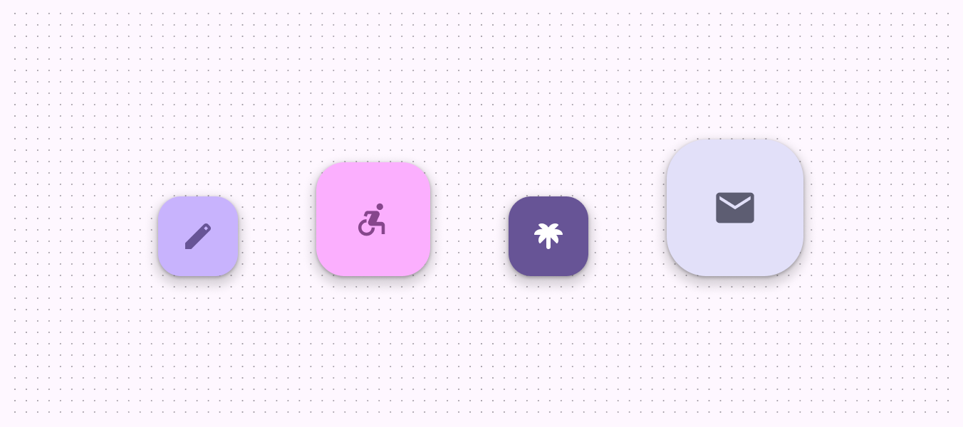
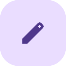
Floating action buttons (FABs)
A floating action button (FAB) represents the primary action of a screen. There are three variants of a FAB.

- FAB
- Medium FAB
- Large FAB
Note: Images use various dynamic color schemes.
A FAB performs the primary or the most common action on a screen. It appears in front of all screen content, typically as a boxy shape with an icon in its center.
Design & API documentation
Anatomy

- Container
- Icon
More details on anatomy items in the component guidelines.
M3 Expressive
M3 Expressive update
Before you can use Material3Expressive component styles, follow the
Material3Expressive themes setup instructions.
 FABs have updated colors and sizes
The FAB has new sizes to match the extended FAB and more color options. The small FAB is deprecated. More on M3 Expressive
Types and naming:
- Added medium FAB size
- Deprecated small FAB size
- FAB and large FAB sizes are unchanged
- FAB types are based on size, not color
Color:
- Added tone color styles:
- Primary
- Secondary
- Tertiary
- Renamed existing tonal color styles to match their token names:
- Primary to Primary container
- Secondary to Secondary container
- Tertiary to Tertiary container
- The values haven't changed
- Deprecated surface color FABs
M3 Expressive styles
Theme overlays
To avoid a scenario of exploding style combinations, the colors will be handled via theme overlays instead of creating distinct styles for each size/palette combination for FABs and extended FABs.
M3 Expressive library provides six theme overlays to be used:
ThemeOverlay.Material3Expressive.FloatingActionButton.PrimaryThemeOverlay.Material3Expressive.FloatingActionButton.SecondaryThemeOverlay.Material3Expressive.FloatingActionButton.TertiaryThemeOverlay.Material3Expressive.FloatingActionButton.PrimaryContainerThemeOverlay.Material3Expressive.FloatingActionButton.SecondaryContainerThemeOverlay.Material3Expressive.FloatingActionButton.TertiaryContainer
The theme overlay for a given FAB or extended FAB can be specified within the
component XML by adding, for example,
app:materialThemeOverlay="@style/ThemeOverlay.Material3Expressive.FloatingActionButton.Primary.
Note: The images below show FAB examples in light mode (left) and in dark mode (right) using the primary theme overlay.
M3 Expressive FAB
 |
 |
|---|
<com.google.android.material.floatingactionbutton.FloatingActionButton
      style="?attr/floatingActionButtonStyle"
      android:layout_width="wrap_content"
      android:layout_height="wrap_content"
      android:layout_margin="8dp"
      android:contentDescription="@string/m3_expressive_primary_fab_content_description"
      app:srcCompat="@drawable/gs_edit_fill1_vd_theme_24"
      app:materialThemeOverlay="@style/ThemeOverlay.Material3Expressive.FloatingActionButton.Primary" />
M3 Expressive medium FAB
 |
 |
|---|
<com.google.android.material.floatingactionbutton.FloatingActionButton
            style="?attr/floatingActionButtonMediumStyle"
            android:layout_width="wrap_content"
            android:layout_height="wrap_content"
            android:layout_margin="8dp"
            android:contentDescription="@string/m3_expressive_primary_medium_fab_content_description"
            app:srcCompat="@drawable/gs_edit_fill1_vd_theme_24"
            app:materialThemeOverlay="@style/ThemeOverlay.Material3Expressive.FloatingActionButton.Primary" />
M3 Expressive large FAB
 |
 |
|---|
<com.google.android.material.floatingactionbutton.FloatingActionButton
      style="?attr/floatingActionButtonLargeStyle"
      android:layout_width="wrap_content"
      android:layout_height="wrap_content"
      android:layout_margin="8dp"
      android:contentDescription="@string/m3_expressive_primary_large_fab_content_description"
      app:srcCompat="@drawable/gs_edit_fill1_vd_theme_24"
      app:materialThemeOverlay="@style/ThemeOverlay.Material3Expressive.FloatingActionButton.Primary" />
Key properties
Container attributes
| Element | Attribute | Related method(s) | Default value |
|---|---|---|---|
| Color | app:backgroundTint |
setBackgroundTintListgetBackgroundTintList |
?attr/colorPrimaryContainer (see all states) |
| Stroke | app:borderWidth |
N/A | 0dp |
| Size | app:fabSizeapp:fabCustomSize |
setSizesetCustomSizeclearCustomSizegetSizegetCustomSize |
auto |
| Shape | shapeAppearanceshapeAppearanceOverlay |
setShapeAppearanceModelgetShapeAppearanceModel |
ShapeAppearanceOverlay.Material3.FloatingActionButton |
| Elevation | app:elevation |
setElevationgetCompatElevation |
6dp |
| Hovered/Focused elevation | app:hoveredFocusedTranslationZ |
setCompatHoveredFocusedTranslationZgetCompatHoveredFocusedTranslationZ |
2dp |
| Pressed elevation | app:pressedTranslationZ |
setCompatPressedTranslationZgetCompatPressedTranslationZ |
6dp |
| Ripple | app:rippleColor |
setRippleColorgetRippleColorgetRippleColorStateList |
variations of ?attr/colorOnPrimaryContainer, see all states |
| Motion | app:showMotionSpecapp:hideMotionSpec |
set*MotionSpecset*MotionSpecResourceget*MotionSpec |
@null |
Icon attributes
| Element | Attribute | Related method(s) | Default value |
|---|---|---|---|
| Icon | app:srcCompat |
setImageDrawablesetImageResourcegetDrawable |
null |
| Color | app:tint |
setImageTintListgetImageTintList |
?attr/colorOnPrimaryContainer (see all states) |
Styles
| Element | Style | Theme attribute |
|---|---|---|
| Default style | Widget.Material3.FloatingActionButton.Primary |
?attr/floatingActionButtonStyle |
See the full list of styles and attrs.
Variants of FAB
There are three FAB sizes:
- FAB
- Medium FAB (most recommended)
- Large FAB
Choose the FAB size based on the visual hierarchy of your layout.
 FABs have multiple sizes that scale with
window size
FABs have multiple sizes that scale with
window size
FAB
FABs are the default size and style for a primary action button. The FAB is the smallest size, and is best used in compact windows where other actions may be present on screen.
API and source code:
FloatingActionButton
FAB example
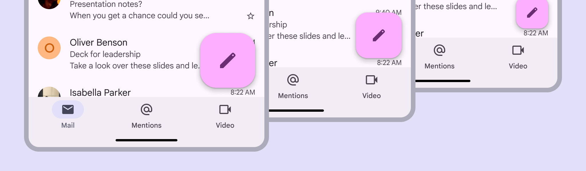
The following example shows a regular FAB with a plus icon.

In the layout:
<androidx.coordinatorlayout.widget.CoordinatorLayout
    ...
    android:layout_width="match_parent"
    android:layout_height="match_parent">

  <!-- Main content -->

  <com.google.android.material.floatingactionbutton.FloatingActionButton
      android:id="@+id/floating_action_button"
      android:layout_width="wrap_content"
      android:layout_height="wrap_content"
      android:layout_gravity="bottom|end"
      android:layout_margin="16dp"
      android:contentDescription="@string/fab_content_desc"
      app:srcCompat="@drawable/ic_plus_24"/>

</androidx.coordinatorlayout.widget.CoordinatorLayout>
In code:
fab.setOnClickListener {
    // Respond to FAB click
}
Medium FAB
A medium FAB is recommended for most situations, and works best in compact and medium windows. Use it for important actions without taking up too much space.
API and source code:
FloatingActionButton
Medium FAB example
The following example shows a medium FAB with a plus icon.

In the layout:
<androidx.coordinatorlayout.widget.CoordinatorLayout
    ...
    >

  <!-- Main content -->

  <com.google.android.material.floatingactionbutton.FloatingActionButton
      ...
      style="?attr/floatingActionButtonMediumStyle"/>

</androidx.coordinatorlayout.widget.CoordinatorLayout>
In code:
fab.setOnClickListener {
    // Respond to FAB click
}
Large FAB
A large FAB is useful in any window size when the layout calls for a clear and prominent primary action, but is best suited for expanded and larger window sizes, where its size helps draw attention.
API and source code:
FloatingActionButton
Large FAB example
The following example shows a large FAB with a plus icon.

In the layout:
<androidx.coordinatorlayout.widget.CoordinatorLayout
    ...
    >

  <!-- Main content -->

  <com.google.android.material.floatingactionbutton.FloatingActionButton
      ...
      style="?attr/floatingActionButtonLargeStyle"/>

</androidx.coordinatorlayout.widget.CoordinatorLayout>
In code:
fab.setOnClickListener {
    // Respond to FAB click
}
Small FAB (deprecated)
A small FAB should be used on smaller screens.
Small FABs can also be used to create visual continuity with other screen elements.
API and source code:
FloatingActionButton
Small FAB example
The following example shows a small FAB with a plus icon.

In the layout:
<androidx.coordinatorlayout.widget.CoordinatorLayout
    ...
    >

  <!-- Main content -->

  <com.google.android.material.floatingactionbutton.FloatingActionButton
      ...
      style="?attr/floatingActionButtonSmallStyle"/>

</androidx.coordinatorlayout.widget.CoordinatorLayout>
In code:
fab.setOnClickListener {
    // Respond to FAB click
}
Code implementation
Before you can use Material FABs, you need to add a dependency to the Material Components for Android library. For more information, go to the Getting started page.
Note: If the FloatingActionButton is a child of a CoordinatorLayout, you
get certain behaviors for free. It will automatically shift so that any
displayed Snackbars do not cover it, and will automatically hide when covered
by an AppBarLayout or BottomSheetBehavior.
Making FABs accessible
You should set a content description on a FAB via the
android:contentDescription attribute or setContentDescription method so that
screen readers like TalkBack are able to announce their purpose or action. Text
rendered in Extended FABs is automatically provided to accessibility services,
so additional content labels are usually unnecessary.
Animating visibility of FAB
Use the show and hide methods to animate the visibility of a
FloatingActionButton. The show animation grows the widget and fades it in,
while the hide animation shrinks the widget and fades it out.
// To show:
fab.show()
// To hide:
fab.hide()
Customizing FABs
Theming FABs
FAB theming example
API and source code:
FloatingActionButton
The following example shows multiple FABs with Material Theming in different sizes that scale with window size.

Implementing FAB theming
Use theme attributes and styles in res/values/styles.xml to add themes to all
FABs. This affects other components:
<style name="Theme.App" parent="Theme.Material3.*">
    ...
    <item name="colorPrimaryContainer">@color/purple_500</item>
    <item name="colorOnPrimaryContainer">@color/purple_700</item>
</style>
Use a default style theme attribute, styles and a theme overlay. This themes all FABs in your app but does not affect other components:
<style name="Theme.App" parent="Theme.Material3.*">
    ...
    <item name="extendedFloatingActionButtonStyle">@style/Widget.App.ExtendedFloatingActionButton</item>
    <item name="floatingActionButtonStyle">@style/Widget.App.FloatingActionButton</item>
</style>

<style name="Widget.App.ExtendedFloatingActionButton" parent="Widget.Material3.ExtendedFloatingActionButton.Icon.Primary">
    <item name="materialThemeOverlay">@style/ThemeOverlay.App.FloatingActionButton</item>
</style>

<style name="Widget.App.FloatingActionButton" parent="Widget.Material3.FloatingActionButton.Primary">
    <item name="materialThemeOverlay">@style/ThemeOverlay.App.FloatingActionButton</item>
</style>

<style name="ThemeOverlay.App.FloatingActionButton" parent="">
    <item name="colorContainer">@color/purple_500</item>
    <item name="colorOnContainer">@color/purple_700</item>
</style>
Use one of the styles in the layout. That affects only this FAB:
<com.google.android.material.floatingactionbutton.FloatingActionButton
    ...
    style="@style/Widget.App.FloatingActionButton"
/>
Sizing FABs
The FloatingActionButton can be sized either by using app:fabCustomSize or
for the large/small FAB (M3 only) by applying the desired style. The
app:fabSize discrete size mode is deprecated in Material3 style. If the
app:fabSize is overridden in your FAB style, which inherits from one of these
styles:
Widget.Material3.FloatingActionButton(.Large).PrimaryWidget.Material3.FloatingActionButton(.Large).SecondaryWidget.Material3.FloatingActionButton(.Large).TertiaryWidget.Material3.FloatingActionButton(.Large).Surface
Please consider one of the following migration options:
- If
normalsize is used, set the parent style toWidget.Material3.FloatingActionButton.{Color}and removeapp:fabSize. - If
minisize is used, set the parent style toWidget.Material3.FloatingActionButton.Small.{Color}and removeapp:fabSize. - If FAB size changes in runtime by either setting
fabSizeorfabCustomSize, and relative sized corners are desired, setshapeAppearanceOverlayas@style/ShapeAppearanceOverlay.Material3.FloatingActionButtonin the style.
If you'd like to use the small FAB, apply one of these style attributes:
?attr/floatingActionButtonSmallStyle?attr/floatingActionButtonSmallPrimaryStyle?attr/floatingActionButtonSmallSecondaryStyle?attr/floatingActionButtonSmallTertiaryStyle?attr/floatingActionButtonSmallSurfaceStyle
If you'd like to use the medium FAB, apply this style with the corresponding
color theme overlay via materialThemeOverlay:
?attr/floatingActionButtonMediumStyle
If you'd like to use the large FAB, apply one of these style attributes:
?attr/floatingActionButtonLargeStyle?attr/floatingActionButtonLargePrimaryStyle?attr/floatingActionButtonLargeSecondaryStyle?attr/floatingActionButtonLargeTertiaryStyle?attr/floatingActionButtonLargeSurfaceStyle