2.7 KiB
Docked & floating toolbars
Docked & floating toolbars display frequently used actions relevant to the current page.
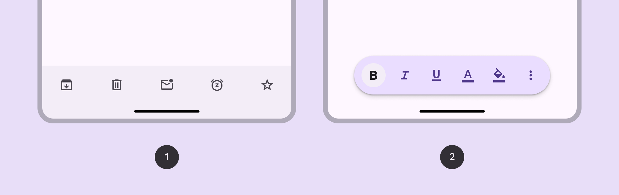
- Docked toolbar: Spans the full width of the window. It’s best used for global actions that remain the same across multiple pages.
- Floating toolbar: Floats above the body content. It’s best used for contextual actions relevant to the body content or the specific page.
Note: Images use various dynamic color schemes.
Design & API documentation
Anatomy

- Container
- Elements
More details on anatomy items in the component guidelines.
M3 Expressive update
Before you can use Material3Expressive component styles, follow the
Material3Expressive themes setup instructions.

- Floating, vibrant color scheme and paired with FAB
- Docked with embedded primary action instead of FAB
The bottom app bar is being deprecated and should be replaced with the docked toolbar, which functions similarly, but is shorter and has more flexibility. The floating toolbar was created for more versatility, greater amounts of actions, and more variety in where it's placed. an inset icon. More on M3 Expressive
Types and naming
-
Added docked toolbar to replace bottom app bar
- Size: Shorter height
- Color: Standard or vibrant
- Flexibility: More layout and element options
-
Added floating toolbar with the following attributes:
- Layout: Horizontal or vertical
- Color: Standard or vibrant
- Flexibility: Can hold many elements and components. Can be paired with FAB.
-
Bottom app bar is still available, but not recommended