Remove more `textScaleFactor` references from flutter/flutter.

- Some changes are related to label scaling: the padding EdgeInsets values of some chip subclasses scale linearly between predetermined "max" padding values and "min" padding values. Before they scale with the `textScaleFactor` scalar, now they scale with the font size and are still capped at the original "max" and "min" values.
- The rest of them are tests or size heuristics that depend on `textScaleFactor`, these are replaced by an effective text scale factor computed using a default font size (which is determined in a pretty random fashion, but it will only make a difference on Android 14+).

No API changes in this batch. There are still some references left that I intend to remove in a different batch that would introduce API changes.
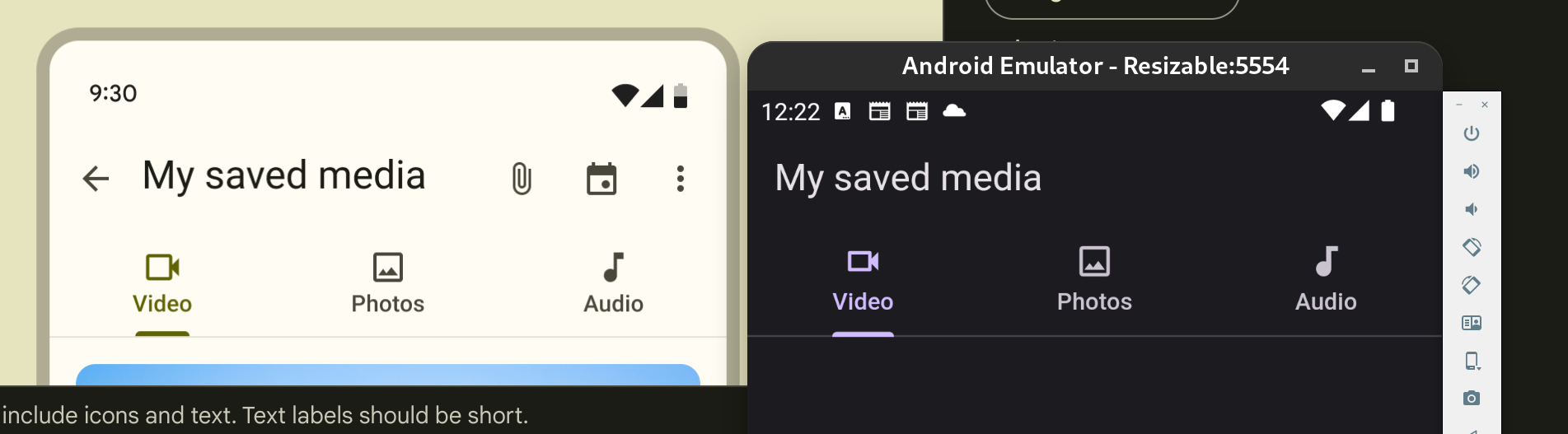
This PR improves the distance between the label and the icon in the Tab widget.
I updated the margin to 2 pixels, taken from the Figma design page for Material 3. On Material 2 I left the default value of 10 pixels.
Related to #128696 (In particular, the distance between label and icon)
Here are some screenshots for comparison. I looked a bit into the other mentioned issue of the tab height not following the M3 spec. Flutter uses 72 and the spec uses 64. But because Tab is a PreferredSizeWidget, I don't think there is an easy way to provide a different size depending on `ThemeData.useMaterial3`, because there is no `BuildContext` available.
I provide a sample image for the 64 height as well for context on the linked issue, even though it's not part of the PR changes.
The screenshots are taken side by side with the image at: https://m3.material.io/components/tabs/guidelines
## Original

## New (tab height = 72, Flutter default for 8 years)

## New (tab height = 64, M3 spec)
Previously `TextField`s error `cursorColor` was being derived without taking into account any `InputDecorationTheme` defaults. This change respects `InputDecorationTheme` defaults when deriving the error `cursorColor`.
Fixes#140607
Fixes#140046
This PR is to add a `headerHeight` property to `SearchAnchor` and `SearchViewThemeData` so the header height on the search view can be customized.
I continued [my mission](https://github.com/flutter/flutter/pull/141431) to find as many typos as I could. This time it's a smaller set than before.

There is no need for issues since it's a typo fix.
## Description
This PR addresses issue #141061, which requested the addition of a 'color' property to buttons extending _ActionButton. The 'color' property has been introduced to enhance customization options for these buttons.
## Issues Fixed
- Fixes#141061
Fixes  #140770 and #103124

Adds the possibility of passing a height and width to icons. And also a margin for the distance of the lines between the icons.
fixes [Invisible SliverAppBar title in Material 3 light theme](https://github.com/flutter/flutter/issues/138296)
fixes [`FlexibleSpaceBar` title is misaligned without the leading widget](https://github.com/flutter/flutter/issues/138608)
Previous attempt https://github.com/flutter/flutter/pull/138611
---
### Description
- fixes the `FlexibleSpaceBar` centered title position when there is a leading widget.
- fixes the `FlexibleSpaceBar` title color for Material 3.
- Added documentation when using a long `FlexibleSpaceBar` title and update its test.
- Improved documentation of default title padding.
### Code sample
### Code sample
<details>
<summary>expand to view the code sample</summary>
```dart
import 'package:flutter/material.dart';
void main() => runApp(const MyApp());
class MyApp extends StatelessWidget {
const MyApp({super.key});
@override
Widget build(BuildContext context) {
return const MaterialApp(
debugShowCheckedModeBanner: false,
home: Example(),
);
}
}
class Example extends StatelessWidget {
const Example({super.key});
@override
Widget build(BuildContext context) {
return const Scaffold(
body: SafeArea(
child: CustomScrollView(
slivers: <Widget>[
SliverAppBar(
leading: Icon(Icons.favorite_rounded),
flexibleSpace: FlexibleSpaceBar(
title: ColoredBox(
color: Color(0xffff0000),
child: Text('SliverAppBar'),
),
),
),
],
)),
);
}
}
```
</details>
### Before

### After

(#139572) I would like to request an update to the document to resolve confusion.
I actually modified the code by applying priority as in the comment in [#139572](https://github.com/flutter/flutter/issues/139572) as shown below, but I thought that if 'OutlinedBorder' was used for 'shape', the default value of side for 'OutlinedBorder' was also the developer's intention.
```
OutlinedBorder _getShape(ThemeData theme, ChipThemeData chipTheme, ChipThemeData chipDefaults) {
final BorderSide? resolvedSide =
MaterialStateProperty.resolveAs<BorderSide?>(widget.side, materialStates)
?? MaterialStateProperty.resolveAs<BorderSide?>(chipTheme.side, materialStates);
final BorderSide? resolvedShapeSide =
MaterialStateProperty.resolveAs<BorderSide?>(widget.shape?.side, materialStates)
?? MaterialStateProperty.resolveAs<BorderSide?>(chipTheme.shape?.side, materialStates);
final OutlinedBorder resolvedShape =
MaterialStateProperty.resolveAs<OutlinedBorder?>(widget.shape, materialStates)
?? MaterialStateProperty.resolveAs<OutlinedBorder?>( chipTheme.shape, materialStates)
?? MaterialStateProperty.resolveAs<OutlinedBorder?>(chipDefaults.shape, materialStates)
// TODO(tahatesser): Remove this fallback when Material 2 is deprecated.
?? const StadiumBorder();
// If the side is provided, shape uses the provided side.
if (resolvedSide != null) {
return resolvedShape.copyWith(side: resolvedSide);
}
if (resolvedShapeSide != null) {
return resolvedShape.copyWith(side: resolvedShapeSide);
}
// If the side is not provided
// then the shape's side is used. Otherwise, the default side is used.
return resolvedShape.copyWith(side: chipDefaults.side);
}
```
(in `chip.dart`)
However, (#133856) PR seems to be intended to ignore this and use the aspect of `chipDefault.side` even if the developer specifies `shape.side` as [Border.none] without explicitly applying `side` .
This is probably because the default value of OutlinedBorder is [Border.none].
I think this is an area that can cause enough confusion, but there are a lot of things that need to be modified to reduce confusion through code changes, and the impact on existing code is likely to be significant.
I also confirmed that this is not accurately explained in the API Docs.
So rather than modifying the code, I decided to add additional explanation to the `shape` comment.
If the results are different from what you intended or the updated content is strange, please review. ð
Changes drag release logic so that an armed refresh is only canceled if the user has scrolled back up beyond the point where the refresh indicator was armed. (Fixes https://github.com/flutter/flutter/issues/138848.)

This is the minimal change I found could be made to restore something like the behavior that I would expect.

This may still need a bit of work, because it only masks the second issue I mentioned, that releasing a drag can cause the scroll position to be animated back up from the release point. There is actually a bug about that: https://github.com/flutter/flutter/issues/6052. I would like to see that bug fixed too. This PR doesn't address that, but makes it harder to hit that issue.

@Piinks this is a recreation of #139015 (since I couldn't figure out some issue with a git detached branch, so I fixed the PR and I'm re-submitting it). This version includes one line that was somehow accidentally dropped from the original PR. This will hopefully fix the test failures.

However, I don't have a clue how to write a test for a Flutter UI widget. I'll try to figure that out, but also I don't have a lot of time to work on this. I would appreciate at least some user testing to verify that the new behavior is much more intuitive than the old behavior.

- [?] All existing and new tests are passing.
fixes https://github.com/flutter/flutter/issues/138289

---

SegmentedButtom.styleFrom has been added to the segment button, so there is no longer any need to the button style from the beginning. It works like ElevatedButton.styleFrom only I added selectedForegroundColor, selectedBackgroundColor. In this way, the user will be able to change the color first without checking the MaterialState states. I added tests of the same controls.

#129215 I opened this problem myself, but I was rejected because I handled too many items in a PR. For now, I wrote a structure that only handles MaterialStates instead of users.

old (still avaliable)
<img width="626" alt="image" src="https://github.com/flutter/flutter/assets/65075121/9446b13b-c355-4d20-bda2-c47a23d42d4f">

new (just an option for developer)
<img width="483" alt="image" src="https://github.com/flutter/flutter/assets/65075121/0a645257-4c83-4029-9484-bd746c02265f">

### Code sample

<details>
<summary>expand to view the code sample</summary>

```dart
import 'package:flutter/material.dart';

/// Flutter code sample for [SegmentedButton].

void main() {
  runApp(const SegmentedButtonApp());
}

enum Calendar { day, week, month, year }

class SegmentedButtonApp extends StatefulWidget {
  const SegmentedButtonApp({super.key});

  @override
  State<SegmentedButtonApp> createState() => _SegmentedButtonAppState();
}

class _SegmentedButtonAppState extends State<SegmentedButtonApp> {
  Calendar calendarView = Calendar.day;

  @override
  Widget build(BuildContext context) {
    return MaterialApp(
      theme: ThemeData(useMaterial3: true),
      home: Scaffold(
        body: Center(
          child: SegmentedButton<Calendar>(
            style: SegmentedButton.styleFrom(
              foregroundColor: Colors.amber,
              visualDensity: VisualDensity.comfortable,
            ),
            // style: const ButtonStyle(
            //   foregroundColor: MaterialStatePropertyAll<Color>(Colors.deepPurple),
            //   visualDensity: VisualDensity.comfortable,
            // ),
            segments: const <ButtonSegment<Calendar>>[
              ButtonSegment<Calendar>(
                  value: Calendar.day,
                  label: Text('Day'),
                  icon: Icon(Icons.calendar_view_day)),
              ButtonSegment<Calendar>(
                  value: Calendar.week,
                  label: Text('Week'),
                  icon: Icon(Icons.calendar_view_week)),
              ButtonSegment<Calendar>(
                  value: Calendar.month,
                  label: Text('Month'),
                  icon: Icon(Icons.calendar_view_month)),
              ButtonSegment<Calendar>(
                  value: Calendar.year,
                  label: Text('Year'),
                  icon: Icon(Icons.calendar_today)),
            ],
            selected: <Calendar>{calendarView},
            onSelectionChanged: (Set<Calendar> newSelection) {
              setState(() {
                calendarView = newSelection.first;
              });
            },
          ),
        ),
      ),
    );
  }
}

```

</details>
*Replace this paragraph with a description of what this PR is changing or adding, and why. Consider including before/after screenshots.*

*List which issues are fixed by this PR. You must list at least one issue. An issue is not required if the PR fixes something trivial like a typo.*

*If you had to change anything in the [flutter/tests] repo, include a link to the migration guide as per the [breaking change policy].*
## Description

This PR fixes the positionning of a floating snackbar when the text direction is RTL.

## Related Issue

Fixes https://github.com/flutter/flutter/issues/140125.

## Tests

Adds 1 test.
Add onTapAlwaysCalled in TextFormField

*List which issues are fixed by this PR. You must list at least one issue. An issue is not required if the PR fixes something trivial like a typo.*

*If you had to change anything in the [flutter/tests] repo, include a link to the migration guide as per the [breaking change policy].*
This PR wraps the `label` with `IntrinsicWidth` and then `Flexible` which allows DefaulTextStyle `TextOverflow.ellipsis` to work. Wrapping `label` directly with `Flexible` brings more space between `icon` and `label`. `IntrinsicWidth` fixes this by giving reasonable width.
Fixes#112163
## Description

This fixes the handling of `dayPeriodColor` on the `TimePicker` so that if it's a non-`MaterialStateColor`, it only applies the color to the selected state, but otherwise uses the given `MaterialStateColor` to get custom behavior.

## Related Issues
 - Fixes https://github.com/flutter/flutter/issues/139445

## Tests
 - Added tests for both non-`MaterialStateColor` and `MaterialStateColor` cases.
Adds an `enabled` property to `ExpansionTile` that allows the user to disable the internal `ListTile`, so that we can prevent user interaction.
Fixes#135770.
## Description

This PR adds the 'Share' button to the text selection toolbar on Android.

## Related Issue

Fixes https://github.com/flutter/flutter/issues/138728

## Tests

Refactor a lot of existing tests in order to:
- make them more readable (avoid duplication by introducing helper functions, specify explictly check which buttons are expected).
- make them more accurate (check that expected buttons are visible instead of just checking the number of buttons).

For instance, previous tests contained sections such as:

```dart

      // Collapsed toolbar shows 3 buttons.
      expect(
        find.byType(CupertinoButton),
        isContextMenuProvidedByPlatform ? findsNothing : isTargetPlatformIOS ? findsNWidgets(6) : findsNWidgets(3)
      );

```

Where the comment is obsolete, the two cases (6 widgets and 3 widgets) are not explicit (which buttons are expected?), and not accurate (will pass if the number of buttons is right but the buttons are the wrong ones).
This PR introduces a new property `exitDuration` to Tooltip, the counterpart to `waitDuration`. The need for this is shown by #136586. This changes the behaviour of `showDuration` on mouse pointer devices. This is because the use cases for the current behaviour on touch screen devices vs mouse pointer devices is fundamentally different.
<details>
<summary>Demo: tooltip with showDuration set</summary>
Tooltip disappears after 100 ms when moving away the mouse. Tooltip will not disappear when hovered.
https://github.com/flutter/flutter/assets/5138348/81d36dc9-78e0-4723-a84b-2552843ee181
</details>
Currently, when `showDuration` is set, this adjusts the time it takes for the tooltip to hide _after_ a mouse pointer has left the tooltip. This is not the same use case as its effect on touch screen devices, where it dictates how long the tooltip stays on screen after a long press. That is needed because the tooltip takes up screen space and there is not an intuitive way to hide it, whereas when using a mouse users expect to simply have to hover somewhere else. Having the tooltip stay around will look broken.
Thus, this PR splits the two use cases. `showDuration` no longer affects mouse pointer devices at all*. There is a precedent for such mouse pointer-only behaviour in `waitDuration`. Instead, I have split up the two use cases and created the new property `exitDuration`, which will still allow for tweaking the time it takes for the tooltip to hide after the user has moved their mouse pointer somewhere else.
*Note: Should `showDuration` affect [this line](e33d4b8627/packages/flutter/lib/src/material/tooltip.dart (L610))?
Fixes#136586.
Note: I noticed that when I made the change, no tests were broken. Hopefully, the tests added here help that in the future. I also noticed that in the _existing_ tests, the `waitDuration` tests contain assertions that implicate that it is the role of `waitDuration` to change this behaviour, but that's not currently (nor in the new behaviour) true, so I have fixed those tests.
Fixes#139409
`SubmenuButton.onFocusChange` is not implemented. This PR is just add one line fix to assign this property to `TextButton.onFocusChange` which is used in `SubmenuButton`:)
This PR introduces a new feature that allows users to configure the 'dismissDirection' in SnackBarTheme. This enhancement provides users with the flexibility to set the 'dismissDirection' property in the ThemeData, rather than having to apply it each time when initializing a snack bar. This streamlines the process and makes it more convenient for users to manage and customize the behavior of snack bars within their applications.
Fixes#139012
## Description

When a DropdownMenu exists within another menu and a MenuItem is selected, the `TextEditingController` of the DropdownMenu is used after it has been disposed.

This PR manages the local `TextController` instance better, making sure that the one used when building is the current one, and handling the case where the `controller` is set on the widget after initial creation.

Also, places where we were setting the text and selection separately were converted to use `TextEditingValue` and set the value atomically.

## Related Issues
 - Fixes https://github.com/flutter/flutter/issues/139266

## Tests
 - Added tests (Created by @josh-burton  in https://github.com/flutter/flutter/pull/139268 - Thanks Josh!)