 dc10fe2d0d
This is an attempt at taking the existing text controls example and making it A) abstract, so that similar example can be made for text areas and chip fields, and B) fit in a scrollview, so all of the example is accessible in large content size categories. It's fully functional, but probably not done changing. Closes #9359. Here's a gif: 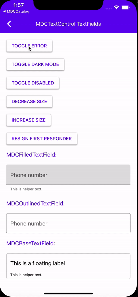
TextControls
TextControls are controls used for text input that make use of classes like UITextField and UITextView.

Design & API documentation
Table of contents
Overview
At this time, the only text control we offer is the text field. There are three text field classes:
- MDCFilledTextField: A text field implementing the Material filled style
- MDCOutlinedTextField: A text field implementing the Material outlined style
- MDCBaseTextField: An unstyled text field that the previous two inherit from
Installation
Installation with CocoaPods
Add the following to your Podfile:
pod 'MaterialComponents/TextControls'
Then, run the following command:
pod install
Importing
To use TextControls in your code, import the MaterialTextControls umbrella header (Objective-C) or MaterialComponents module (Swift).
Swift
import MaterialComponents.MaterialTextControls
Objective-C
#import "MaterialTextControls.h"
Usage
Text fields
The largest difference between MDCTextControl text fields and UITextFields from a usability standpoint relates to the sizing behavior of MDCTextControl text fields. Where UITextField can be whatever height a user wants it to be, MDCTextControl text fields have heights that they need to be in order to look correct. The process for ensuring that MDCTextControl text fields have their preferred heights depends on whether one is in an Auto Layout or Manual Layout environment. In an Auto Layout environment, the text field's preferred height will be reflected in intrinsicContentSize, and the user will not have to do anything other than set a width constraint on the text field to ensure that the preferred height is achieved. In a Manual Layout environment, standard methods like sizeThatFits: or sizeToFit must be used to inform the frames of the text field. These methods assume that the text field already has the preferred width.
Theming
Theming
You can theme a text field to match the Material Design style by using a theming extension. The content below assumes you have read the article on Theming.
First, import the theming extension for TextControls and create a text field.
Swift
import MaterialComponents.MaterialTextControls
import MaterialComponents.MaterialTextControls_Theming

let textField = MDCOutlinedTextField()
Objective-C
#import <MaterialComponents/MaterialTextControls.h>
#import <MaterialComponents/MaterialTextControls+Theming.h>

MDCFilledTextField *filledTextField = [[MDCFilledTextField alloc] init];
Then pass a container scheme to one of the theming methods on a theming extension.
Swift
filledTextField.applyTheme(withScheme: containerScheme)
Objective-C
[self.filledTextField applyThemeWithScheme:self.containerScheme];
Examples
Creating a text field
Swift
let estimatedFrame = ...
let textField = MDCFilledTextField(frame: estimatedFrame)
textField.label.text = "This is the floating label"
textField.leadingAssistiveLabel.text = "This is helper text"
textField.sizeToFit()
view.addSubview(textField)
Objective-C
CGRect estimatedFrame = ...
MDCOutlinedTextField *textField = [[MDCOutlinedTextField alloc] initWithFrame:estimatedFrame];
textField.label.text = "This is the floating label";
textField.leadingAssistiveLabel.text = "This is helper text";
[textField sizeToFit];
[view addSubview:textField];