mirror of
https://github.com/material-components/material-components-ios.git
synced 2026-02-20 08:27:32 +08:00
 5c09f5e625
Also updated the examples accordingly. Pivotal story: https://www.pivotaltracker.com/story/show/156169509 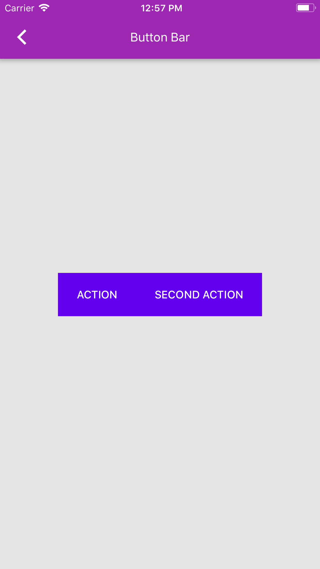
93 lines
2.6 KiB
Swift
93 lines
2.6 KiB
Swift
/*
|
|
Copyright 2016-present the Material Components for iOS authors. All Rights Reserved.
|
|
|
|
Licensed under the Apache License, Version 2.0 (the "License");
|
|
you may not use this file except in compliance with the License.
|
|
You may obtain a copy of the License at
|
|
|
|
http://www.apache.org/licenses/LICENSE-2.0
|
|
|
|
Unless required by applicable law or agreed to in writing, software
|
|
distributed under the License is distributed on an "AS IS" BASIS,
|
|
WITHOUT WARRANTIES OR CONDITIONS OF ANY KIND, either express or implied.
|
|
See the License for the specific language governing permissions and
|
|
limitations under the License.
|
|
*/
|
|
|
|
import Foundation
|
|
import MaterialComponents
|
|
|
|
class ButtonBarTypicalUseSwiftExample: UIViewController {
|
|
|
|
override func viewDidLoad() {
|
|
super.viewDidLoad()
|
|
|
|
let buttonBar = MDCButtonBar()
|
|
|
|
// MDCButtonBar ignores the style of UIBarButtonItem.
|
|
let ignored: UIBarButtonItemStyle = .done
|
|
|
|
let actionItem = UIBarButtonItem(
|
|
title: "Action",
|
|
style: ignored,
|
|
target: self,
|
|
action: #selector(didTapActionButton)
|
|
)
|
|
|
|
let secondActionItem = UIBarButtonItem(
|
|
title: "Second action",
|
|
style: ignored,
|
|
target: self,
|
|
action: #selector(didTapActionButton)
|
|
)
|
|
|
|
buttonBar.items = [actionItem, secondActionItem]
|
|
|
|
let scheme = MDCSemanticColorScheme(defaults: .material201804)
|
|
MDCButtonBarColorThemer.applySemanticColorScheme(scheme, to: buttonBar)
|
|
|
|
// MDCButtonBar's sizeThatFits gives a "best-fit" size of the provided items.
|
|
let size = buttonBar.sizeThatFits(self.view.bounds.size)
|
|
let x = (self.view.bounds.size.width - size.width) / 2
|
|
let y = self.view.bounds.size.height / 2 - size.height
|
|
buttonBar.frame = CGRect(x: x, y: y, width: size.width, height: size.height)
|
|
buttonBar.autoresizingMask =
|
|
[.flexibleTopMargin, .flexibleBottomMargin, .flexibleLeftMargin, .flexibleRightMargin]
|
|
self.view.addSubview(buttonBar)
|
|
|
|
// Ensure that the controller's view isn't transparent.
|
|
view.backgroundColor = .white
|
|
}
|
|
|
|
@objc func didTapActionButton(_ sender: Any) {
|
|
print("Did tap action item: \(sender)")
|
|
}
|
|
|
|
// MARK: Typical application code (not Material-specific)
|
|
init() {
|
|
super.init(nibName: nil, bundle: nil)
|
|
|
|
self.title = "Button Bar"
|
|
}
|
|
|
|
required init?(coder aDecoder: NSCoder) {
|
|
super.init(coder: aDecoder)
|
|
}
|
|
}
|
|
|
|
// MARK: Catalog by convention
|
|
extension ButtonBarTypicalUseSwiftExample {
|
|
@objc class func catalogBreadcrumbs() -> [String] {
|
|
return ["Button Bar", "Button Bar (Swift)"]
|
|
}
|
|
|
|
@objc class func catalogIsPrimaryDemo() -> Bool {
|
|
return false
|
|
}
|
|
|
|
@objc class func catalogIsPresentable() -> Bool {
|
|
return true
|
|
}
|
|
}
|
|
|