 1ce4467321
The BottomAppBar needs to support the "surface variant" of Material color theming. A new method on MDCBottomAppBarColorThemer now allows clients to apply the surface variant theme to their MDCBottomAppBarView instances. **Change demonstration** These changes are not in this PR, but will be made in a follow-up PR. These screenshots are to show the before/after effect of using the new themer. |Example|Before|After| |--|--|--| |Catalog (Objc)|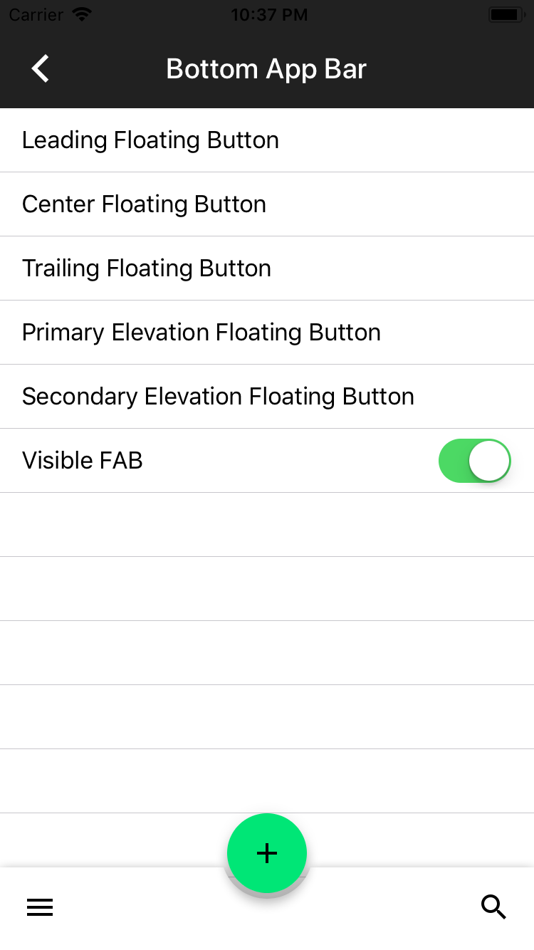|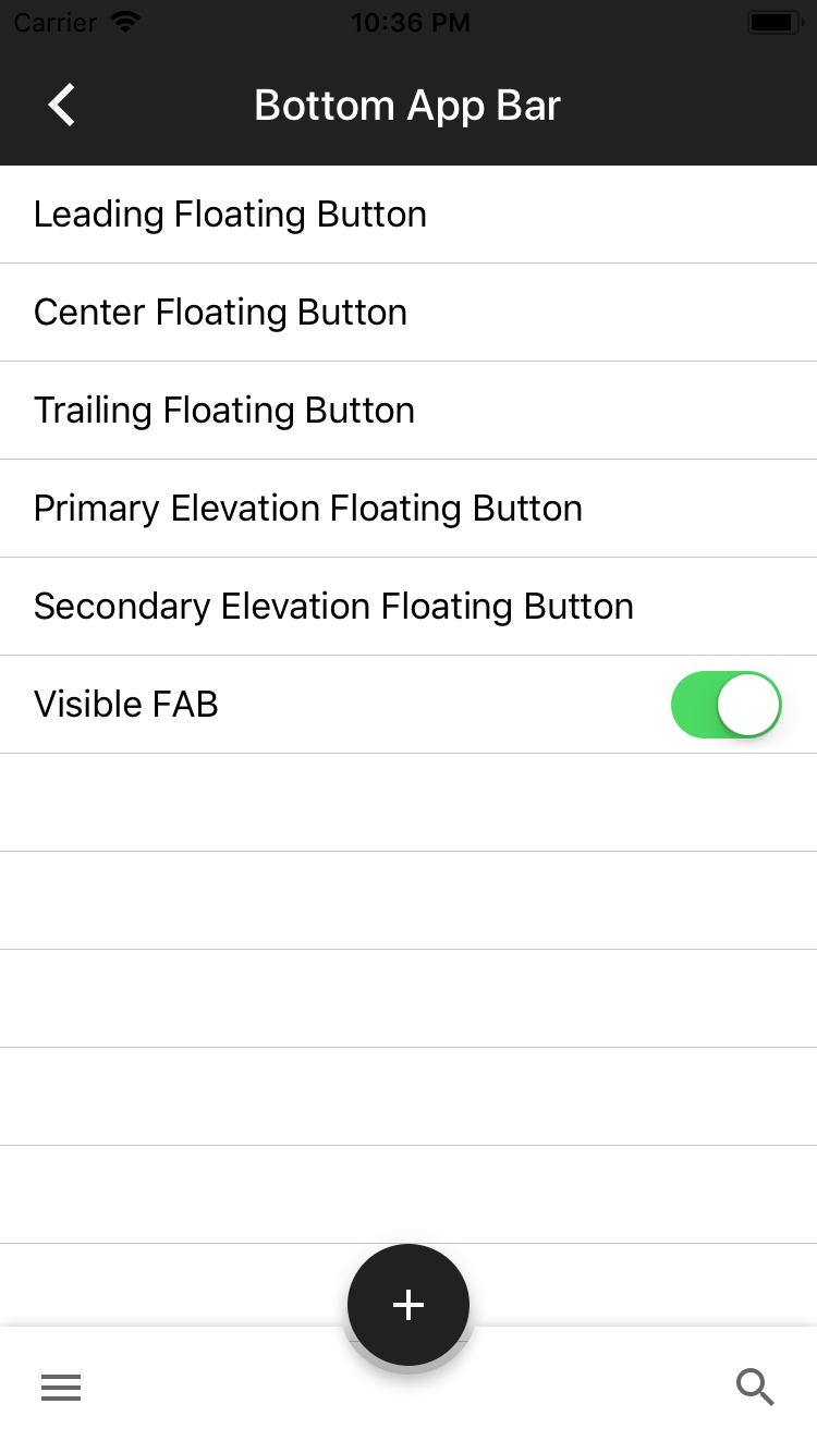| |Dragons (Objc)|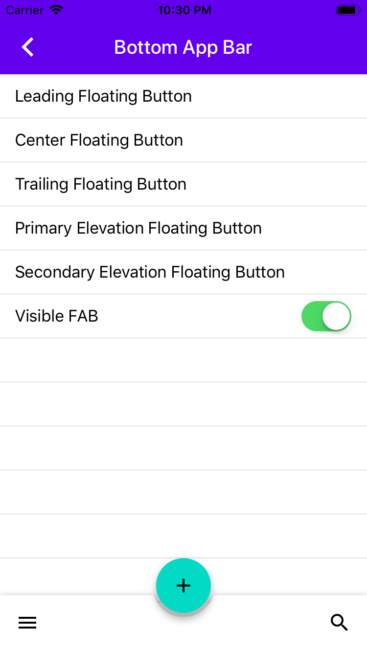|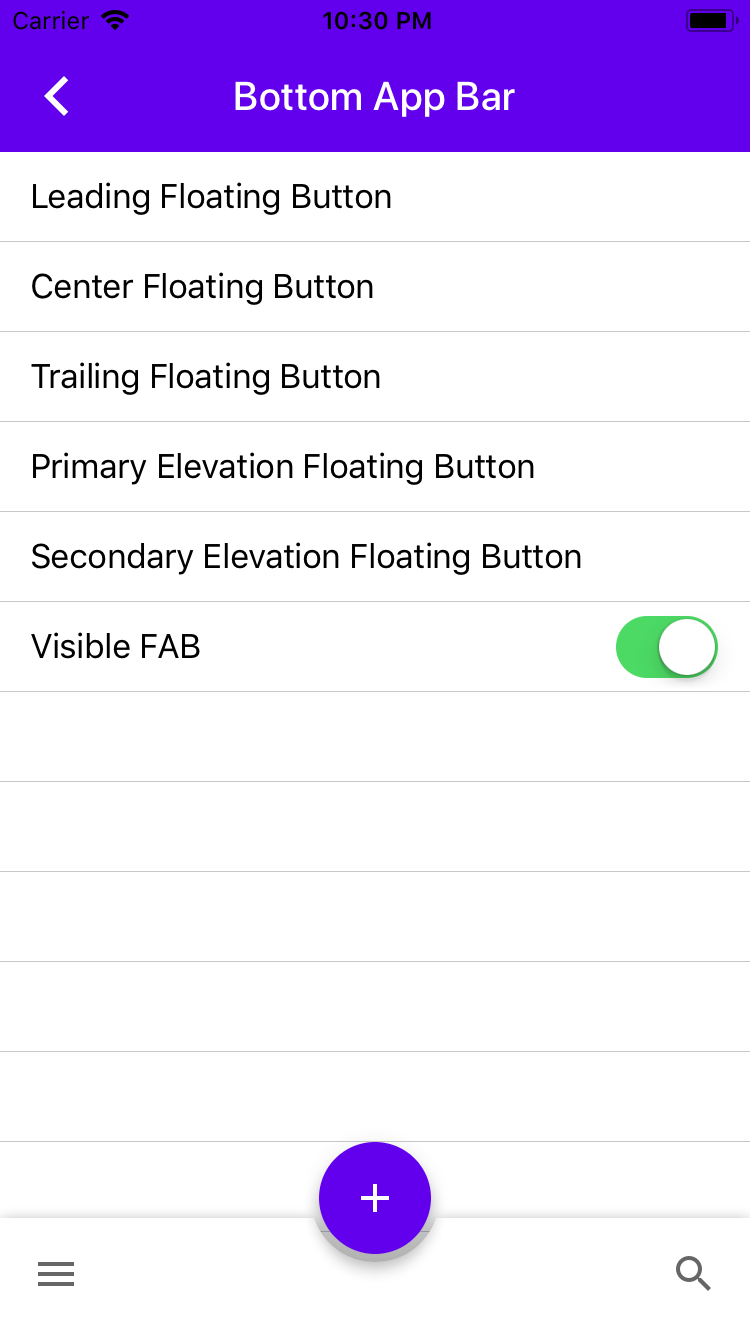| |Dragons (Swift)|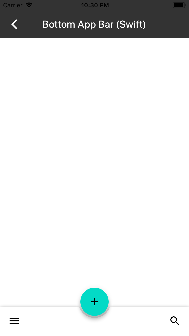|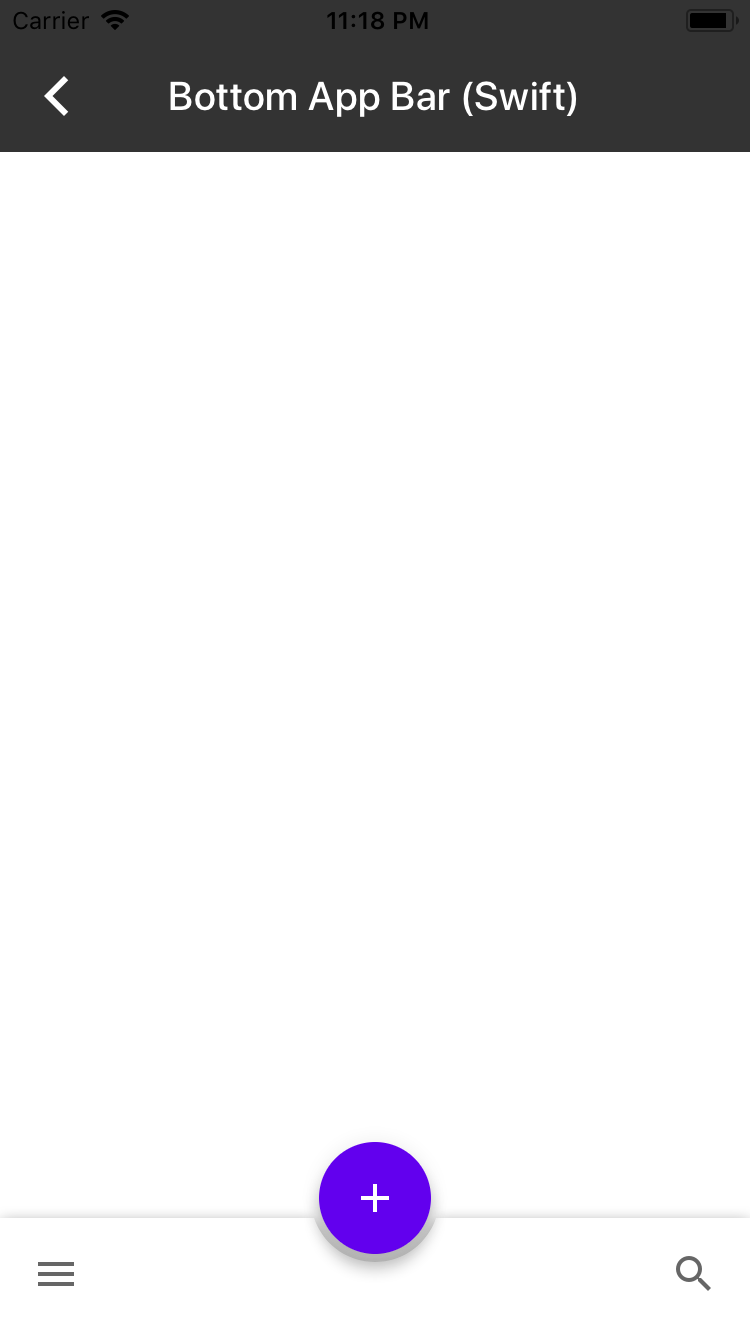| Closes #3928
App bars: bottom
A bottom app bar displays navigation and key actions at the bottom of the screen. Bottom app bars work like navigation bars, but with the additional option to show a floating action button.

Overview
Bottom app bars follow a recommended Material Design interaction design pattern for providing primary and secondary actions that are easily accessible. With a bottom app bar users are more easily able to use single-handed touch interaction with an application since actions are displayed close to the bottom of the screen within easy reach of a user's thumb.
The bottom app bar includes a floating action button that is intended to provide users with a primary action. Secondary actions are available on a navigation bar that can be customized with several buttons on the left and right sides of the navigation bar. The primary action floating action button is centered on the bottom app bar by default.
MDCBottomAppBarView should be attached to the bottom of the screen or used in conjunction with an expandable bottom drawer. The MDCBottomAppBarView API includes properties that allow changes to the elevation, position and visibility of the embedded floating action button.
UIBarButtonItems can be added to the navigation bar of the MDCBottomAppBarView. Leading and trailing navigation items will be shown and hidden based on the position of the floating action button.
Transitions between floating action button position, elevation and visibility states are animated by default, but can be disabled if desired.