This is a follow up PR for #5119 and #5120 and relies on both.
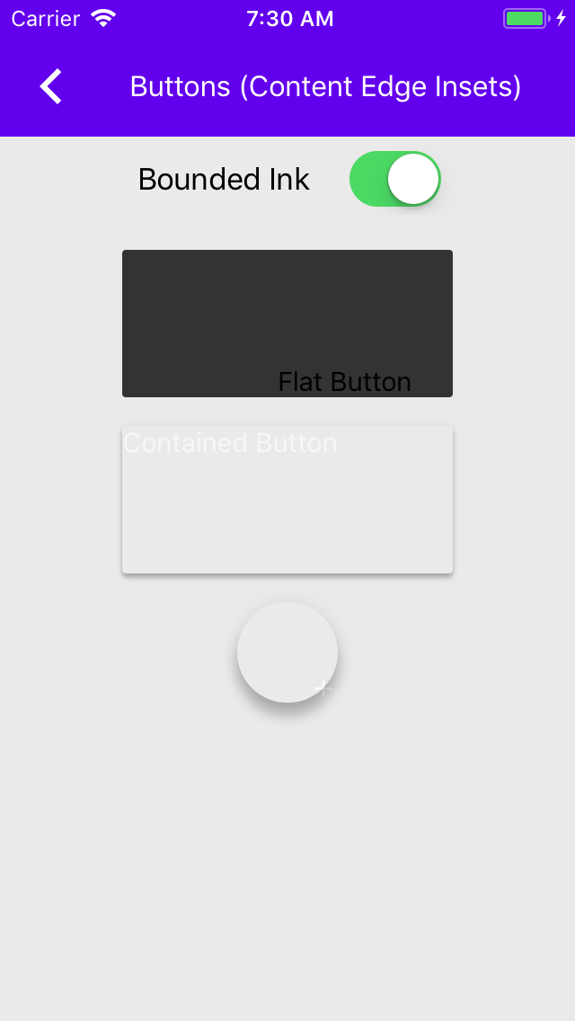
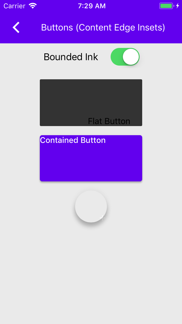
This integrates the created shape themer for buttons into the examples that currently use color/typography themers.
This closes#5050
Removes the need to copy-paste stanzas from other files anymore as we'll rely on #4478 to generate the correct stanza for us instead.

This was an automated change generated by running a find-and-replace regular expression:

```
/\*
 Copyright ([0-9]+)-present the Material Components for iOS authors\. All Rights Reserved\.

 Licensed under the Apache License, Version 2\.0 \(the "License"\);
 you may not use this file except in compliance with the License\.
 You may obtain a copy of the License at

 http://www\.apache\.org/licenses/LICENSE-2\.0

 Unless required by applicable law or agreed to in writing, software
 distributed under the License is distributed on an "AS IS" BASIS,
 WITHOUT WARRANTIES OR CONDITIONS OF ANY KIND, either express or implied\.
 See the License for the specific language governing permissions and
 limitations under the License\.
 \*/
```

```
/\*
Copyright ([0-9]+)-present the Material Components for iOS authors\. All Rights Reserved\.

Licensed under the Apache License, Version 2\.0 \(the "License"\);
you may not use this file except in compliance with the License\.
You may obtain a copy of the License at

http://www\.apache\.org/licenses/LICENSE-2\.0

Unless required by applicable law or agreed to in writing, software
distributed under the License is distributed on an "AS IS" BASIS,
WITHOUT WARRANTIES OR CONDITIONS OF ANY KIND, either express or implied\.
See the License for the specific language governing permissions and
limitations under the License\.
\*/
```

```
/\*
 Copyright ([0-9]+)-present the Material Components for iOS authors\. All Rights Reserved\.
 Licensed under the Apache License, Version 2\.0 \(the "License"\);
 you may not use this file except in compliance with the License\.
 You may obtain a copy of the License at
 http://www\.apache\.org/licenses/LICENSE-2\.0
 Unless required by applicable law or agreed to in writing, software
 distributed under the License is distributed on an "AS IS" BASIS,
 WITHOUT WARRANTIES OR CONDITIONS OF ANY KIND, either express or implied\.
 See the License for the specific language governing permissions and
 limitations under the License\.
 \*/
```

```
// Copyright $1-present the Material Components for iOS authors. All Rights Reserved.
//
// Licensed under the Apache License, Version 2.0 (the "License");
// you may not use this file except in compliance with the License.
// You may obtain a copy of the License at
//
// http://www.apache.org/licenses/LICENSE-2.0
//
// Unless required by applicable law or agreed to in writing, software
// distributed under the License is distributed on an "AS IS" BASIS,
// WITHOUT WARRANTIES OR CONDITIONS OF ANY KIND, either express or implied.
// See the License for the specific language governing permissions and
// limitations under the License.
```
We can now make use of @available throughout our codebase.

We support Xcode 9 and up, which includes the iOS 11 SDK. This means we can remove any guards for SDKs prior to iOS 11.

This was cleaned up by running a global find-and-replace with the following regular expression:

```
Find:#if defined\(__IPHONE_11_0\) && \(__IPHONE_OS_VERSION_MAX_ALLOWED >= __IPHONE_11_0\)\n(.+if \(@available\(iOS 11.0, \*\)\) \{(?:.|\n)*?)(?:#else(?:.|\n)*?)?\n#endif
Replace:$1
```

With some additional cleanup for stragglers that didn't match this pattern. Note that else clauses were intentionally dropped.

Closes https://github.com/material-components/material-components-ios/issues/4909
Many of our Swift examples are either missing imports or are importing all of
MaterialComponents. Both of these will cause failures during internal builds.
This enables the new FlexibleHeader/AppBar behavior that correctly updates the content view controller's safe area insets/top layout guide to match the flexible header's height and sets the frame of the content view controller to match the bounds of the container view controller.

As part of this change, we were able to remove the Catalog logic that would manually adjust the frame of examples that did not have a scroll view. Examples are now expected to adjust their content according to the top layout guide / safe area insets, as can be seen in the ButtonsTypicalUse example.

Examples that *do* have a scroll view will also now make use of the correct top layout guide / safe area insets behavior. This behavioral change can most notably be seen in the ActivityIndicator example, which no longer has a 20 point "dead zone" above the table view.
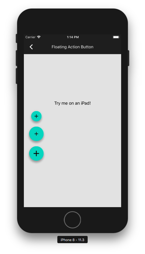
When VoiceOver is running and the FAB animations for expanding/collapsing are
triggered, sometimes VoiceOver won't detect the FAB. It can still detect the
FAB if the user "scrubs" their finger to discover it, but it's a big problem
if they don't know they're missing a button.  The effect seems intermittent
and this is the best work-around.
The Buttons main demo had its views "out of order" when using VoiceOver
because the buttons' frames were closer to the top of the screen
relative to their labels. Instead of relying on the view hierarchy to
find all of the elements, they can be manually returned in-order.
Closes#3654
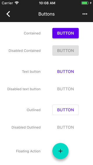
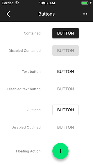
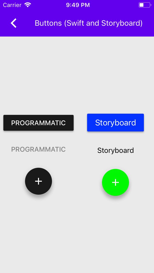
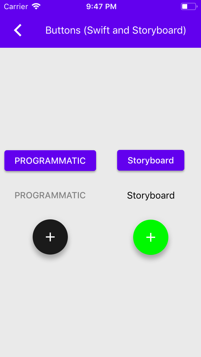
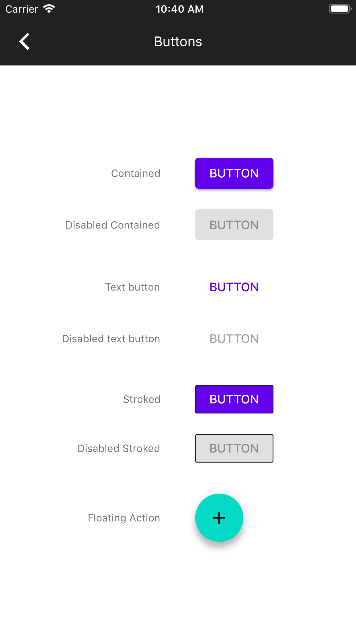
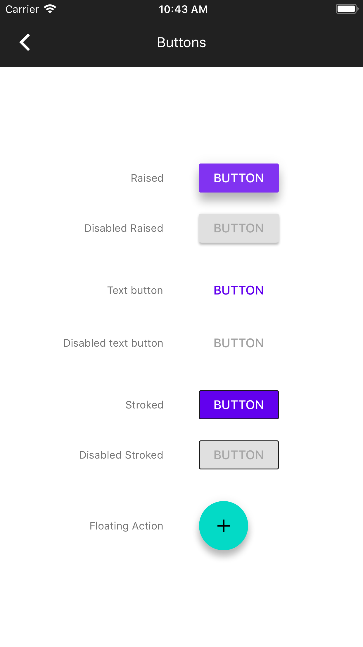
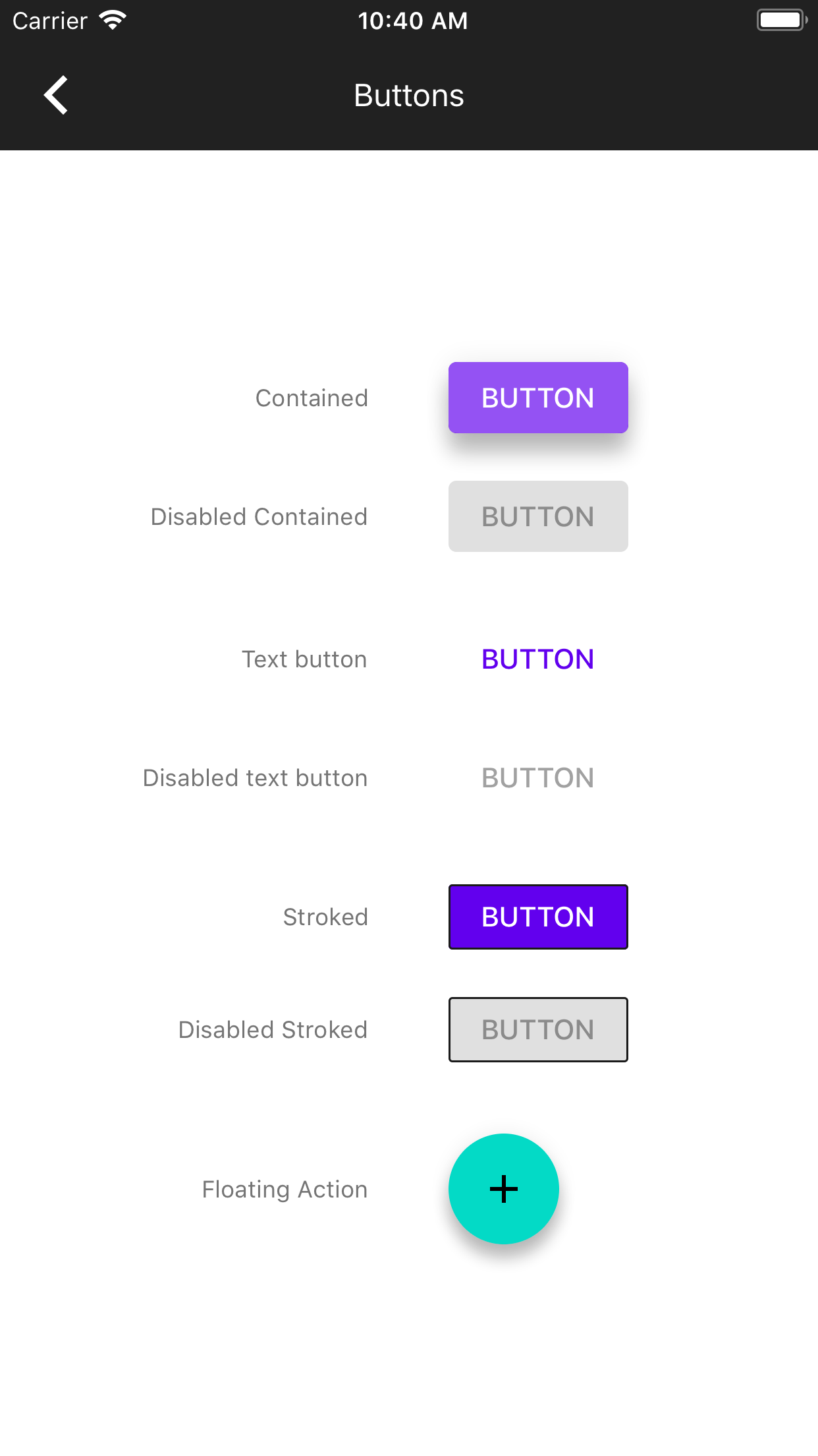
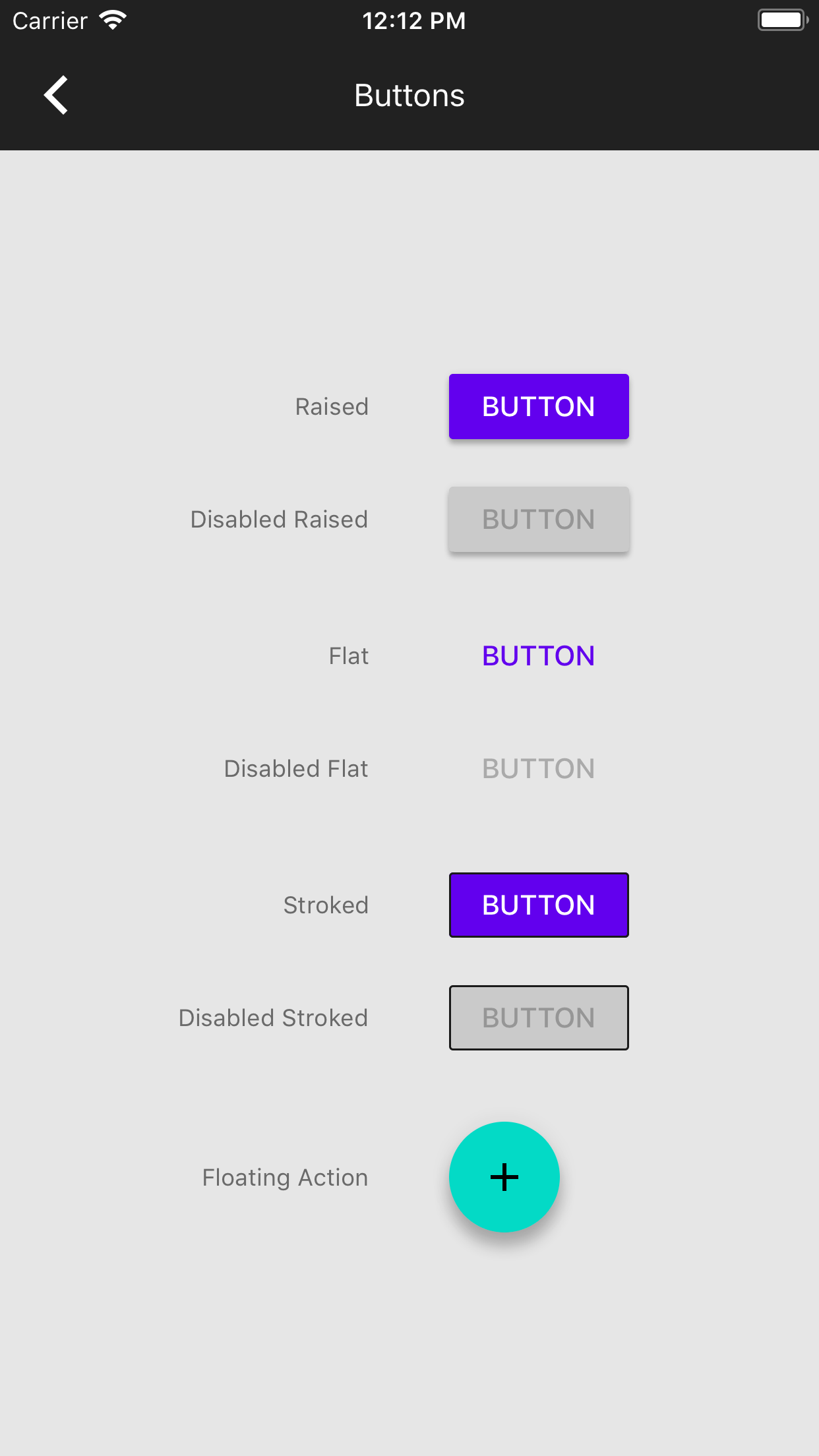
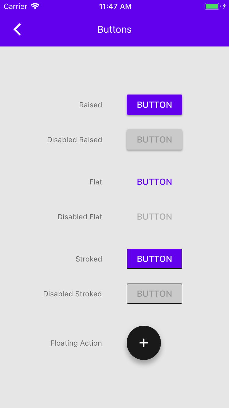
Made colorScheme and typographyScheme properties in the class interfaces for all our examples.
Moved theming away from example inits and into viewDidLoad
Small update for slider example to allow it to grab the theming properly.
Related Pivotal: https://www.pivotaltracker.com/story/show/156616695
Pivotal Story: https://www.pivotaltracker.com/story/show/156616695

This includes an implementation example in the ButtonTypicalUse example. In a separate PR will this be added to the rest of our examples.
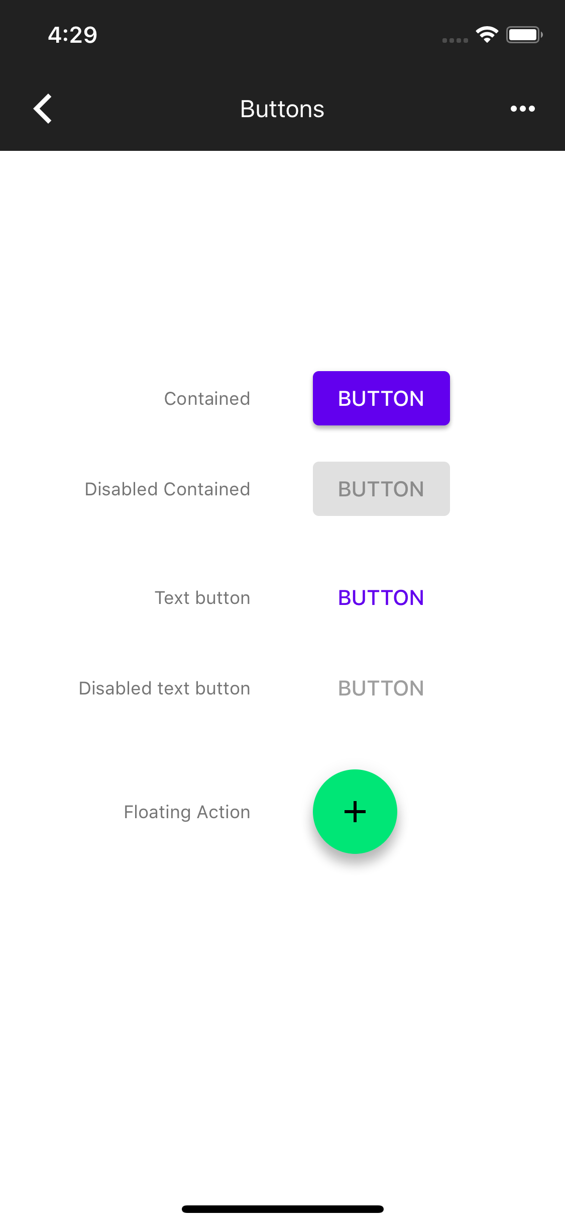
* MDCFloatingButton Color Themer added.
No support for icon color change inside color themer, this is left for user to handle for now.
Example added.
Pivotal: https://www.pivotaltracker.com/story/show/156725760

* Remove redundancy in tests and FabButtonColorThemer.

* Adding another example for color theming of a button.

* Setting secondary color for the test instead of primary since that's the value that's being used.

PR: https://github.com/material-components/material-components-ios/pull/3381
Pivotal Story: https://www.pivotaltracker.com/story/show/156168281
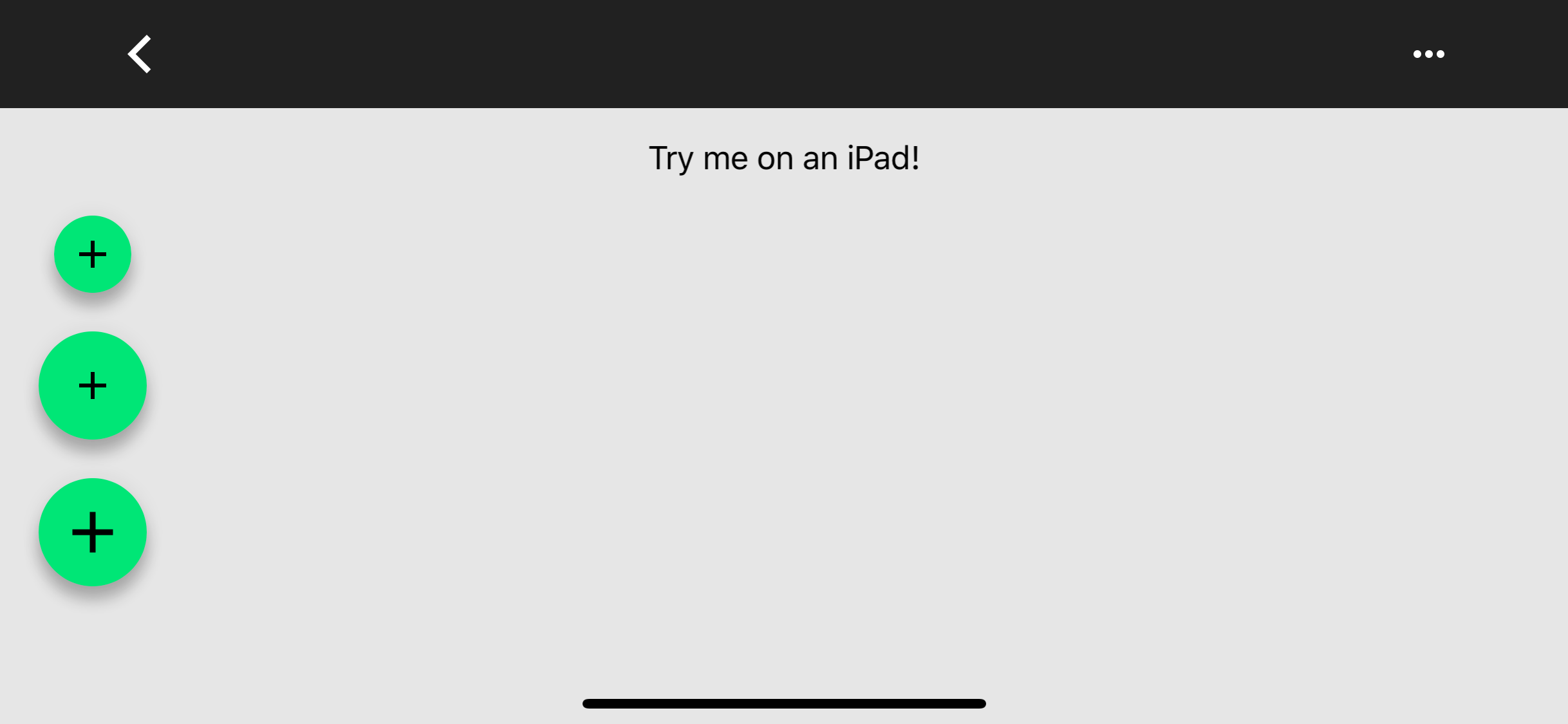
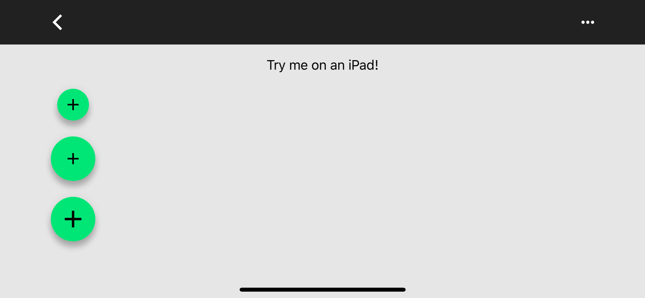
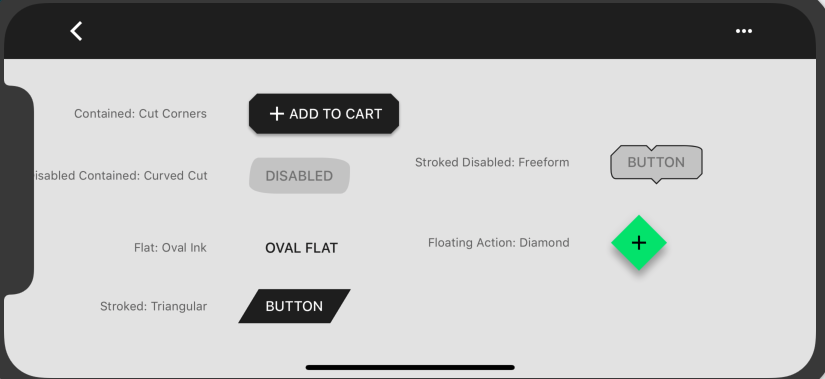
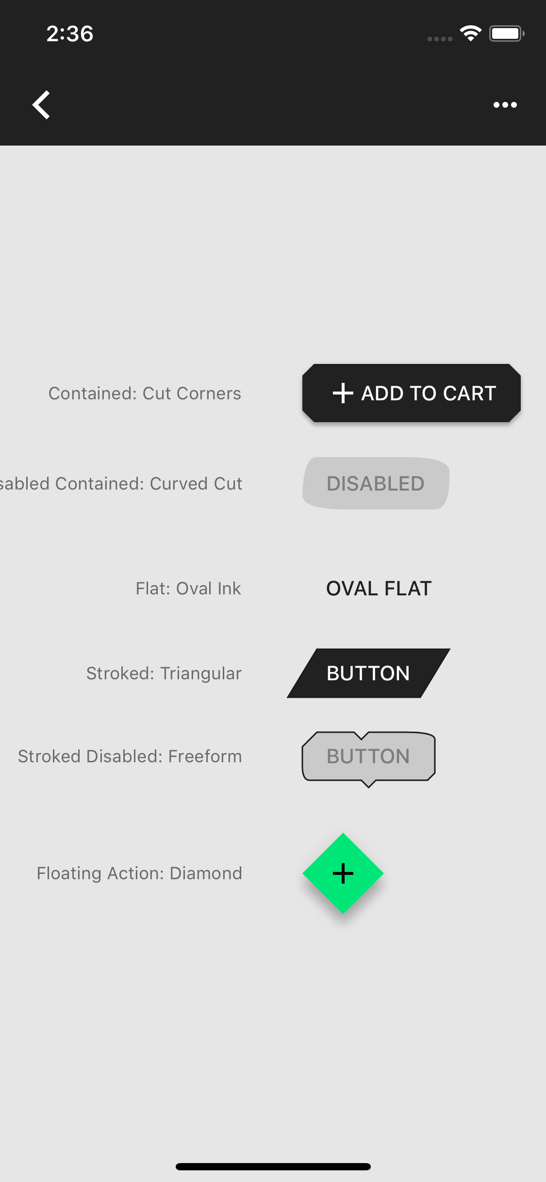
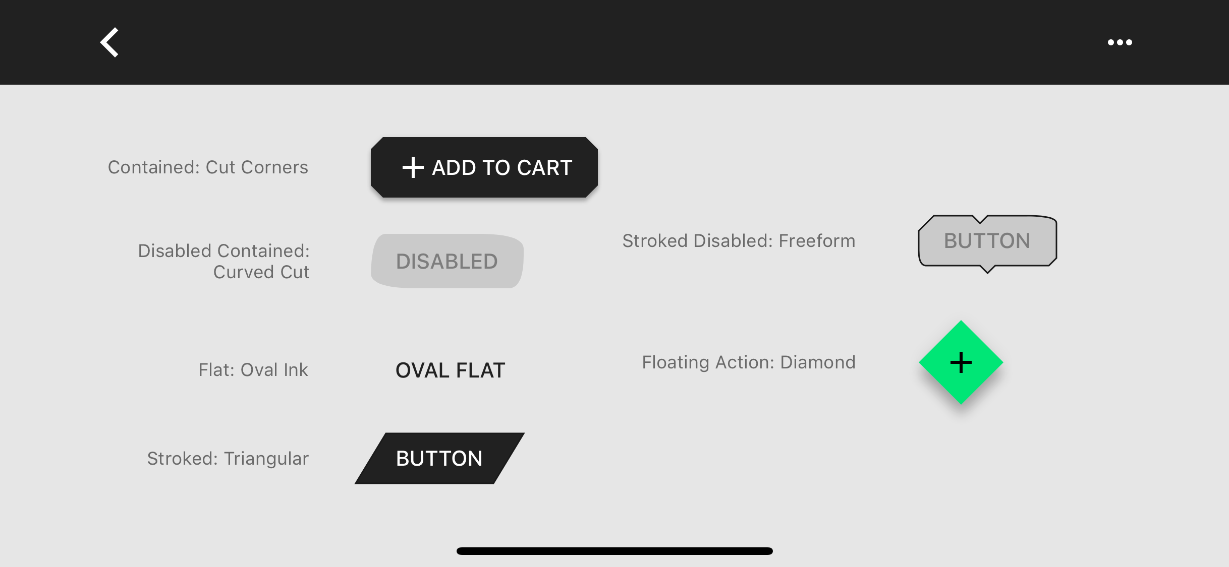
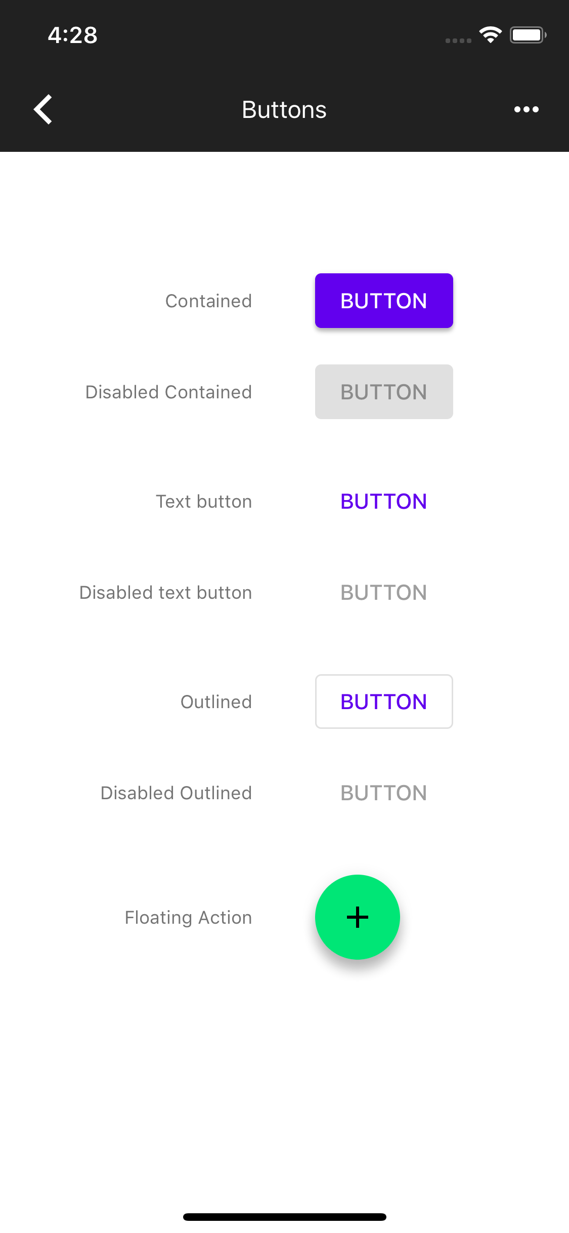
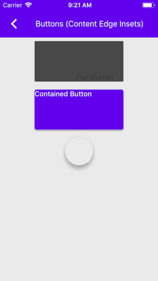
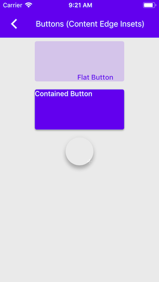
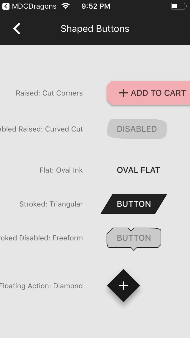
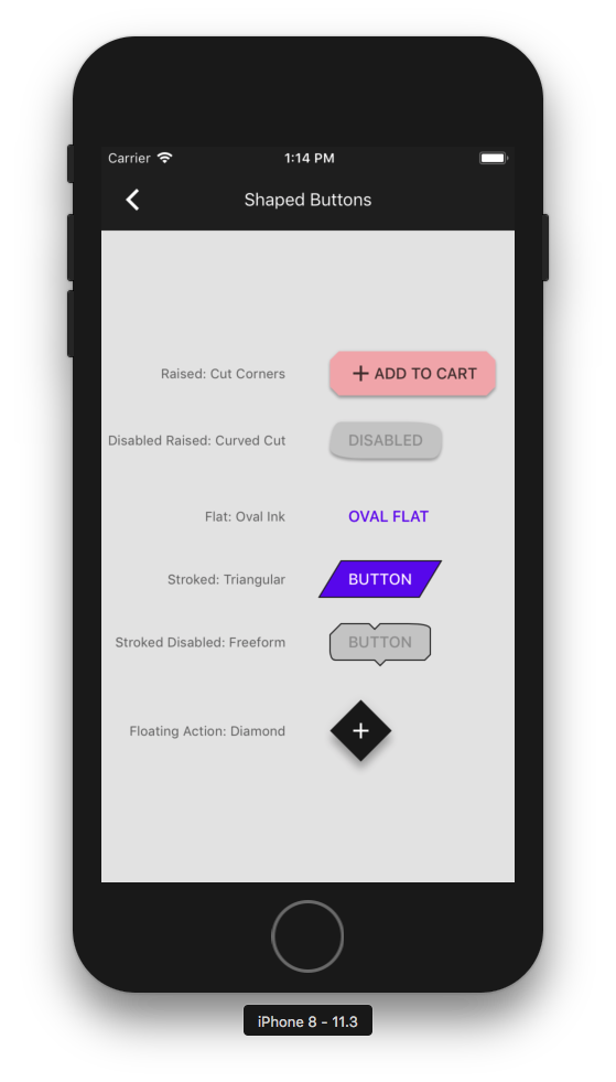
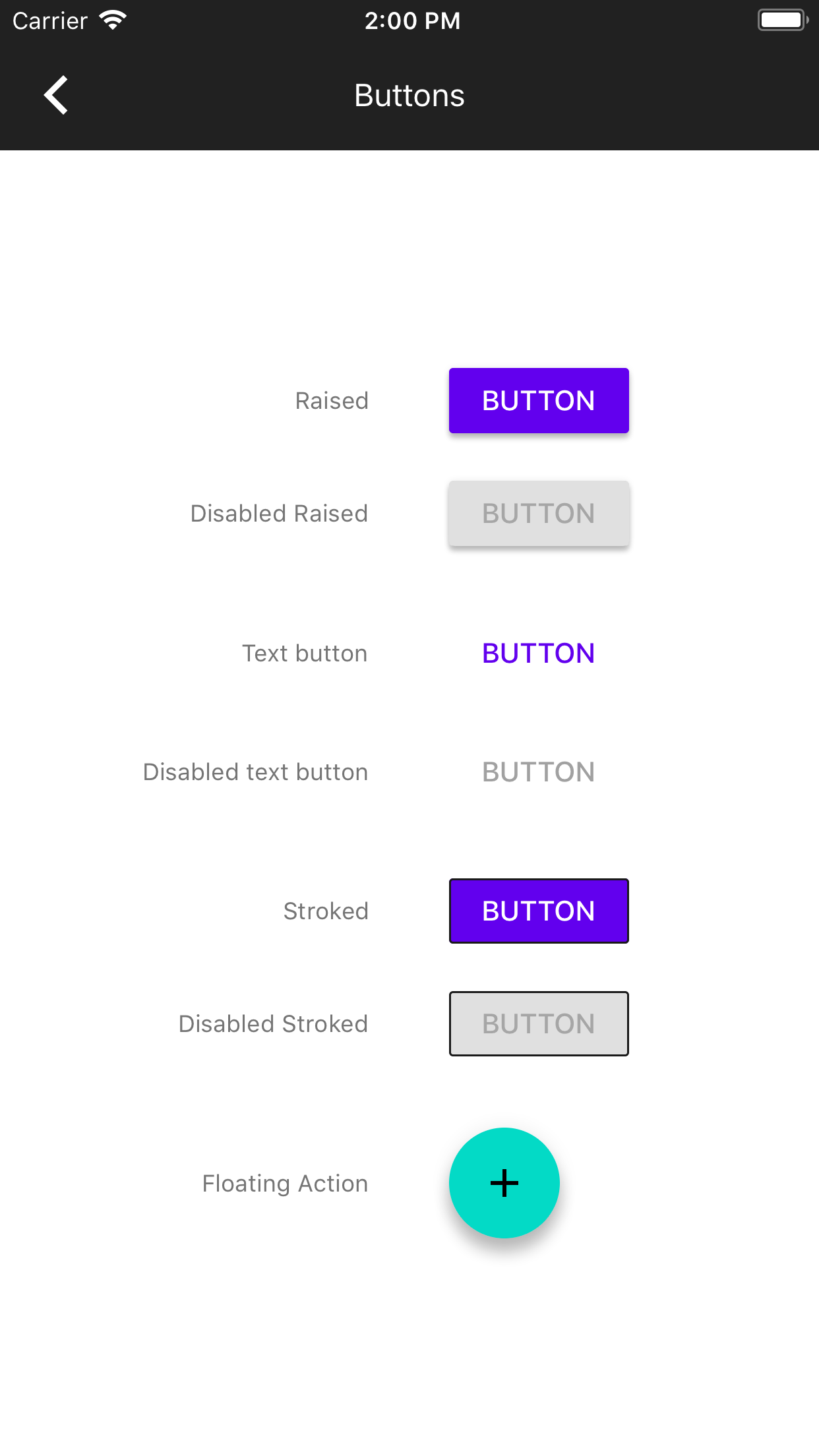
* Implementation of Shapes support in Buttons.
* Added example of using shapes on different styles of buttons (see screenshot and gif below).
* Exposed an initializer for MDCCurvedCornerTreatment to be able to use in the example.
* Exposed the color sublayer in MDCShapedShadowLayer to allow hierarchal reordering of sublayers for a shaped button to work with ink and shadow correctly.
* Updated unit tests.
Addition of a unit test, and updated example to use the new themer.

Pivotal: https://www.pivotaltracker.com/story/show/156169780

Flat button and raised button theming are separate stories and will be added in separate PRs.
* [Button] Add custom font properties

* Add example and tests

* Add sample supporting custom font and dynamic type

* Clean up tests

* Fix C&P error in Copyright date.

* Remove outdated warning

* Fix misuse of standardFont and simplify scale invocation.