The API allows setting horizontal insets for the accessory view that are different from the message. This is most often used for dialogs that have both a message and an accessory view, as demonstrated in the attached example.

Additionally, this example demonstrates how to add an horizontal hairline as shown on the material.io spec for Confirmation Dialogs.

Note:
This new API is needed because clients do not always have control over the view that is being used as an accessory view, or that the view is used in multiple areas in the app, and cannot be customized.
Additionally, there's no way currently to set 0 insets for the accessory view, while still keeping the 24 value insets for the message, which is a relatively common scenario.
PiperOrigin-RevId: 334142026
When actions are vertically aligned, the first trailing or leading action is positioned incorrectly, hiding the second trailing/leading action. This is fixed in a followup change list.

PiperOrigin-RevId: 318875437
The type of the message in Material Dialogs was switched from UILabel to UITextView, That is done in order to support links in attributed text. We're seeing some differences in the text rendering in dialog snapshots. In some cases, the width of the dialog may also change, which can result in some other elements moving to maintain required spacing from the edges. Based on our testing, we're not expecting any other changes, so please let us know if you find anything unusual.

This change set includes:
* `messageLabel` was renamed to `messageTextView`.
* The UITextView has its editable flag set to false, and all internal padding set to
  zero, to ensure spacing remain the same as it was with UILabel.
* `scrollEnabled` was set to false to ensure text does't scroll when not needed (it
  still enables scrolling when needed: when there's more text than the visible area.)
* `backgroundColor` was set to `clear`. It seems UITextView's default is white, which
   breaks inverted/dark mode support.

Noticeable differences:
* `sizeThatFits` occasionally returns different width for some texts:
   -- Some texts result in a wider layout (ie: dialogs-presented-with-emphasis-buttons.png)
   -- Empty text views may have a non-zero height. Determining zero
      size based on `hasText` before calling `sizeThatFits` resolved the issue.
* Text rendering is slightly different in almost all snapshots.
* Links in attributed texts are rendered differently then before (ie: color).
* In a couple of RTL snapshot tests, I needed to set the RTL test direction before
  setting the message alignment for the test to work properly.

PiperOrigin-RevId: 313607718
Include insets in horizontal calculations when determining if all buttons fit horizontally. This will allow actions whose title is nearly half of the dialog to be aligned horizontally.

PiperOrigin-RevId: 310331603
Fixing the error:
`error: implicit conversion from enumeration type 'enum MDCContentHorizontalAlignment' to different enumeration type 'NSTextAlignment' (aka 'enum NSTextAlignment') [-Werror,-Wenum-conversion]`

PiperOrigin-RevId: 310164335
Three MDCAlertController properties were not initialized during object initialization.
Their initialization during viewDidLoad caused values previously assigned to them to be reverted to default during presentation or theming.
Adding unit tests that reproduce the issue.

PiperOrigin-RevId: 308075191
This CL demonstrates three different ways to present a message with a "Learn More" button under it in an alert. It also demonstrates accessory views with manual and auto layouts.

The 2 auto-layout tests create a view with a label and a button as subviews, and lay them out using constraints. One of them is testing a subclass, while the other adds the button/text directly to the accessory view.

The manual layout test uses the alert's default message property, and uses a button for the accessory view. It then uses the new 'accessoryViewVerticalInset' to customize the space between the message and the button.

Note: Using `sizeToFitContentInBounds:` for snapshot tests is now correctly resizing snapshot tests that were previously too wide (including the snapshot in b/147241131).
PiperOrigin-RevId: 307884732
A followup for cl/305814799 - replacing calls to all private APIs in MDCAlertControllerAccessoryTests.m with the new testing utilities in MDCAlertController+Testing.h

PiperOrigin-RevId: 305878401
A followup for cl/305814799 - replacing calls to all private APIs in MDCAlertControllerActionsTests.m with the new testing utilities in MDCAlertController+Testing.h

Removing the private header since it's no longer needed for testing.

PiperOrigin-RevId: 305865529
A followup for cl/305814799 - replacing calls to all private APIs in MDCAlertControllerInsetsTests.m with the new testing utilities in MDCAlertController+Testing.h

PiperOrigin-RevId: 305864413
A followup for cl/305814799 - replacing calls to all private APIs in MDCAlertControllerInsetsTests.m with the new testing utilities in MDCAlertController+Testing.h

PiperOrigin-RevId: 305863373
A followup for cl/305814799 - replacing calls to all private APIs in MDCAlertControllerConfigurationsTests.m with the new testing utilities in MDCAlertController+Testing.h

Note: Snapshot diffs affecting the width of snapshot are expected for tests that used non-standard sizing logic and were migrated to use the new sizing API.
PiperOrigin-RevId: 305861786
Adding tests for various views that may be used as a Dialogs accessory view.
The textfield test is not showing a textfield because of issue b/153181102.

PiperOrigin-RevId: 305808160
To allow a meaningful contentMode setting for the titleIcon image view, the title icon image is sized to fit the alert's width. The height is then adjusted proportionally.

To maintain backward compatibility (and minimize client UI changes), the icon frame size is not adjusted for non-justified alignments.

This is a potential breaking change for clients that use Justified title, however it is unlikely that many clients (if any) would do that, since it's in most cases a bad UI/UX.

PiperOrigin-RevId: 304213073
Adding support for customizing the alignment of the title icon, independently of the alignment of the title.
To preserve backward compatibility, the default title-icon alignment is the same as the title. We're using the internal _alignIconWithTitle flag to track if the alignment had been implicitly assigned. Once the value is implicitly assigned, the title icon alignment is independent from the title.
## Issues
Closes#9545, #9824.
PiperOrigin-RevId: 303748434
## (Visually) Breaking Changes
The padding between the title or title icon, and the actions, when there is no message is now determined by titleInsets.bottom instead of contentInsets.top (no sense in using contentInsets when there is no content). The actual inset value has is different, and is now 20 (changed from 24), which caused some client scuba diffs.
## Background
Insets calculations of the title and content panes in dialogs were using the same insets values, causing various misalignments. This is fixed by ensuring that title calculations are using the titleInsets and that content calculations (of the message or accessory view) are using the content insets.
## Additional (non-breaking) misalignment fixes
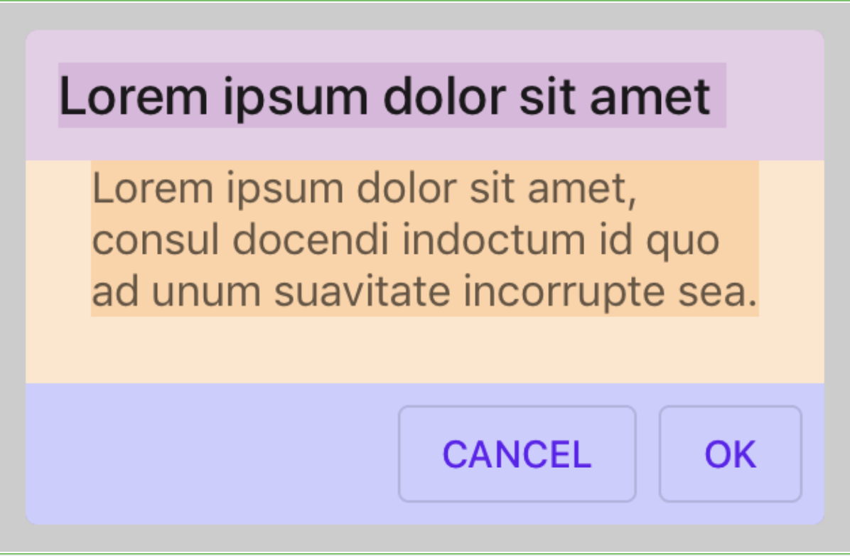
#### The title Label stretches too long (pink title has no right inset):
```
titletInsets = UIEdgeInsetsMake(24.f, 24.f, 24.f, 24.f);
contentInsets = UIEdgeInsetsMake(10.f, 10.f, 10.f, 10.f);
```
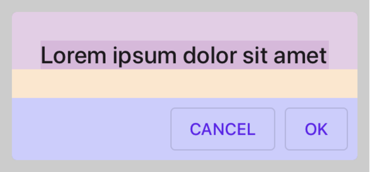
#### The title label is too short (pink title right inset is too large):
```
titleInsets = UIEdgeInsetsMake(12.f, 12.f, 12.f, 12.f);
```
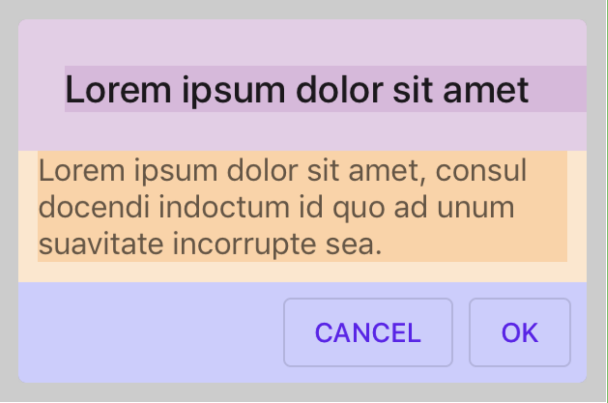
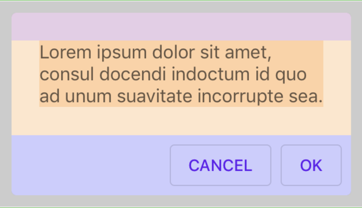
#### A dialog with no message has a message pane (yellow):
#### A dialog with no title has a title pane (pink):
## Issues
Fixes#9545, #9824.
b/133006455, b/148572399
PiperOrigin-RevId: 303368923
Insets calculations of the title and content panes in dialogs were using the same insets values, causing various misalignments.  This is fixed by ensuring that title calculations are using the titleInsets and that content calculations (of the message or accessory view) are using the content insets.

PiperOrigin-RevId: 303166366
This CL adds a baseline snapshot for how the current dialog works.

The original layout of the Dialogs components used private insets that had all the same value, so many of the insets were used interchangeably. After creating separate insets for different sections, these issues because visible.
The goal of this CL is to demonstrate the issue of accessory view alignment (which is affected by content, title and actions insets). This issue is fixed in a followup cl.

PiperOrigin-RevId: 302970679
We recommend using `initWithDefaults` and we should follow the recommendation. This change removes all usage of `init` within MDC components in order to let us remove that initializer from the public surface.

PiperOrigin-RevId: 302958447
Testing different combinations of configurations that affect the appearance of the title icon:
- title alignment.
- Long, wide & square images.
- Insets.
- LTR/RTL

## Issues
#9824 and #9545.

PiperOrigin-RevId: 302419683
To setup appearance of `titleIcon`, clients need to setup properties like `contentMode` or `clipsToBound`. Instead of adding individual APIs for these customizations, and since these customizations are not the common case, we're exposing the image view that is backing the `title icon` in the customize header.

* Issues
b/133006455, b/148572399

PiperOrigin-RevId: 302031346
The current snapshot is inaccurate because there is not enough room to layout all the dialog's elements, so spaces between the elements are inaccurate for many snapshots.

# Solution
Applying `sizeAlertToFitContent` before taking a snapshot of all dialogs. This method uses `calculatePreferredContentSizeForBounds:` to let the dialog layout itself correctly, within the given width, and to determine the height it needs to display itself.    The new snapshots have a more realistic layout that is closer to how dialogs should be presented.

PiperOrigin-RevId: 301862389
Sizing dialogs snapshots to correct size in order to better simulate sizing of dialogs on a device.
The previous implementation used `preferredContentSize` which was not updated with the actual size of the snapshot after the dialog has been configured, causing most snapshot to be sized too wide.

This fix is implemented using the `calculatePreferredContentSizeForBounds:` API, which recalculates the dialog height based on the actual snapshot width, resulting in accurate width & height.

PiperOrigin-RevId: 301607700
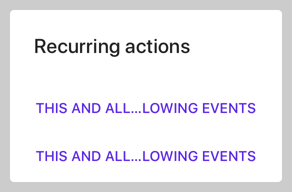
#9411 Description
Making sure layout subviews calculates content size based on the available size, not based on the size of the previous layout calculations. This fixes an issue in which the dialog unexpectedly changed vertical vs horizontal actions layout after the first layout pass (see issue #8434 - b/137070719).
## Before
Actions are laid out vertically - when loaded for the first time, and horizontally thereafter (for instance: after orientation changed, app is sent to the background, etc):
## After
Actions are laid out horizontally on all layout passes - including the first:
## Issues
Closes#8434 (b/137070719).
PiperOrigin-RevId: 299735842
I just tried checking out develop and I got this, which I've seen many times before:
```
Encountered 1 file(s) that should have been pointers, but weren't:
snapshot_test_goldens/goldens_64/MDCAlertControllerActionsTests/testActionsAreOrderedByEmphasis_11_2@2x.png
```
I tried regenerating the snapshot and looking at the comparison on GitHub. I couldn't preview the snapshot. I can't remember if you're supposed to be able to preview the snapshot after _replacing_ a binary file with a Git LFS file...

I looked at [the PR](https://github.com/material-components/material-components-ios/pull/9829/files?short_path=7652328#diff-7652328521a2f11db26e3ab6838365e6) the problematic snapshot was added in and saw that I was able to preview it there. I wasn't expecting this, because up to this point I thought that if you could preview the snapshot in the PR that meant everything was good. I guess not? It said it was a binary file, and not a git LFS file. I also noticed the PR was exported from an internal CL. So I guess if you export a CL to a PR and it has a binary snapshot you can preview it, but that doesn't mean it should be merged.

I tried issuing the following command to fix it:
```
git lfs migrate import --no-rewrite snapshot_test_goldens/goldens_64/MDCAlertControllerActionsTests/testActionsAreOrderedByEmphasis_11_2@2x.png
```
That resulted in 224a322. The commit message said it converted the binary file to a Git LFS file, which is good. However, I still couldn't preview it, and I'm used to using that as a test to make sure I've done it correctly, for better or worse. I decided to just rename the test and generate a new snapshot. That's in 10b7b37. Now GitHub says it's a Git LFS file, and I can preview it, so I think this should solve the issue.