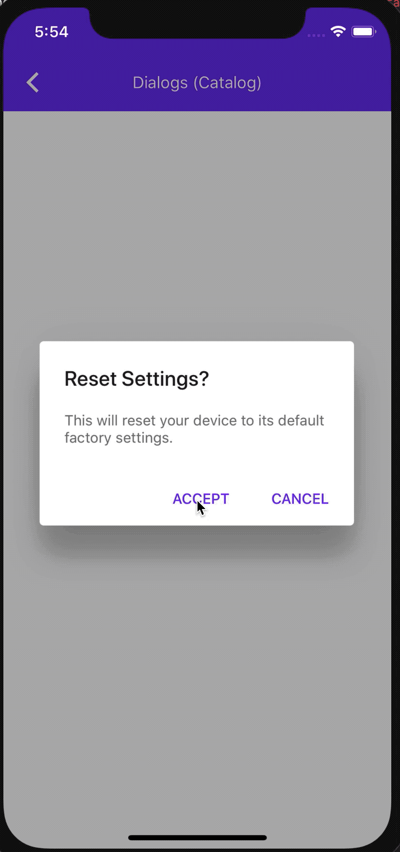
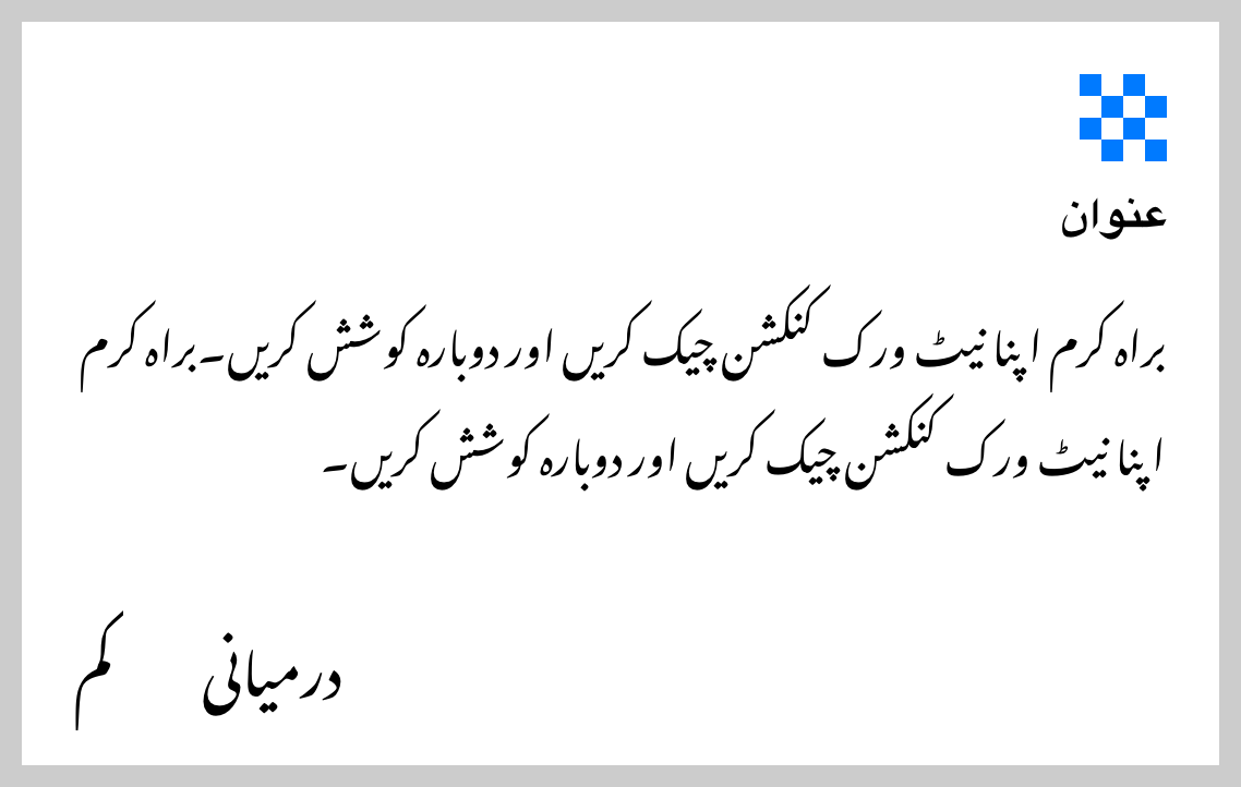
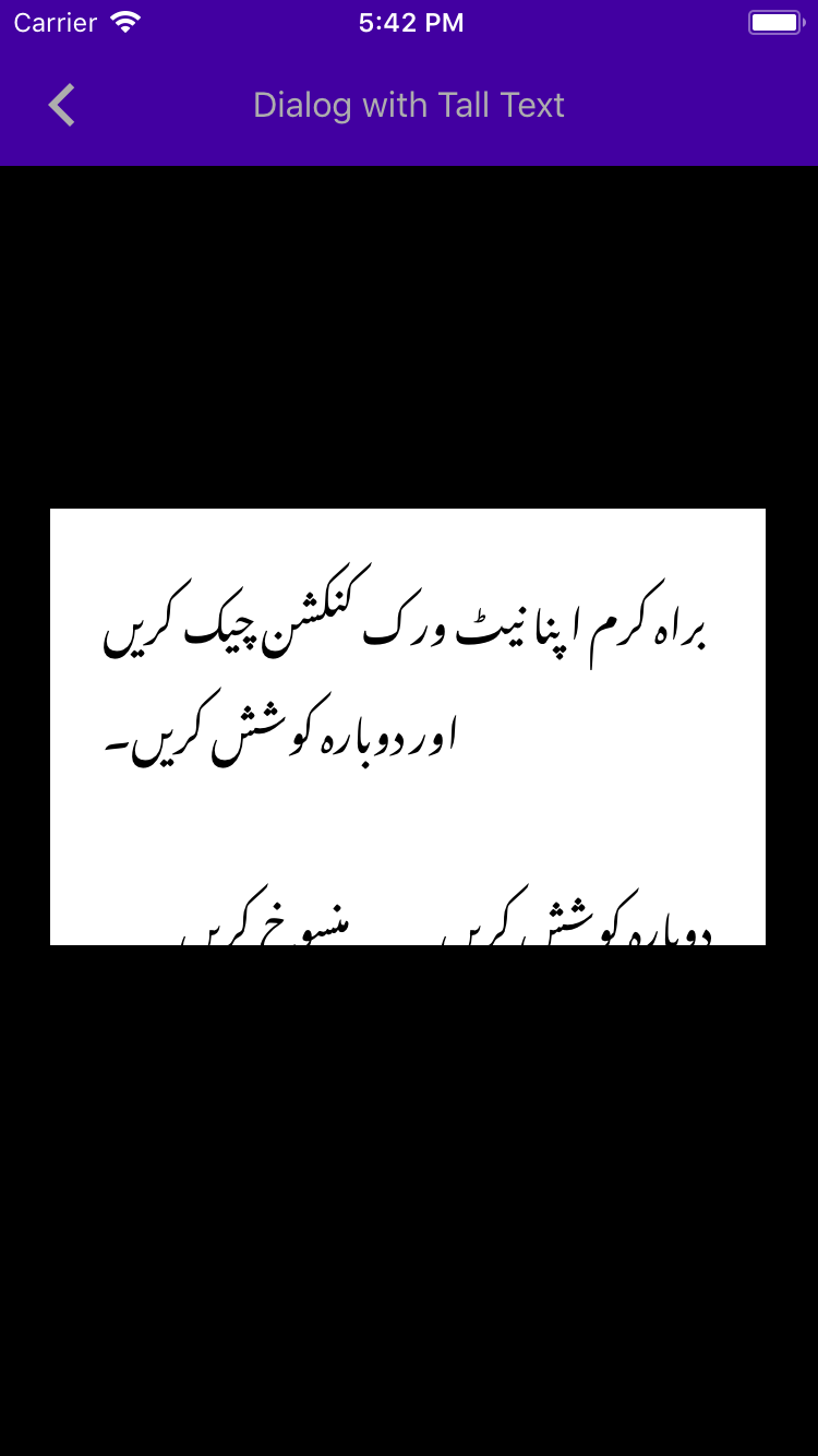
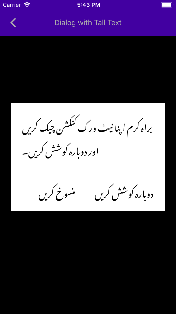
The API allows setting horizontal insets for the accessory view that are different from the message. This is most often used for dialogs that have both a message and an accessory view, as demonstrated in the attached example.
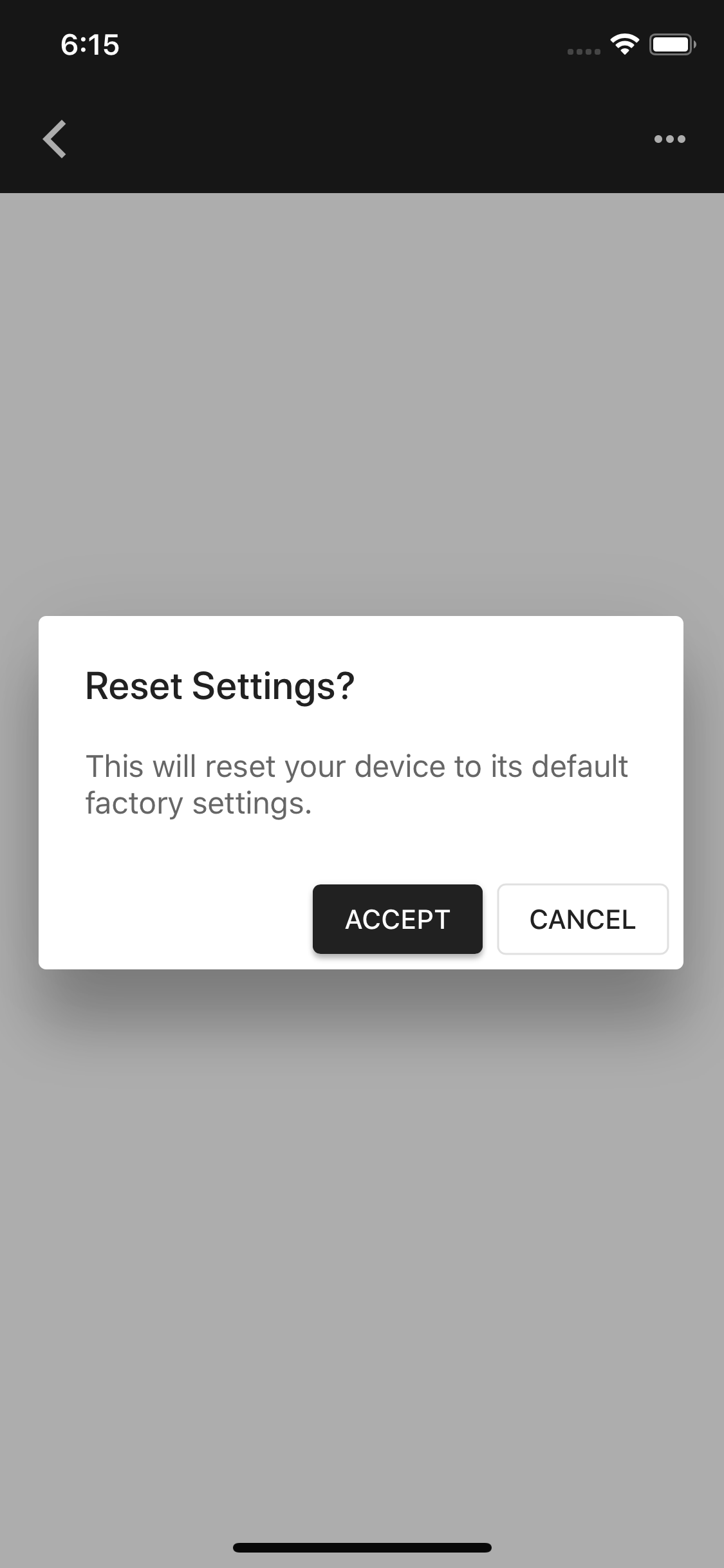
Additionally, this example demonstrates how to add an horizontal hairline as shown on the material.io spec for Confirmation Dialogs.
Note:
This new API is needed because clients do not always have control over the view that is being used as an accessory view, or that the view is used in multiple areas in the app, and cannot be customized.
Additionally, there's no way currently to set 0 insets for the accessory view, while still keeping the 24 value insets for the message, which is a relatively common scenario.
PiperOrigin-RevId: 334142026
This example demonstrates adding a collection view as an accessory view of a Material alert.  It also demonstrates adding a horizontal line above the actions, as shown on material.io's spec for Confirmation Dialogs. The line will be fixed to reach the edges of the dialogs in a followup PR (cl/331128888).

PiperOrigin-RevId: 333376220
* Moving attributed message example out from accessory view
  examples into its own examples file.
* Fixing examples:
   1. Using latest theming versions in examples.
   2. Enabling dynamic type.
   3. Renaming examples.

PiperOrigin-RevId: 319013022
* Merging the two material spec examples - typical use and styled actions.
* Fixing the typical use examples:
   1. Displaying actions in correct order.
   2. Using latest theming versions.
   3. Enabling dynamic type.
   4. Moving the DialogsThemedPresentationExampleViewController to dragons.
      Almost all diffs in this file are due to swift-format.

PiperOrigin-RevId: 318941737
Develop currently doesn't build in Xcode. One of the errors pertains to the use of UITextItemInteraction without availability checks.

PiperOrigin-RevId: 315491912
Fixing incorrect sizing of accessoryView after returning from 3D Touch
Subclassing UITextView and implementing `systemLayoutSizeFittingSize:` so the alert's accessory view will be sized correctly during layout.

PiperOrigin-RevId: 310577286
Adding examples for accessory view, including:
* A textfield accessory view. This example uses an accessory view with auto-layout.
* A default label with a button as an accessory view
* An accessory view with a label and a button subclasses. Using auto-layout.

PiperOrigin-RevId: 307889891
We recommend using `initWithDefaults` and we should follow the recommendation. This change removes all usage of `init` within MDC components in order to let us remove that initializer from the public surface.

PiperOrigin-RevId: 302958447
We need to add @objc annotations to the containerScheme instances in our Swift examples, because we moved to Swift 4.2, the respondsToSelector won't find the setContainerScheme: setter otherwise.
This PR graduates ContainerScheme to ready.
This includes updating the podspecs, podfile, all the import statements related to ContainerScheme, updating .kokoro rewrite rules, and finally the readme to not have ContainerScheme regarded to as being in beta.
Ran locally kokoro with -b bazel successfully.
Resolves#6732
This is a follow up PR for #7166 adds @objc annotations to Swift catalogMetadata() methods, because the Swift 4 compiler no longer attempts to infer what methods should be visible to Objective-C. As a result of this change in the compiler, no Swift examples were showing up in Dragons after #7166. See this article: https://useyourloaf.com/blog/objc-warnings-upgrading-to-swift-4/ for additional context.
DialogPresentationController changes the corner radius dynamically during presentation while ensuring that the presented view's corner radius always matches the corner radius of the tracking view which draws the shadow behind the presented view.
## Introduction
Before we move container scheme to ready we need to have both the `colorScheme` and `typographyScheme` nonnull. By making colorScheme and typographyScheme of MDCContainerScheming nonnull, clients will reduce the amount of conditional checks required in their apps and reduce a category of potential errors (accidentally passing nil to a nonnull parameter).

## The problem
Both `colorScheme` and `typographyScheme` were nullable in the container scheme making it harder for clients to use the container scheme throughout their app on non Material UIElements, i.e. UIView.backgroundColor

## The fix
Make both of these properties nonnull.

## Additional work
- [x]  I had to update the swift examples to not be optional and I additionally removed the nil checks from the ObjC examples.
* Add DialogPresentationControllerDelegate

* Consider nullability

* Address PR feedback

* Address a little bit more PR feedback

* Address another batch of PR feedback
## Related links
* Bug: #6438
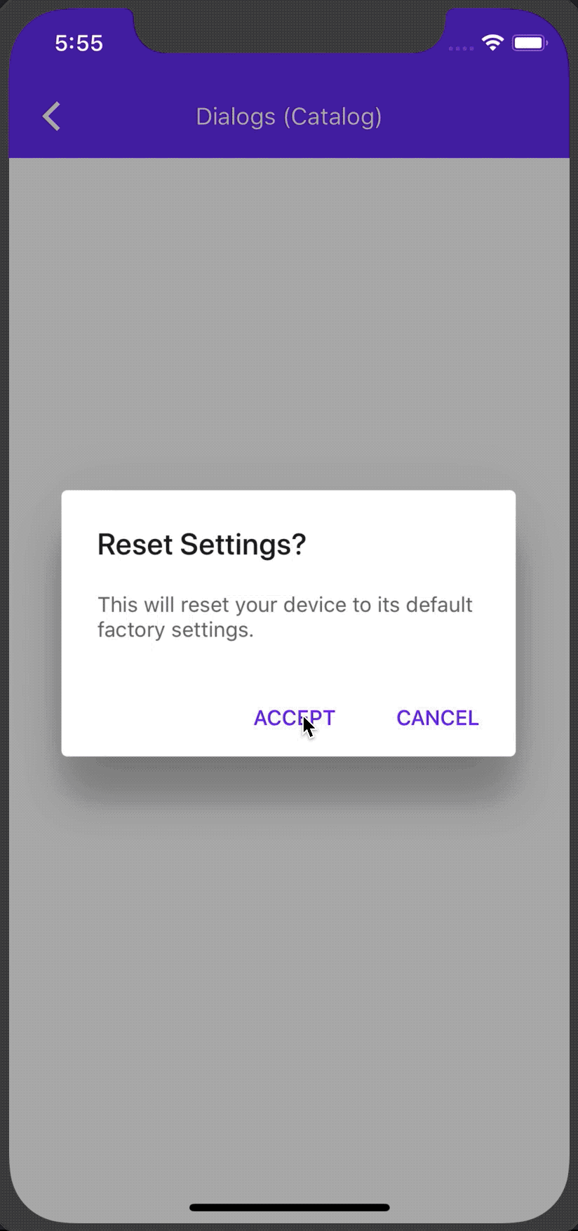
* Component: [Dialogs](https://github.com/material-components/material-components-ios/tree/develop/components/Dialogs)
## Introduction
As we move to theming extensions all components that have a theming extension should use that within it's examples. Currently MDCAlertController has a theming extension and should use it in all examples. Additionally all components within the examples that have a theming extension should use it.
## The problem
Within MDCAlertController examples some components are using the old _Themers_.
## The fix
For all components being used in MDCAlertController examples use a theming extension if available.
## Additional notes
This also cleans up some ivar usage and import statements.
Adding two new rules to our bazel definitions for examples. Objective-C
examples and Swift examples. Using these ensures we have a common set of
definitions for things like warnings, Swift version, and default
visibility.
Closes#6215
This is an automated change generated by replacing all instances of MaterialComponentsAlpha with MaterialComponentsBeta. This is not a breaking change because changes to Alpha/Beta components (including renaming them) are not considered breaking.

The MaterialComponentsAlpha podspec was mistakenly named Alpha, when what we meant was more close to Beta. The distinction is that Alpha components are not expected to be used by clients, while Beta components are.
### Context
All of our theming targets should be `MDC<#Component>+Theming` but all files should be `MDC<#Component>+MaterialTheming.m/h`. We got out of sync and caught this early.

### The problem
Our targets and file names weren't correct in some cases

### The fix
Update our targets and files to be what we have decided as a team.