Minor test update to validate that the new property doesn't cause the view to load.

Also removed some unused imports found during code review.

PiperOrigin-RevId: 484516340
The type of the message in Material Dialogs was switched from UILabel to UITextView, That is done in order to support links in attributed text. We're seeing some differences in the text rendering in dialog snapshots. In some cases, the width of the dialog may also change, which can result in some other elements moving to maintain required spacing from the edges. Based on our testing, we're not expecting any other changes, so please let us know if you find anything unusual.

This change set includes:
* `messageLabel` was renamed to `messageTextView`.
* The UITextView has its editable flag set to false, and all internal padding set to
  zero, to ensure spacing remain the same as it was with UILabel.
* `scrollEnabled` was set to false to ensure text does't scroll when not needed (it
  still enables scrolling when needed: when there's more text than the visible area.)
* `backgroundColor` was set to `clear`. It seems UITextView's default is white, which
   breaks inverted/dark mode support.

Noticeable differences:
* `sizeThatFits` occasionally returns different width for some texts:
   -- Some texts result in a wider layout (ie: dialogs-presented-with-emphasis-buttons.png)
   -- Empty text views may have a non-zero height. Determining zero
      size based on `hasText` before calling `sizeThatFits` resolved the issue.
* Text rendering is slightly different in almost all snapshots.
* Links in attributed texts are rendered differently then before (ie: color).
* In a couple of RTL snapshot tests, I needed to set the RTL test direction before
  setting the message alignment for the test to work properly.

PiperOrigin-RevId: 313607718
Three MDCAlertController properties were not initialized during object initialization.
Their initialization during viewDidLoad caused values previously assigned to them to be reverted to default during presentation or theming.
Adding unit tests that reproduce the issue.

PiperOrigin-RevId: 308075191
A followup for cl/305814799 - replacing calls to all private APIs in MDCAlertControllerInsetsTests.m with the new testing utilities in MDCAlertController+Testing.h

PiperOrigin-RevId: 305863373
To allow a meaningful contentMode setting for the titleIcon image view, the title icon image is sized to fit the alert's width. The height is then adjusted proportionally.

To maintain backward compatibility (and minimize client UI changes), the icon frame size is not adjusted for non-justified alignments.

This is a potential breaking change for clients that use Justified title, however it is unlikely that many clients (if any) would do that, since it's in most cases a bad UI/UX.

PiperOrigin-RevId: 304213073
Adding support for customizing the alignment of the title icon, independently of the alignment of the title.
To preserve backward compatibility, the default title-icon alignment is the same as the title. We're using the internal _alignIconWithTitle flag to track if the alignment had been implicitly assigned. Once the value is implicitly assigned, the title icon alignment is independent from the title.
## Issues
Closes#9545, #9824.
PiperOrigin-RevId: 303748434
## (Visually) Breaking Changes
The padding between the title or title icon, and the actions, when there is no message is now determined by titleInsets.bottom instead of contentInsets.top (no sense in using contentInsets when there is no content). The actual inset value has is different, and is now 20 (changed from 24), which caused some client scuba diffs.
## Background
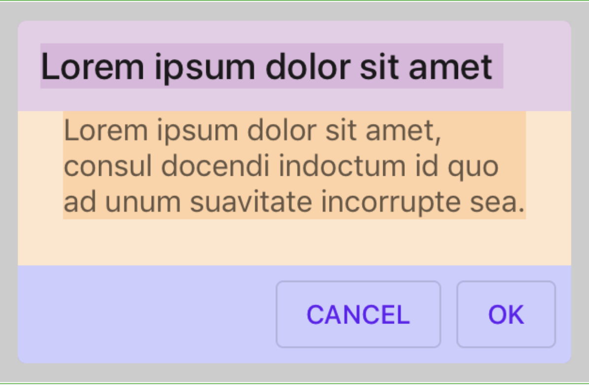
Insets calculations of the title and content panes in dialogs were using the same insets values, causing various misalignments. This is fixed by ensuring that title calculations are using the titleInsets and that content calculations (of the message or accessory view) are using the content insets.
## Additional (non-breaking) misalignment fixes
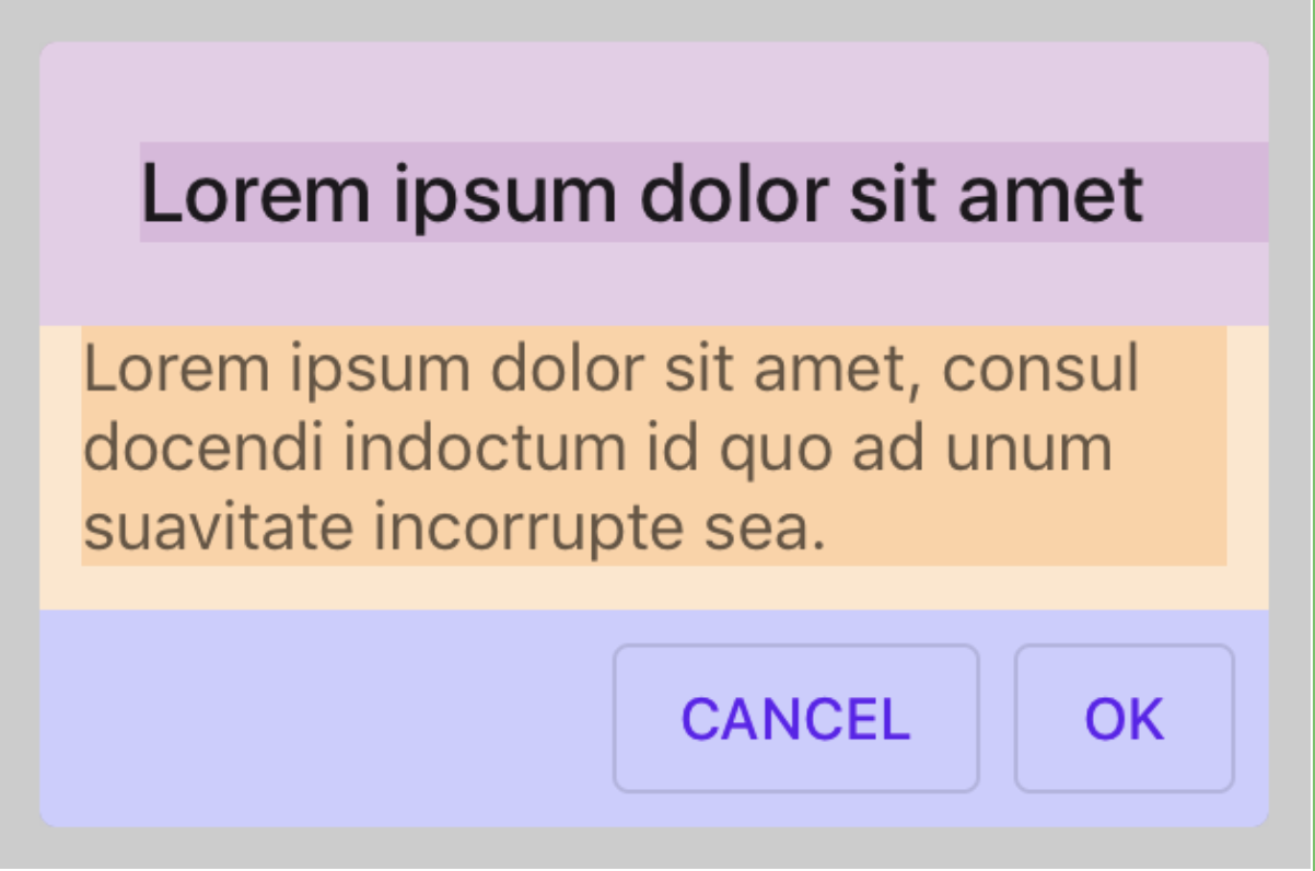
#### The title Label stretches too long (pink title has no right inset):
```
titletInsets = UIEdgeInsetsMake(24.f, 24.f, 24.f, 24.f);
contentInsets = UIEdgeInsetsMake(10.f, 10.f, 10.f, 10.f);
```
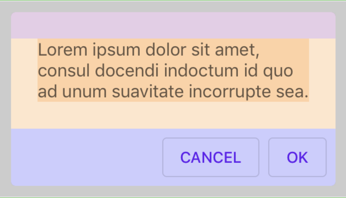
#### The title label is too short (pink title right inset is too large):
```
titleInsets = UIEdgeInsetsMake(12.f, 12.f, 12.f, 12.f);
```
#### A dialog with no message has a message pane (yellow):
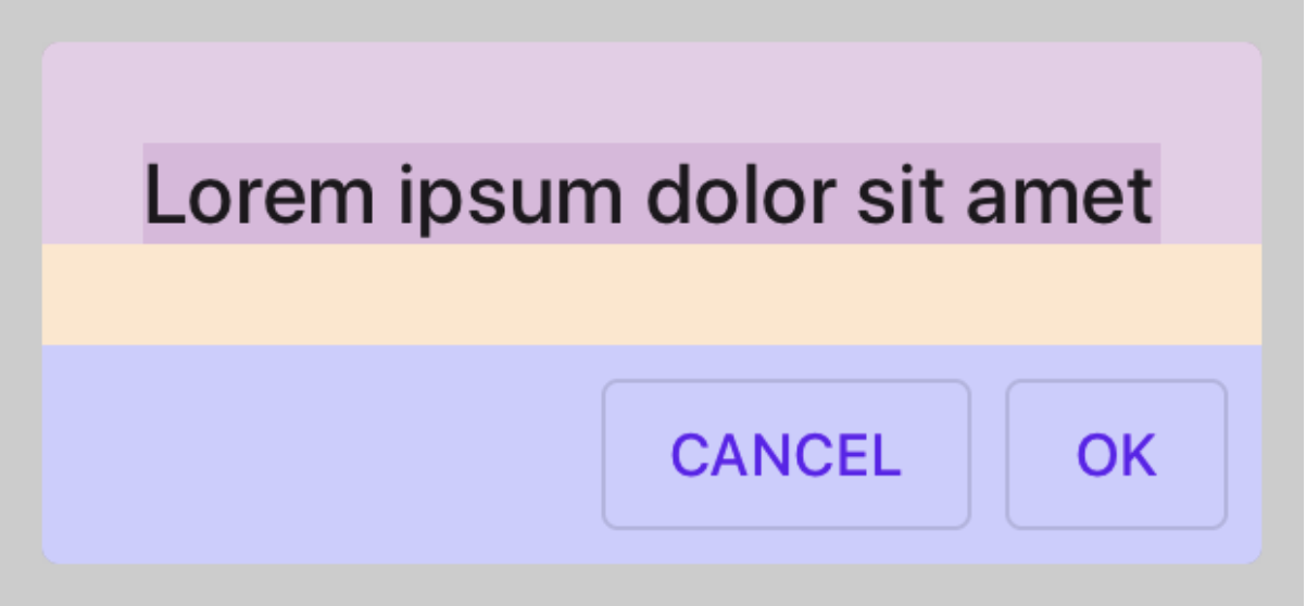
#### A dialog with no title has a title pane (pink):
## Issues
Fixes#9545, #9824.
b/133006455, b/148572399
PiperOrigin-RevId: 303368923
Insets calculations of the title and content panes in dialogs were using the same insets values, causing various misalignments.  This is fixed by ensuring that title calculations are using the titleInsets and that content calculations (of the message or accessory view) are using the content insets.

PiperOrigin-RevId: 303166366
We recommend using `initWithDefaults` and we should follow the recommendation. This change removes all usage of `init` within MDC components in order to let us remove that initializer from the public surface.

PiperOrigin-RevId: 302958447
Enables MDCAlertController and the title font to support automatic resizing of
fonts generated from a UIFontMetrics or UIFont preferredFont.

Part of #8672
closes https://github.com/material-components/material-components-ios/issues/8256.

## Context
Error occurs when testing using Bazel.
```
Test Case '-[components_Dialogs_unit_test_swift_sources.MDCDialogPresentationControllerTests testTraitCollectionDidChangeCalledWithCorrectParameters]' started.
Child process terminated with signal 11: Segmentation fault
```