# Text fields
[Text fields](https://material.io/components/text-fields) let users enter and
edit text.

**Contents**
* [Design & API Documentation](#design-api-documentation)
* [Using text fields](#using-text-fields)
* [Filled text field](#filled-text-field)
* [Outlined text field](#outlined-text-field)
* [Theming](#theming-text-fields)
## Design & API Documentation
* [Google Material3 Spec](https://material.io/components/text-fields/overview)
* [API Reference](https://developer.android.com/reference/com/google/android/material/textfield/package-summary)
## Using text fields
Before you can use Material text fields, you need to add a dependency to the
Material Components for Android library. For more information, go to the
[Getting started](https://github.com/material-components/material-components-android/tree/master/docs/getting-started.md)
page.
```xml
```
API and source code:
* `TextInputLayout`
* [Class definition](https://developer.android.com/reference/com/google/android/material/textfield/TextInputLayout)
* [Class source](https://github.com/material-components/material-components-android/tree/master/lib/java/com/google/android/material/textfield/TextInputLayout.java)
* `TextInputEditText`
* [Class definition](https://developer.android.com/reference/com/google/android/material/textfield/TextInputEditText)
* [Class source](https://github.com/material-components/material-components-android/tree/master/lib/java/com/google/android/material/textfield/TextInputEditText.java)
**Note:** A text field is composed of a `TextInputLayout` and a
`TextInputEditText` as a direct child. Using an `EditText` as the child might
work, but `TextInputEditText` provides accessibility support for the text field
and allows `TextInputLayout` greater control over the visual aspects of the
input text. If an `EditText` is being used, make sure to set its
`android:background` to `@null` so that `TextInputLayout` can set the proper
background on it.
### Making text fields accessible
Android's text field component APIs support both label text and helper text,
which explain what is requested for a text field. While optional, their use is
strongly encouraged.
#### Content description
When using **custom icons**, you should set a content description on them so
that screen readers, like TalkBack, are able to announce their purpose or
action.
For the leading icon, that can be achieved via the
`app:startIconContentDescription` attribute or `setStartIconContentDescription`
method. For the trailing icon, that can be achieved via the
`app:endIconContentDescription` attribute or `setEndIconContentDescription`
method.
When setting an **error message** that contains special characters that screen
readers or other accessibility systems are not able to read, you should set a
content description via the `app:errorContentDescription` attribute or
`setErrorContentDescription` method. That way the error will announce the
content description instead of the error message.
**Note:** Icons that don't have click listeners set on them work as decorative
elements, and are therefore skipped by screen readers.
#### Custom `EditText`
If you are using a custom `EditText` as `TextInputLayout`'s child and your text
field requires different accessibility support than the one offered by
`TextInputLayout`, you can set a `TextInputLayout.AccessibilityDelegate` via the
`setTextInputAccessibilityDelegate` method. This method should be used in place
of providing an `AccessibilityDelegate` directly on the `EditText`.
### Adding a leading icon to a text field

```xml
...
```
### Adding a trailing icon to a text field
**Password toggle:**

When the `TextInputEditText` is set to display a password, an icon can be added
to toggle between masking the password or displaying the password as plain-text.
```xml
```
**Clear text:**

An icon can be set to display when text is present. The icon can be pressed to
clear the input text.
```xml
...
```
**Custom icon:**

It is possible to set a custom `Drawable` as the text field's trailing icon via
`app:endIconMode="custom"`. You should specify a drawable and content
description for the icon, and you have the option to specify custom behaviors.
In the layout:
```xml
...
```
Optionally, in code:
```kt
textField.setEndIconOnClickListener {
// Respond to end icon presses
}
textField.addOnEditTextAttachedListener {
// If any specific changes should be done when the edit text is attached (and
// thus when the trailing icon is added to it), set an
// OnEditTextAttachedListener.
// Example: The clear text icon's visibility behavior depends on whether the
// EditText has input present. Therefore, an OnEditTextAttachedListener is set
// so things like editText.getText() can be called.
}
textField.addOnEndIconChangedListener {
// If any specific changes should be done if/when the endIconMode gets
// changed, set an OnEndIconChangedListener.
// Example: If the password toggle icon is set and a different EndIconMode
// gets set, the TextInputLayout has to make sure that the edit text's
// TransformationMethod is still PasswordTransformationMethod. Because of
// that, an OnEndIconChangedListener is used.
}
```
**Note:** You should opt to use the `EndIconMode` API instead of setting an
end/right compound `Drawable` on the `TextInputEditText`. The same applies to
the now-deprecated `passwordToggle*` attributes.
**Important:** Calling `setEndIconMode` will initialize the icon with its
default features, such as default drawables, and in the case of the custom mode,
an empty drawable. You can add customizations after calling `setEndIconMode`.
The exception for this is if a drawable was specified in XML via the
`app:endIconDrawable` attribute. An end icon drawable set in XML will take
precedence and override an existing default icon.
See the full list of
[end icon modes](https://github.com/material-components/material-components-android/tree/master/lib/java/com/google/android/material/textfield/res/values/attrs.xml#L149).
### Implementing an exposed dropdown menu

In the layout:
```xml
```
The string array specified by `app:simpleItems` will be used as the default
item strings for auto-completion. Or you can also set it programmatically:
```kt
val items = arrayOf("Item 1", "Item 2", "Item 3", "Item 4")
(textField.editText as? MaterialAutoCompleteTextView)?.setSimpleItems(items)
```
Alternatively, to have more control over the auto-completion items rendering,
you can also provide a custom item adapter by:
```kt
val items = listOf("Item 1", "Item 2", "Item 3", "Item 4")
val adapter = ArrayAdapter(requireContext(), R.layout.list_item, items)
(textField.editText as? AutoCompleteTextView)?.setAdapter(adapter)
```
And a custom item layout (`list_item.xml`):
```xml
```
### Adding helper text to a text field

```xml
...
```
### Adding a counter to a text field

```xml
...
```
### Adding errors to a text field
In the layout:
```xml
...
```
In code:
```kt
// Set error text
passwordLayout.error = getString(R.string.error)
// Clear error text
passwordLayout.error = null
```
**Note:** Non-null error text will replace any existing helper text, and
non-null helper text will replace any existing error text.
### Adding a prefix/suffix to a text field

```xml
...
```
### Text field dimensions
The recommended default `android:layout_width` is `245dp`.
By default, text fields have a maximum width of `488dp`, and a minimum width of
`56dp` for layouts without a label. If a label is present, the minimum width
recommended is `88dp`. `android:minWidth` and `android:maxWidth` (as well as
`android:minEms` and `android:maxEms`) should be set on the `TextInputLayout`
instead of on the `TextInputEditText` to avoid unintended behaviors.
You can override those values in a custom style that inherits from a
`TextInputLayout` style or by making changes directly on the layout:
```xml
```
**Note:** The `android:layout_width` of the `TextInputLayout` should be
`wrap_content` in order for those minimum and maximum dimensions to be used.
### Using text fields programmatically
If you construct the `TextInputEditText` child of a `TextInputLayout`
programmatically, you should use `TextInputLayout`'s context to create the view.
This will allow `TextInputLayout` to pass along the appropriate styling to the
edit text.
```kt
val textInputLayout = TextInputLayout(context)
val editText = TextInputEditText(textInputLayout.context)
```
### Types
There are two types of text fields: 1\. [Filled text field](#filled-text-field),
2\. [Outlined text field](#outlined-text-field)

## Filled text field
[Filled text fields](https://material.io/components/text-fields/#filled-text-field)
have more visual emphasis than outlined text fields, making them stand out when
surrounded by other content and components.
### Filled text field examples
The following example shows a filled text field with a label.

In the layout:
```xml
```
In code:
```kt
// Get input text
val inputText = filledTextField.editText?.text.toString()
filledTextField.editText?.doOnTextChanged { inputText, _, _, _ ->
// Respond to input text change
}
```
See the [using text fields](#using-text-fields) section above for more examples.
### Anatomy and key properties
A filled text field has a filled container, input text, a label, an activation
indicator, optional helper/error text and optional leading/trailing icons.

1. Container
2. Leading icon
3. Label
4. Input text
5. Trailing icon
6. Activation indicator
7. Helper/error/counter text
8. Prefix/suffix/placeholder (not shown)
#### Container attributes
Element | Attribute | Related method(s) | Default value
---------------------- | ------------------------ | --------------------------------------------------------------------------------------- | -------------
**Color** | `app:boxBackgroundColor` | `setBoxBackgroundColor`
`setBoxBackgroundColorResource`
`getBoxBackgroundColor` | `?attr/colorSurfaceContainerHighest` (see all [states](https://github.com/material-components/material-components-android/tree/master/lib/java/com/google/android/material/textfield/res/color/m3_textfield_filled_background_color.xml))
**Shape** | `app:shapeAppearance` | N/A | `?attr/shapeAppearanceSmallComponent`
**Text field enabled** | `android:enabled` | `setEnabled` | `true`
#### Leading icon attributes
Element | Attribute | Related method(s) | Default value
----------------------- | --------------------------------- | --------------------------------------------------------------------- | -------------
**Icon** | `app:startIconDrawable` | `setStartIconDrawable`
`getStartIconDrawable` | `null`
**Content description** | `app:startIconContentDescription` | `setStartIconContentDescription`
`getStartIconContentDescription` | `null`
**Color** | `app:startIconTint` | `setStartIconTintList` | `?attr/colorOnSurfaceVariant` (see all [states](https://github.com/material-components/material-components-android/tree/master/lib/java/com/google/android/material/textfield/res/color/m3_textfield_indicator_text_color.xml))
**Checkable** | `app:startIconCheckable` | `setStartIconCheckable`
`isStartIconCheckable` | `false`
**Size** | `app:startIconMinSize` | `setStartIconMinSize`
`getStartIconMinSize` | `48dp`
**Scale type** | `app:startIconScaleType` | `setStartIconScaleType`
`getStartIconScaleType` | `ScaleType.CENTER`
#### Label attributes
Element | Attribute | Related method(s) | Default value
------------------------------ | -------------------------- | ------------------------------------------------------- | -------------
**Text** | `android:hint` | `setHint`
`getHint` | `null`
**Color** | `android:textColorHint` | `setDefaultHintTextColor`
`getDefaultHintTextColor` | `?attr/colorOnSurfaceVariant` (see all [states](https://github.com/material-components/material-components-android/tree/master/lib/java/com/google/android/material/textfield/res/color/m3_textfield_label_color.xml))
**Collapsed (floating) color** | `app:hintTextColor` | `setHintTextColor`
`getHintTextColor` | `?attr/colorPrimary` (see all [states](https://github.com/material-components/material-components-android/tree/master/lib/java/com/google/android/material/textfield/res/color/m3_textfield_label_color.xml))
**Typography** | `app:hintTextAppearance` | `setHintTextAppearance` | `?attr/textAppearanceBodySmall`
**Animation** | `app:hintAnimationEnabled` | `setHintAnimationEnabled`
`isHintAnimationEnabled` | `true`
**Expanded enabled** | `app:expandedHintEnabled` | `setExpandedHintEnabled`
`isExpandedHintEnabled` | `true`
**Note:** The `android:hint` should always be set on the `TextInputLayout`
instead of on the `EditText` in order to avoid unintended behaviors.
#### Input text attributes (set on the `TextInputEditText`)
Element | Attribute | Related method(s) | Default value
------------------------ | ------------------------------------------------------------------------ | ------------------------------------------------------------ | -------------
**Input text** | `android:text` | `setText`
`getText` | `@null`
**Typography** | `android:textAppearance` | `setTextAppearance` | `?attr/textAppearanceBodyLarge`
**Input text color** | `android:textColor` | `setTextColor`
`getTextColors`
`getCurrentTextColor` | `?attr/colorOnSurface`
**Cursor color** | N/A (color comes from the theme attr `?attr/colorControlActivated`) | N/A | `?attr/colorPrimary`
**Text highlight color** | N/A (color comes from the theme attr `?android:attr/textColorHighlight`) | N/A | [`@color/m3_highlighted_text`](https://github.com/material-components/material-components-android/tree/master/lib/java/com/google/android/material/color/res/color/m3_highlighted_text.xml)
#### Input text attributes (set on the `TextInputLayout`)
Element | Attribute | Related method(s) | Default value
------------------------ |------------------------------------------|-----------------------------------------------------------------------| -------------
**Cursor color** | `app:cursorColor` on API levels 28+ | `setCursorColor`
`getCursorColor`
on API levels 28+ | `@null` (uses `?attr/colorControlActivated` by default)
**Cursor error color** | `app:cursorErrorColor` on API levels 28+ | `setCursorErrorColor`
`getCursorErrorColor`
on API levels 28+ | `?attr/colorError` on API levels 28+, `?attr/colorControlActivated` otherwise
#### Trailing icon attributes
Element | Attribute | Related method(s) | Default value
----------------------------------- | ------------------------------- | ----------------------------------------------------------------- | -------------
**Mode** | `app:endIconMode` | `setEndIconMode`
`getEndIconMode` | `END_ICON_NONE`
**Color** | `app:endIconTint` | `setEndIconTintList` | `colorOnSurfaceVariant` (see all [states](https://github.com/material-components/material-components-android/tree/master/lib/java/com/google/android/material/textfield/res/color/m3_textfield_indicator_text_color.xml))
**Custom icon** | `app:endIconDrawable` | `setEndIconDrawable`
`getEndIconDrawable` | `null`
**Custom icon content description** | `app:endIconContentDescription` | `setEndIconContentDescription`
`getEndIconContentDescription` | `null`
**Custom icon checkable** | `app:endIconCheckable` | `setEndIconCheckable`
`isEndIconCheckable` | `true`
**Error icon** | `app:errorIconDrawable` | `setErrorIconDrawable`
`getErrorIconDrawable` | [`@drawable/mtrl_ic_error`](https://github.com/material-components/material-components-android/tree/master/lib/java/com/google/android/material/textfield/res/drawable/mtrl_ic_error.xml)
**Error icon color** | `app:errorIconTint` | `setErrorIconTintList` | `?attr/colorError`
**Size** | `app:endIconMinSize` | `setEndIconMinSize`
`getEndIconMinSize` | `48dp`
**Scale type** | `app:endIconScaleType` | `setEndIconScaleType`
`getEndIconScaleType` | `ScaleType.CENTER`
#### Activation indicator attributes
Element | Attribute | Related method(s) | Default value
----------------- | --------------------------- | ---------------------------------------------------------------------------- | -------------
**Color** | `app:boxStrokeColor` | `setBoxStrokeColor`
`setBoxStrokeColorStateList`
`getBoxStrokeColor` | `?attr/colorOutline` and `?attr/colorPrimary` (focused) (see all [states](https://github.com/material-components/material-components-android/tree/master/lib/java/com/google/android/material/textfield/res/color/m3_textfield_stroke_color.xml))
**Error color** | `app:boxStrokeErrorColor` | `setBoxStrokeErrorColor`
`getBoxStrokeErrorColor` | `?attr/colorError`
**Width** | `app:boxStrokeWidth` | N/A | `1dp`
**Focused width** | `app:boxStrokeWidthFocused` | N/A | `2dp`
#### Helper/error/counter text attributes
| Element | Attribute | Related method(s) | Default value |
|------------------------------------------|---------------------------------------------------------------------|---------------------------------------------------------------------------------------------------------------------|----------------------------------------------------------------------------------------------------------------------------------------------------------------------------------------------------------------------------------------------------------------------------------------------------------------------------------------------|
| **Helper text enabled** | `app:helperTextEnabled` | `setHelperTextEnabled`
`isHelperTextEnabled` | `false` |
| **Helper text** | `app:helperText` | `setHelperText`
`getHelperText` | `null` |
| **Helper text color** | `app:helperTextColor` | `setHelperTextColor`
`getHelperTextColor` | `?attr/colorOnSurfaceVariant` (see all [states](https://github.com/material-components/material-components-android/tree/master/lib/java/com/google/android/material/textfield/res/color/m3_textfield_indicator_text_color.xml)) |
| **Helper text typography** | `app:helperTextAppearance` | `setHelperTextAppearance` | `?attr/textAppearanceBodySmall` |
| **Error text enabled** | `app:errorEnabled` | `setErrorEnabled`
`isErrorEnabled` | `false` |
| **Error text** | N/A | `setError`
`getError` | `null` |
| **Error text accessibility live region** | `app:errorAccessibilityLiveRegion` | `setErrorAccessibilityLiveRegion`
`getErrorAccessibilityLiveRegion` | `ViewCompat.ACCESSIBILITY_LIVE_REGION_POLITE` |
| **Error text color** | `app:errorTextColor` | `setErrorTextColor`
`getErrorCurrentTextColors` | `?attr/colorError` |
| **Error text typography** | `app:errorTextAppearance` | `setErrorTextAppearance` | `?attr/textAppearanceBodySmall` |
| **Counter text enabled** | `app:counterEnabled` | `setCounterEnabled`
`isCounterEnabled` | `false` |
| **Counter text length** | `app:counterMaxLength` | `setCounterMaxLength`
`getCounterMaxLength` | `-1` |
| **Counter text typography** | `app:counterTextAppearance`
`app:counterOverflowTextAppearance` | `setCounterTextAppearance`
`setCounterOverflowTextAppearance` | `?attr/textAppearanceBodySmall` |
| **Counter text color** | `app:counterTextColor`
`app:counterOverflowTextColor` | `setCounterTextColor`
`setCounterOverflowTextColor`
`getCounterTextColor`
`getCounterOverflowTextColor` | `?attr/colorOnSurfaceVariant` (`app:counterTextColor`) (see all [states](https://github.com/material-components/material-components-android/tree/master/lib/java/com/google/android/material/textfield/res/color/m3_textfield_indicator_text_color.xml))
`?attr/colorError` (`app:counterOverflowTextColor`) |
#### Prefix/suffix attributes
Element | Attribute | Related method(s) | Default value
--------------------- | -------------------------- | --------------------------------------------- | -------------
**Prefix** | `app:prefixText` | `setPrefixText`
`getPrefixText` | `null`
**Prefix color** | `app:prefixTextColor` | `setPrefixTextColor`
`getPrefixTextColor` | `?attr/colorOnSurfaceVariant` (see all [states](https://github.com/material-components/material-components-android/tree/master/lib/java/com/google/android/material/textfield/res/color/m3_textfield_indicator_text_color.xml))
**Prefix typography** | `app:prefixTextAppearance` | `setPrefixTextAppearance` | `?attr/textAppearanceTitleMedium`
**Suffix** | `app:suffixText` | `setSuffixText`
`getSuffixText` | `null`
**Suffix color** | `app:suffixTextColor` | `setSuffixTextColor`
`getSuffixTextColor` | `?attr/colorOnSurfaceVariant` (see all [states](https://github.com/material-components/material-components-android/tree/master/lib/java/com/google/android/material/textfield/res/color/m3_textfield_indicator_text_color.xml))
**Suffix typography** | `app:suffixTextAppearance` | `setSuffixTextAppearance` | `?attr/textAppearanceTitleMedium`
#### Styles
Element | Style | Default style theme attribute
------------------------------------- | ---------------------------------------------------------------------- | -----------------------------
**Default style** | `Widget.Material3.TextInputLayout.FilledBox` | `?attr/textInputFilledStyle`
**Dense style** | `Widget.Material3.TextInputLayout.FilledBox.Dense` | `?attr/textInputFilledDenseStyle`
**Exposed dropdown menu style** | `Widget.Material3.TextInputLayout.FilledBox.ExposedDropdownMenu` | `?attr/textInputFilledExposedDropdownMenuStyle`
**Dense exposed dropdown menu style** | `Widget.Material3.TextInputLayout.FilledBox.Dense.ExposedDropdownMenu` | N/A
See the full list of
[styles](https://github.com/material-components/material-components-android/tree/master/lib/java/com/google/android/material/textfield/res/values/styles.xml)
and
[attrs](https://github.com/material-components/material-components-android/tree/master/lib/java/com/google/android/material/textfield/res/values/attrs.xml).
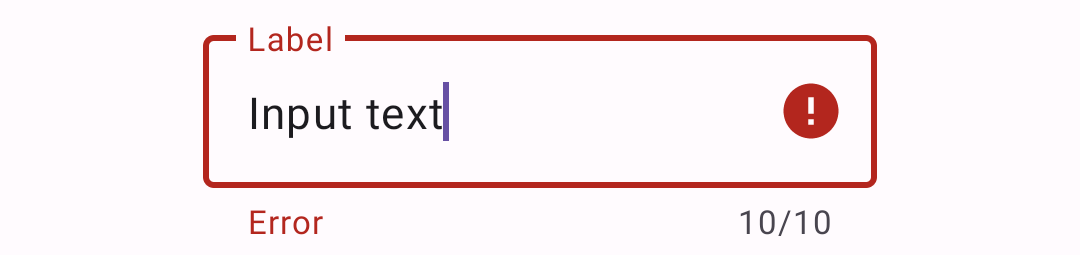
## Outlined text field
[Outlined text fields](https://material.io/components/text-fields/#outlined-text-field)
have less visual emphasis than filled text fields. When they appear in forms,
for example, where many text fields are placed together, their reduced emphasis
helps simplify the layout.
**Note:** The outlined text field is the default style.
### Outlined text field examples
The following example shows an outlined text field.

In the layout:
```xml
```
In code:
```kt
// Get input text
val inputText = outlinedTextField.editText?.text.toString()
outlinedTextField.editText?.doOnTextChanged { inputText, _, _, _ ->
// Respond to input text change
}
```
See the [using text fields](#using-text-fields) section above for more examples.
### Anatomy and key properties
An outlined text field has a stroked container, input text, a label, optional
helper/error text and optional leading/trailing icons.

1. Container
2. Leading icon
3. Label
4. Input text
5. Trailing icon
6. Helper/error/counter text
7. Prefix/suffix/placeholder (not shown)
#### Container attributes
Element | Attribute | Related method(s) | Default value
------------------------ | --------------------------- | ---------------------------------------------------------------------------- | -------------
**Stroke color** | `app:boxStrokeColor` | `setBoxStrokeColor`
`setBoxStrokeColorStateList`
`getBoxStrokeColor` | `?attr/colorOutline` and `?attr/colorPrimary` (focused) (see all [states](https://github.com/material-components/material-components-android/tree/master/lib/java/com/google/android/material/textfield/res/color/m3_textfield_stroke_color.xml))
**Stroke error color** | `app:boxStrokeErrorColor` | `setBoxStrokeErrorColor`
`getBoxStrokeErrorColor` | `?attr/colorError`
**Stroke width** | `app:boxStrokeWidth` | N/A | `1dp`
**Stroke focused width** | `app:boxStrokeWidthFocused` | N/A | `2dp`
**Shape** | `app:shapeAppearance` | N/A | `?attr/shapeAppearanceSmallComponent`
**Text field enabled** | `android:enabled` | `setEnabled` | `true`
#### Leading icon attributes
Element | Attribute | Related method(s) | Default value
----------------------- | --------------------------------- | --------------------------------------------------------------------- | -------------
**Icon** | `app:startIconDrawable` | `setStartIconDrawable`
`getStartIconDrawable` | `null`
**Content description** | `app:startIconContentDescription` | `setStartIconContentDescription`
`getStartIconContentDescription` | `null`
**Color** | `app:startIconTint` | `setStartIconTintList` | `?attr/colorOnSurfaceVariant` (see all [states](https://github.com/material-components/material-components-android/tree/master/lib/java/com/google/android/material/textfield/res/color/m3_textfield_indicator_text_color.xml))
**Checkable** | `app:startIconCheckable` | `setStartIconCheckable`
`isStartIconCheckable` | `false`
#### Label attributes
Element | Attribute | Related method(s) | Default value
------------------------------ | ------------------------ | ------------------------------------------------------- | -------------
**Text** | `android:hint` | `setHint`
`getHint` | `null`
**Color** | `android:textColorHint` | `setDefaultHintTextColor`
`getDefaultHintTextColor` | `?attr/colorOnSurfaceVariant` (see all [states](https://github.com/material-components/material-components-android/tree/master/lib/java/com/google/android/material/textfield/res/color/m3_textfield_label_color.xml))
**Collapsed (floating) color** | `app:hintTextColor` | `setHintTextColor`
`getHintTextColor` | `?attr/colorPrimary`
**Typography** | `app:hintTextAppearance` | `setHintTextAppearance` | `?attr/textAppearanceBodySmall`
**Note:** The `android:hint` should always be set on the `TextInputLayout`
instead of on the `EditText` in order to avoid unintended behaviors.
#### Input text attributes (set on the `TextInputEditText`)
Element | Attribute | Related method(s) | Default value
------------------------ | ------------------------------------------------------------------------ | ------------------------------------------------------------ | -------------
**Input text** | `android:text` | `setText`
`getText` | `@null`
**Typography** | `android:textAppearance` | `setTextAppearance` | `?attr/textAppearanceBodyLarge`
**Input text color** | `android:textColor` | `setTextColor`
`getTextColors`
`getCurrentTextColor` | `?attr/colorOnSurface`
**Cursor color** | N/A (color comes from the theme attr `?attr/colorControlActivated`) | N/A | `?attr/colorPrimary`
**Text highlight color** | N/A (color comes from the theme attr `?android:attr/textColorHighlight`) | N/A | [`@color/m3_highlighted_text`](https://github.com/material-components/material-components-android/tree/master/lib/java/com/google/android/material/color/res/color/m3_highlighted_text.xml)
#### Input text attributes (set on the `TextInputLayout`)
Element | Attribute | Related method(s) | Default value
------------------------ |------------------------------------------|-----------------------------------------------------------------------| -------------
**Cursor color** | `app:cursorColor` on API levels 28+ | `setCursorColor`
`getCursorColor`
on API levels 28+ | `@null` (uses `?attr/colorControlActivated` by default)
**Cursor error color** | `app:cursorErrorColor` on API levels 28+ | `setCursorErrorColor`
`getCursorErrorColor`
on API levels 28+ | `?attr/colorError` on API levels 28+, `?attr/colorControlActivated` otherwise
#### Trailing icon attributes
Element | Attribute | Related method(s) | Default value
----------------------------------- | ------------------------------- | ----------------------------------------------------------------- | -------------
**Mode** | `app:endIconMode` | `setEndIconMode`
`getEndIconMode` | `END_ICON_NONE`
**Color** | `app:endIconTint` | `setEndIconTintList` | `?attr/colorOnSurfaceVariant` (see all [states](https://github.com/material-components/material-components-android/tree/master/lib/java/com/google/android/material/textfield/res/color/m3_textfield_indicator_text_color.xml))
**Custom icon** | `app:endIconDrawable` | `setEndIconDrawable`
`getEndIconDrawable` | `null`
**Custom icon content description** | `app:endIconContentDescription` | `setEndIconContentDescription`
`getEndIconContentDescription` | `null`
**Custom icon checkable** | `app:endIconCheckable` | `setEndIconCheckable`
`isEndIconCheckable` | `true`
**Error icon** | `app:errorIconDrawable` | `setErrorIconDrawable`
`getErrorIconDrawable` | [`@drawable/mtrl_ic_error`](https://github.com/material-components/material-components-android/tree/master/lib/java/com/google/android/material/textfield/res/drawable/mtrl_ic_error.xml)
**Error icon color** | `app:errorIconTint` | `setErrorIconTintList` | `?attr/colorError`
#### Helper/error/counter text attributes
| Element | Attribute | Related method(s) | Default value |
|------------------------------------------|---------------------------------------------------------------------|---------------------------------------------------------------------------------------------------------------------|----------------------------------------------------------------------------------------------------------------------------------------------------------------------------------------------------------------------------------------------------------------------------------------------------------------------------------------------|
| **Helper text enabled** | `app:helperTextEnabled` | `setHelperTextEnabled`
`isHelperTextEnabled` | `false` |
| **Helper text** | `app:helperText` | `setHelperText`
`getHelperText` | `null` |
| **Helper text color** | `app:helperTextColor` | `setHelperTextColor`
`getHelperTextColor` | `?attr/colorOnSurfaceVariant` (see all [states](https://github.com/material-components/material-components-android/tree/master/lib/java/com/google/android/material/textfield/res/color/m3_textfield_indicator_text_color.xml)) |
| **Helper text typography** | `app:helperTextAppearance` | `setHelperTextAppearance` | `?attr/textAppearanceBodySmall` |
| **Error text enabled** | `app:errorEnabled` | `setErrorEnabled`
`isErrorEnabled` | `false` |
| **Error text** | N/A | `setError`
`getError` | `null` |
| **Error text accessibility live region** | `app:errorAccessibilityLiveRegion` | `setErrorAccessibilityLiveRegion`
`getErrorAccessibilityLiveRegion` | `ViewCompat.ACCESSIBILITY_LIVE_REGION_POLITE` |
| **Error text color** | `app:errorTextColor` | `setErrorTextColor`
`getErrorCurrentTextColors` | `?attr/colorError` |
| **Error text typography** | `app:errorTextAppearance` | `setErrorTextAppearance` | `?attr/textAppearanceBodySmall` |
| **Counter text enabled** | `app:counterEnabled` | `setCounterEnabled`
`isCounterEnabled` | `false` |
| **Counter text length** | `app:counterMaxLength` | `setCounterMaxLength`
`getCounterMaxLength` | `-1` |
| **Counter text typography** | `app:counterTextAppearance`
`app:counterOverflowTextAppearance` | `setCounterTextAppearance`
`setCounterOverflowTextAppearance` | `?attr/textAppearanceBodySmall` |
| **Counter text color** | `app:counterTextColor`
`app:counterOverflowTextColor` | `setCounterTextColor`
`setCounterOverflowTextColor`
`getCounterTextColor`
`getCounterOverflowTextColor` | `?attr/colorOnSurfaceVariant` (`app:counterTextColor`) (see all [states](https://github.com/material-components/material-components-android/tree/master/lib/java/com/google/android/material/textfield/res/color/m3_textfield_indicator_text_color.xml))
`?attr/colorError` (`app:counterOverflowTextColor`) |
#### Prefix/suffix attributes
Element | Attribute | Related method(s) | Default value
--------------------- | -------------------------- | --------------------------------------------- | -------------
**Prefix** | `app:prefixText` | `setPrefixText`
`getPrefixText` | `null`
**Prefix color** | `app:prefixTextColor` | `setPrefixTextColor`
`getPrefixTextColor` | `?attr/colorOnSurfaceVariant` (see all [states](https://github.com/material-components/material-components-android/tree/master/lib/java/com/google/android/material/textfield/res/color/m3_textfield_indicator_text_color.xml))
**Prefix typography** | `app:prefixTextAppearance` | `setPrefixTextAppearance` | `?attr/textAppearanceTitleMedium`
**Suffix** | `app:suffixText` | `setSuffixText`
`getSuffixText` | `null`
**Suffix color** | `app:suffixTextColor` | `setSuffixTextColor`
`getSuffixTextColor` | `?attr/colorOnSurfaceVariant` (see all [states](https://github.com/material-components/material-components-android/tree/master/lib/java/com/google/android/material/textfield/res/color/m3_textfield_indicator_text_color.xml))
**Suffix typography** | `app:suffixTextAppearance` | `setSuffixTextAppearance` | `?attr/textAppearanceTitleMedium`
#### Styles
Element | Style | Default style theme attribute
------------------------------------- | ------------------------------------------------------------------------ | -----------------------------
**Default style** | `Widget.Material3.TextInputLayout.OutlinedBox` | `?attr/textInputStyle` and `?attr/textInputOutlinedStyle`
**Dense style** | `Widget.Material3.TextInputLayout.OutlinedBox.Dense` | `?attr/textInputOutlinedDenseStyle`
**Exposed dropdown menu style** | `Widget.Material3.TextInputLayout.OutlinedBox.ExposedDropdownMenu` | `?attr/textInputOutlinedExposedDropdownMenuStyle`
**Dense exposed dropdown menu style** | `Widget.Material3.TextInputLayout.OutlinedBox.Dense.ExposedDropdownMenu` | N/A
See the full list of
[styles](https://github.com/material-components/material-components-android/tree/master/lib/java/com/google/android/material/textfield/res/values/styles.xml)
and
[attrs](https://github.com/material-components/material-components-android/tree/master/lib/java/com/google/android/material/textfield/res/values/attrs.xml).
## Theming text fields
Text fields support
[Material Theming](https://material.io/components/text-fields/#theming) which
provides color, typography and shape customization.
### Text field theming example
API and source code:
* `TextInputLayout`
* [Class definition](https://developer.android.com/reference/com/google/android/material/textfield/TextInputLayout)
* [Class source](https://github.com/material-components/material-components-android/tree/master/lib/java/com/google/android/material/textfield/TextInputLayout.java)
* `TextInputEditText`
* [Class definition](https://developer.android.com/reference/com/google/android/material/textfield/TextInputEditText)
* [Class source](https://github.com/material-components/material-components-android/tree/master/lib/java/com/google/android/material/textfield/TextInputEditText.java)
The following example shows filled and outlined text field types with Material
Theming.

#### Implementing text field theming
Using theme attributes and styles in `res/values/styles.xml` adds themes to all
text fields and affects other components:
```xml
```
Using default style theme attributes, styles and theme overlays adds themes to
all text fields but does not affect other components:
```xml
```
Using the style in the layout affects only this text field:
```xml
...
```
**Note:** When setting a `materialThemeOverlay` on a custom `TextInputLayout`
style, don't forget to set `editTextStyle` to either a
`@style/Widget.Material3.TextInputEditText.*` style or to a custom one that
inherits from that.
The `TextInputLayout` styles set
`materialThemeOverlay` to override `editTextStyle` with the specific
`TextInputEditText` style needed. Therefore, you don't need to specify a style
tag on the edit text.