mirror of
https://github.com/flutter/flutter.git
synced 2026-02-20 02:29:02 +08:00

478 lines
17 KiB
Dart
478 lines
17 KiB
Dart
// Copyright 2014 The Flutter Authors. All rights reserved.
|
|
// Use of this source code is governed by a BSD-style license that can be
|
|
// found in the LICENSE file.
|
|
|
|
import 'package:flutter/foundation.dart';
|
|
import 'package:flutter/rendering.dart';
|
|
|
|
import 'basic.dart';
|
|
import 'framework.dart';
|
|
import 'image.dart';
|
|
|
|
// Examples can assume:
|
|
// late BuildContext context;
|
|
|
|
/// A widget that paints a [Decoration] either before or after its child paints.
|
|
///
|
|
/// [Container] insets its child by the widths of the borders; this widget does
|
|
/// not.
|
|
///
|
|
/// Commonly used with [BoxDecoration].
|
|
///
|
|
/// The [child] is not clipped. To clip a child to the shape of a particular
|
|
/// [ShapeDecoration], consider using a [ClipPath] widget.
|
|
///
|
|
/// {@tool snippet}
|
|
///
|
|
/// This sample shows a radial gradient that draws a moon on a night sky:
|
|
///
|
|
/// ```dart
|
|
/// const DecoratedBox(
|
|
/// decoration: BoxDecoration(
|
|
/// gradient: RadialGradient(
|
|
/// center: Alignment(-0.5, -0.6),
|
|
/// radius: 0.15,
|
|
/// colors: <Color>[
|
|
/// Color(0xFFEEEEEE),
|
|
/// Color(0xFF111133),
|
|
/// ],
|
|
/// stops: <double>[0.9, 1.0],
|
|
/// ),
|
|
/// ),
|
|
/// )
|
|
/// ```
|
|
/// {@end-tool}
|
|
///
|
|
/// See also:
|
|
///
|
|
/// * [Ink], which paints a [Decoration] on a [Material], allowing
|
|
/// [InkResponse] and [InkWell] splashes to paint over them.
|
|
/// * [DecoratedBoxTransition], the version of this class that animates on the
|
|
/// [decoration] property.
|
|
/// * [Decoration], which you can extend to provide other effects with
|
|
/// [DecoratedBox].
|
|
/// * [CustomPaint], another way to draw custom effects from the widget layer.
|
|
class DecoratedBox extends SingleChildRenderObjectWidget {
|
|
/// Creates a widget that paints a [Decoration].
|
|
///
|
|
/// The [decoration] and [position] arguments must not be null. By default the
|
|
/// decoration paints behind the child.
|
|
const DecoratedBox({
|
|
Key? key,
|
|
required this.decoration,
|
|
this.position = DecorationPosition.background,
|
|
Widget? child,
|
|
}) : assert(decoration != null),
|
|
assert(position != null),
|
|
super(key: key, child: child);
|
|
|
|
/// What decoration to paint.
|
|
///
|
|
/// Commonly a [BoxDecoration].
|
|
final Decoration decoration;
|
|
|
|
/// Whether to paint the box decoration behind or in front of the child.
|
|
final DecorationPosition position;
|
|
|
|
@override
|
|
RenderDecoratedBox createRenderObject(BuildContext context) {
|
|
return RenderDecoratedBox(
|
|
decoration: decoration,
|
|
position: position,
|
|
configuration: createLocalImageConfiguration(context),
|
|
);
|
|
}
|
|
|
|
@override
|
|
void updateRenderObject(BuildContext context, RenderDecoratedBox renderObject) {
|
|
renderObject
|
|
..decoration = decoration
|
|
..configuration = createLocalImageConfiguration(context)
|
|
..position = position;
|
|
}
|
|
|
|
@override
|
|
void debugFillProperties(DiagnosticPropertiesBuilder properties) {
|
|
super.debugFillProperties(properties);
|
|
final String label;
|
|
switch (position) {
|
|
case DecorationPosition.background:
|
|
label = 'bg';
|
|
break;
|
|
case DecorationPosition.foreground:
|
|
label = 'fg';
|
|
break;
|
|
}
|
|
properties.add(EnumProperty<DecorationPosition>('position', position, level: DiagnosticLevel.hidden));
|
|
properties.add(DiagnosticsProperty<Decoration>(label, decoration));
|
|
}
|
|
}
|
|
|
|
/// A convenience widget that combines common painting, positioning, and sizing
|
|
/// widgets.
|
|
///
|
|
/// {@youtube 560 315 https://www.youtube.com/watch?v=c1xLMaTUWCY}
|
|
///
|
|
/// A container first surrounds the child with [padding] (inflated by any
|
|
/// borders present in the [decoration]) and then applies additional
|
|
/// [constraints] to the padded extent (incorporating the `width` and `height`
|
|
/// as constraints, if either is non-null). The container is then surrounded by
|
|
/// additional empty space described from the [margin].
|
|
///
|
|
/// During painting, the container first applies the given [transform], then
|
|
/// paints the [decoration] to fill the padded extent, then it paints the child,
|
|
/// and finally paints the [foregroundDecoration], also filling the padded
|
|
/// extent.
|
|
///
|
|
/// Containers with no children try to be as big as possible unless the incoming
|
|
/// constraints are unbounded, in which case they try to be as small as
|
|
/// possible. Containers with children size themselves to their children. The
|
|
/// `width`, `height`, and [constraints] arguments to the constructor override
|
|
/// this.
|
|
///
|
|
/// By default, containers return false for all hit tests. If the [color]
|
|
/// property is specified, the hit testing is handled by [ColoredBox], which
|
|
/// always returns true. If the [decoration] or [foregroundDecoration] properties
|
|
/// are specified, hit testing is handled by [Decoration.hitTest].
|
|
///
|
|
/// ## Layout behavior
|
|
///
|
|
/// _See [BoxConstraints] for an introduction to box layout models._
|
|
///
|
|
/// Since [Container] combines a number of other widgets each with their own
|
|
/// layout behavior, [Container]'s layout behavior is somewhat complicated.
|
|
///
|
|
/// Summary: [Container] tries, in order: to honor [alignment], to size itself
|
|
/// to the [child], to honor the `width`, `height`, and [constraints], to expand
|
|
/// to fit the parent, to be as small as possible.
|
|
///
|
|
/// More specifically:
|
|
///
|
|
/// If the widget has no child, no `height`, no `width`, no [constraints],
|
|
/// and the parent provides unbounded constraints, then [Container] tries to
|
|
/// size as small as possible.
|
|
///
|
|
/// If the widget has no child and no [alignment], but a `height`, `width`, or
|
|
/// [constraints] are provided, then the [Container] tries to be as small as
|
|
/// possible given the combination of those constraints and the parent's
|
|
/// constraints.
|
|
///
|
|
/// If the widget has no child, no `height`, no `width`, no [constraints], and
|
|
/// no [alignment], but the parent provides bounded constraints, then
|
|
/// [Container] expands to fit the constraints provided by the parent.
|
|
///
|
|
/// If the widget has an [alignment], and the parent provides unbounded
|
|
/// constraints, then the [Container] tries to size itself around the child.
|
|
///
|
|
/// If the widget has an [alignment], and the parent provides bounded
|
|
/// constraints, then the [Container] tries to expand to fit the parent, and
|
|
/// then positions the child within itself as per the [alignment].
|
|
///
|
|
/// Otherwise, the widget has a [child] but no `height`, no `width`, no
|
|
/// [constraints], and no [alignment], and the [Container] passes the
|
|
/// constraints from the parent to the child and sizes itself to match the
|
|
/// child.
|
|
///
|
|
/// The [margin] and [padding] properties also affect the layout, as described
|
|
/// in the documentation for those properties. (Their effects merely augment the
|
|
/// rules described above.) The [decoration] can implicitly increase the
|
|
/// [padding] (e.g. borders in a [BoxDecoration] contribute to the [padding]);
|
|
/// see [Decoration.padding].
|
|
///
|
|
/// ## Example
|
|
///
|
|
/// {@tool snippet}
|
|
/// This example shows a 48x48 amber square (placed inside a [Center] widget in
|
|
/// case the parent widget has its own opinions regarding the size that the
|
|
/// [Container] should take), with a margin so that it stays away from
|
|
/// neighboring widgets:
|
|
///
|
|
/// 
|
|
///
|
|
/// ```dart
|
|
/// Center(
|
|
/// child: Container(
|
|
/// margin: const EdgeInsets.all(10.0),
|
|
/// color: Colors.amber[600],
|
|
/// width: 48.0,
|
|
/// height: 48.0,
|
|
/// ),
|
|
/// )
|
|
/// ```
|
|
/// {@end-tool}
|
|
///
|
|
/// {@tool snippet}
|
|
///
|
|
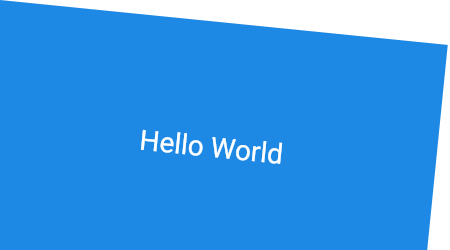
/// This example shows how to use many of the features of [Container] at once.
|
|
/// The [constraints] are set to fit the font size plus ample headroom
|
|
/// vertically, while expanding horizontally to fit the parent. The [padding] is
|
|
/// used to make sure there is space between the contents and the text. The
|
|
/// [color] makes the box blue. The [alignment] causes the [child] to be
|
|
/// centered in the box. Finally, the [transform] applies a slight rotation to the
|
|
/// entire contraption to complete the effect.
|
|
///
|
|
/// 
|
|
///
|
|
/// ```dart
|
|
/// Container(
|
|
/// constraints: BoxConstraints.expand(
|
|
/// height: Theme.of(context).textTheme.headline4!.fontSize! * 1.1 + 200.0,
|
|
/// ),
|
|
/// padding: const EdgeInsets.all(8.0),
|
|
/// color: Colors.blue[600],
|
|
/// alignment: Alignment.center,
|
|
/// child: Text('Hello World',
|
|
/// style: Theme.of(context)
|
|
/// .textTheme
|
|
/// .headline4!
|
|
/// .copyWith(color: Colors.white)),
|
|
/// transform: Matrix4.rotationZ(0.1),
|
|
/// )
|
|
/// ```
|
|
/// {@end-tool}
|
|
///
|
|
/// See also:
|
|
///
|
|
/// * [AnimatedContainer], a variant that smoothly animates the properties when
|
|
/// they change.
|
|
/// * [Border], which has a sample which uses [Container] heavily.
|
|
/// * [Ink], which paints a [Decoration] on a [Material], allowing
|
|
/// [InkResponse] and [InkWell] splashes to paint over them.
|
|
/// * Cookbook: [Animate the properties of a container](https://flutter.dev/docs/cookbook/animation/animated-container)
|
|
/// * The [catalog of layout widgets](https://flutter.dev/widgets/layout/).
|
|
class Container extends StatelessWidget {
|
|
/// Creates a widget that combines common painting, positioning, and sizing widgets.
|
|
///
|
|
/// The `height` and `width` values include the padding.
|
|
///
|
|
/// The `color` and `decoration` arguments cannot both be supplied, since
|
|
/// it would potentially result in the decoration drawing over the background
|
|
/// color. To supply a decoration with a color, use `decoration:
|
|
/// BoxDecoration(color: color)`.
|
|
Container({
|
|
Key? key,
|
|
this.alignment,
|
|
this.padding,
|
|
this.color,
|
|
this.decoration,
|
|
this.foregroundDecoration,
|
|
double? width,
|
|
double? height,
|
|
BoxConstraints? constraints,
|
|
this.margin,
|
|
this.transform,
|
|
this.transformAlignment,
|
|
this.child,
|
|
this.clipBehavior = Clip.none,
|
|
}) : assert(margin == null || margin.isNonNegative),
|
|
assert(padding == null || padding.isNonNegative),
|
|
assert(decoration == null || decoration.debugAssertIsValid()),
|
|
assert(constraints == null || constraints.debugAssertIsValid()),
|
|
assert(clipBehavior != null),
|
|
assert(decoration != null || clipBehavior == Clip.none),
|
|
assert(color == null || decoration == null,
|
|
'Cannot provide both a color and a decoration\n'
|
|
'To provide both, use "decoration: BoxDecoration(color: color)".'
|
|
),
|
|
constraints =
|
|
(width != null || height != null)
|
|
? constraints?.tighten(width: width, height: height)
|
|
?? BoxConstraints.tightFor(width: width, height: height)
|
|
: constraints,
|
|
super(key: key);
|
|
|
|
/// The [child] contained by the container.
|
|
///
|
|
/// If null, and if the [constraints] are unbounded or also null, the
|
|
/// container will expand to fill all available space in its parent, unless
|
|
/// the parent provides unbounded constraints, in which case the container
|
|
/// will attempt to be as small as possible.
|
|
///
|
|
/// {@macro flutter.widgets.ProxyWidget.child}
|
|
final Widget? child;
|
|
|
|
/// Align the [child] within the container.
|
|
///
|
|
/// If non-null, the container will expand to fill its parent and position its
|
|
/// child within itself according to the given value. If the incoming
|
|
/// constraints are unbounded, then the child will be shrink-wrapped instead.
|
|
///
|
|
/// Ignored if [child] is null.
|
|
///
|
|
/// See also:
|
|
///
|
|
/// * [Alignment], a class with convenient constants typically used to
|
|
/// specify an [AlignmentGeometry].
|
|
/// * [AlignmentDirectional], like [Alignment] for specifying alignments
|
|
/// relative to text direction.
|
|
final AlignmentGeometry? alignment;
|
|
|
|
/// Empty space to inscribe inside the [decoration]. The [child], if any, is
|
|
/// placed inside this padding.
|
|
///
|
|
/// This padding is in addition to any padding inherent in the [decoration];
|
|
/// see [Decoration.padding].
|
|
final EdgeInsetsGeometry? padding;
|
|
|
|
/// The color to paint behind the [child].
|
|
///
|
|
/// This property should be preferred when the background is a simple color.
|
|
/// For other cases, such as gradients or images, use the [decoration]
|
|
/// property.
|
|
///
|
|
/// If the [decoration] is used, this property must be null. A background
|
|
/// color may still be painted by the [decoration] even if this property is
|
|
/// null.
|
|
final Color? color;
|
|
|
|
/// The decoration to paint behind the [child].
|
|
///
|
|
/// Use the [color] property to specify a simple solid color.
|
|
///
|
|
/// The [child] is not clipped to the decoration. To clip a child to the shape
|
|
/// of a particular [ShapeDecoration], consider using a [ClipPath] widget.
|
|
final Decoration? decoration;
|
|
|
|
/// The decoration to paint in front of the [child].
|
|
final Decoration? foregroundDecoration;
|
|
|
|
/// Additional constraints to apply to the child.
|
|
///
|
|
/// The constructor `width` and `height` arguments are combined with the
|
|
/// `constraints` argument to set this property.
|
|
///
|
|
/// The [padding] goes inside the constraints.
|
|
final BoxConstraints? constraints;
|
|
|
|
/// Empty space to surround the [decoration] and [child].
|
|
final EdgeInsetsGeometry? margin;
|
|
|
|
/// The transformation matrix to apply before painting the container.
|
|
final Matrix4? transform;
|
|
|
|
/// The alignment of the origin, relative to the size of the container, if [transform] is specified.
|
|
///
|
|
/// When [transform] is null, the value of this property is ignored.
|
|
///
|
|
/// See also:
|
|
///
|
|
/// * [Transform.alignment], which is set by this property.
|
|
final AlignmentGeometry? transformAlignment;
|
|
|
|
/// The clip behavior when [Container.decoration] is not null.
|
|
///
|
|
/// Defaults to [Clip.none]. Must be [Clip.none] if [decoration] is null.
|
|
///
|
|
/// If a clip is to be applied, the [Decoration.getClipPath] method
|
|
/// for the provided decoration must return a clip path. (This is not
|
|
/// supported by all decorations; the default implementation of that
|
|
/// method throws an [UnsupportedError].)
|
|
final Clip clipBehavior;
|
|
|
|
EdgeInsetsGeometry? get _paddingIncludingDecoration {
|
|
if (decoration == null || decoration!.padding == null)
|
|
return padding;
|
|
final EdgeInsetsGeometry? decorationPadding = decoration!.padding;
|
|
if (padding == null)
|
|
return decorationPadding;
|
|
return padding!.add(decorationPadding!);
|
|
}
|
|
|
|
@override
|
|
Widget build(BuildContext context) {
|
|
Widget? current = child;
|
|
|
|
if (child == null && (constraints == null || !constraints!.isTight)) {
|
|
current = LimitedBox(
|
|
maxWidth: 0.0,
|
|
maxHeight: 0.0,
|
|
child: ConstrainedBox(constraints: const BoxConstraints.expand()),
|
|
);
|
|
}
|
|
|
|
if (alignment != null)
|
|
current = Align(alignment: alignment!, child: current);
|
|
|
|
final EdgeInsetsGeometry? effectivePadding = _paddingIncludingDecoration;
|
|
if (effectivePadding != null)
|
|
current = Padding(padding: effectivePadding, child: current);
|
|
|
|
if (color != null)
|
|
current = ColoredBox(color: color!, child: current);
|
|
|
|
if (clipBehavior != Clip.none) {
|
|
assert(decoration != null);
|
|
current = ClipPath(
|
|
clipper: _DecorationClipper(
|
|
textDirection: Directionality.maybeOf(context),
|
|
decoration: decoration!,
|
|
),
|
|
clipBehavior: clipBehavior,
|
|
child: current,
|
|
);
|
|
}
|
|
|
|
if (decoration != null)
|
|
current = DecoratedBox(decoration: decoration!, child: current);
|
|
|
|
if (foregroundDecoration != null) {
|
|
current = DecoratedBox(
|
|
decoration: foregroundDecoration!,
|
|
position: DecorationPosition.foreground,
|
|
child: current,
|
|
);
|
|
}
|
|
|
|
if (constraints != null)
|
|
current = ConstrainedBox(constraints: constraints!, child: current);
|
|
|
|
if (margin != null)
|
|
current = Padding(padding: margin!, child: current);
|
|
|
|
if (transform != null)
|
|
current = Transform(transform: transform!, child: current, alignment: transformAlignment);
|
|
|
|
return current!;
|
|
}
|
|
|
|
@override
|
|
void debugFillProperties(DiagnosticPropertiesBuilder properties) {
|
|
super.debugFillProperties(properties);
|
|
properties.add(DiagnosticsProperty<AlignmentGeometry>('alignment', alignment, showName: false, defaultValue: null));
|
|
properties.add(DiagnosticsProperty<EdgeInsetsGeometry>('padding', padding, defaultValue: null));
|
|
properties.add(DiagnosticsProperty<Clip>('clipBehavior', clipBehavior, defaultValue: Clip.none));
|
|
if (color != null)
|
|
properties.add(DiagnosticsProperty<Color>('bg', color));
|
|
else
|
|
properties.add(DiagnosticsProperty<Decoration>('bg', decoration, defaultValue: null));
|
|
properties.add(DiagnosticsProperty<Decoration>('fg', foregroundDecoration, defaultValue: null));
|
|
properties.add(DiagnosticsProperty<BoxConstraints>('constraints', constraints, defaultValue: null));
|
|
properties.add(DiagnosticsProperty<EdgeInsetsGeometry>('margin', margin, defaultValue: null));
|
|
properties.add(ObjectFlagProperty<Matrix4>.has('transform', transform));
|
|
}
|
|
}
|
|
|
|
/// A clipper that uses [Decoration.getClipPath] to clip.
|
|
class _DecorationClipper extends CustomClipper<Path> {
|
|
_DecorationClipper({
|
|
TextDirection? textDirection,
|
|
required this.decoration
|
|
}) : assert(decoration != null),
|
|
textDirection = textDirection ?? TextDirection.ltr;
|
|
|
|
final TextDirection textDirection;
|
|
final Decoration decoration;
|
|
|
|
@override
|
|
Path getClip(Size size) {
|
|
return decoration.getClipPath(Offset.zero & size, textDirection);
|
|
}
|
|
|
|
@override
|
|
bool shouldReclip(_DecorationClipper oldClipper) {
|
|
return oldClipper.decoration != decoration
|
|
|| oldClipper.textDirection != textDirection;
|
|
}
|
|
}
|