mirror of
https://github.com/flutter/flutter.git
synced 2026-02-20 02:29:02 +08:00
 b893884f50
This PR fixes #13631 through documentation as suggested in https://github.com/flutter/flutter/issues/13631#issuecomment-354902727.

Since the documentation additions rely on new screenshots this PR will be accompanied by a PR in the assets repository.
716 lines
27 KiB
Dart
716 lines
27 KiB
Dart
// Copyright 2014 The Flutter Authors. All rights reserved.
|
|
// Use of this source code is governed by a BSD-style license that can be
|
|
// found in the LICENSE file.
|
|
|
|
import 'dart:ui' as ui show TextHeightBehavior;
|
|
|
|
import 'package:flutter/rendering.dart';
|
|
|
|
import 'basic.dart';
|
|
import 'default_selection_style.dart';
|
|
import 'framework.dart';
|
|
import 'inherited_theme.dart';
|
|
import 'media_query.dart';
|
|
import 'selection_container.dart';
|
|
|
|
// Examples can assume:
|
|
// late String _name;
|
|
// late BuildContext context;
|
|
|
|
/// The text style to apply to descendant [Text] widgets which don't have an
|
|
/// explicit style.
|
|
///
|
|
/// {@tool dartpad}
|
|
/// This example shows how to use [DefaultTextStyle.merge] to create a default
|
|
/// text style that inherits styling information from the current default text
|
|
/// style and overrides some properties.
|
|
///
|
|
/// ** See code in examples/api/lib/widgets/text/text.0.dart **
|
|
/// {@end-tool}
|
|
///
|
|
/// See also:
|
|
///
|
|
/// * [AnimatedDefaultTextStyle], which animates changes in the text style
|
|
/// smoothly over a given duration.
|
|
/// * [DefaultTextStyleTransition], which takes a provided [Animation] to
|
|
/// animate changes in text style smoothly over time.
|
|
class DefaultTextStyle extends InheritedTheme {
|
|
/// Creates a default text style for the given subtree.
|
|
///
|
|
/// Consider using [DefaultTextStyle.merge] to inherit styling information
|
|
/// from the current default text style for a given [BuildContext].
|
|
///
|
|
/// The [maxLines] property may be null (and indeed defaults to null), but if
|
|
/// it is not null, it must be greater than zero.
|
|
const DefaultTextStyle({
|
|
super.key,
|
|
required this.style,
|
|
this.textAlign,
|
|
this.softWrap = true,
|
|
this.overflow = TextOverflow.clip,
|
|
this.maxLines,
|
|
this.textWidthBasis = TextWidthBasis.parent,
|
|
this.textHeightBehavior,
|
|
required super.child,
|
|
}) : assert(maxLines == null || maxLines > 0);
|
|
|
|
/// A const-constructable default text style that provides fallback values.
|
|
///
|
|
/// Returned from [of] when the given [BuildContext] doesn't have an enclosing default text style.
|
|
///
|
|
/// This constructor creates a [DefaultTextStyle] with an invalid [child], which
|
|
/// means the constructed value cannot be incorporated into the tree.
|
|
const DefaultTextStyle.fallback({ super.key })
|
|
: style = const TextStyle(),
|
|
textAlign = null,
|
|
softWrap = true,
|
|
maxLines = null,
|
|
overflow = TextOverflow.clip,
|
|
textWidthBasis = TextWidthBasis.parent,
|
|
textHeightBehavior = null,
|
|
super(child: const _NullWidget());
|
|
|
|
/// Creates a default text style that overrides the text styles in scope at
|
|
/// this point in the widget tree.
|
|
///
|
|
/// The given [style] is merged with the [style] from the default text style
|
|
/// for the [BuildContext] where the widget is inserted, and any of the other
|
|
/// arguments that are not null replace the corresponding properties on that
|
|
/// same default text style.
|
|
///
|
|
/// This constructor cannot be used to override the [maxLines] property of the
|
|
/// ancestor with the value null, since null here is used to mean "defer to
|
|
/// ancestor". To replace a non-null [maxLines] from an ancestor with the null
|
|
/// value (to remove the restriction on number of lines), manually obtain the
|
|
/// ambient [DefaultTextStyle] using [DefaultTextStyle.of], then create a new
|
|
/// [DefaultTextStyle] using the [DefaultTextStyle.new] constructor directly.
|
|
/// See the source below for an example of how to do this (since that's
|
|
/// essentially what this constructor does).
|
|
static Widget merge({
|
|
Key? key,
|
|
TextStyle? style,
|
|
TextAlign? textAlign,
|
|
bool? softWrap,
|
|
TextOverflow? overflow,
|
|
int? maxLines,
|
|
TextWidthBasis? textWidthBasis,
|
|
required Widget child,
|
|
}) {
|
|
return Builder(
|
|
builder: (BuildContext context) {
|
|
final DefaultTextStyle parent = DefaultTextStyle.of(context);
|
|
return DefaultTextStyle(
|
|
key: key,
|
|
style: parent.style.merge(style),
|
|
textAlign: textAlign ?? parent.textAlign,
|
|
softWrap: softWrap ?? parent.softWrap,
|
|
overflow: overflow ?? parent.overflow,
|
|
maxLines: maxLines ?? parent.maxLines,
|
|
textWidthBasis: textWidthBasis ?? parent.textWidthBasis,
|
|
child: child,
|
|
);
|
|
},
|
|
);
|
|
}
|
|
|
|
/// The text style to apply.
|
|
final TextStyle style;
|
|
|
|
/// How each line of text in the Text widget should be aligned horizontally.
|
|
final TextAlign? textAlign;
|
|
|
|
/// Whether the text should break at soft line breaks.
|
|
///
|
|
/// If false, the glyphs in the text will be positioned as if there was unlimited horizontal space.
|
|
///
|
|
/// This also decides the [overflow] property's behavior. If this is true or null,
|
|
/// the glyph causing overflow, and those that follow, will not be rendered.
|
|
final bool softWrap;
|
|
|
|
/// How visual overflow should be handled.
|
|
///
|
|
/// If [softWrap] is true or null, the glyph causing overflow, and those that follow,
|
|
/// will not be rendered. Otherwise, it will be shown with the given overflow option.
|
|
final TextOverflow overflow;
|
|
|
|
/// An optional maximum number of lines for the text to span, wrapping if necessary.
|
|
/// If the text exceeds the given number of lines, it will be truncated according
|
|
/// to [overflow].
|
|
///
|
|
/// If this is 1, text will not wrap. Otherwise, text will be wrapped at the
|
|
/// edge of the box.
|
|
///
|
|
/// If this is non-null, it will override even explicit null values of
|
|
/// [Text.maxLines].
|
|
final int? maxLines;
|
|
|
|
/// The strategy to use when calculating the width of the Text.
|
|
///
|
|
/// See [TextWidthBasis] for possible values and their implications.
|
|
final TextWidthBasis textWidthBasis;
|
|
|
|
/// {@macro dart.ui.textHeightBehavior}
|
|
final ui.TextHeightBehavior? textHeightBehavior;
|
|
|
|
/// The closest instance of this class that encloses the given context.
|
|
///
|
|
/// If no such instance exists, returns an instance created by
|
|
/// [DefaultTextStyle.fallback], which contains fallback values.
|
|
///
|
|
/// Typical usage is as follows:
|
|
///
|
|
/// ```dart
|
|
/// DefaultTextStyle style = DefaultTextStyle.of(context);
|
|
/// ```
|
|
static DefaultTextStyle of(BuildContext context) {
|
|
return context.dependOnInheritedWidgetOfExactType<DefaultTextStyle>() ?? const DefaultTextStyle.fallback();
|
|
}
|
|
|
|
@override
|
|
bool updateShouldNotify(DefaultTextStyle oldWidget) {
|
|
return style != oldWidget.style ||
|
|
textAlign != oldWidget.textAlign ||
|
|
softWrap != oldWidget.softWrap ||
|
|
overflow != oldWidget.overflow ||
|
|
maxLines != oldWidget.maxLines ||
|
|
textWidthBasis != oldWidget.textWidthBasis ||
|
|
textHeightBehavior != oldWidget.textHeightBehavior;
|
|
}
|
|
|
|
@override
|
|
Widget wrap(BuildContext context, Widget child) {
|
|
return DefaultTextStyle(
|
|
style: style,
|
|
textAlign: textAlign,
|
|
softWrap: softWrap,
|
|
overflow: overflow,
|
|
maxLines: maxLines,
|
|
textWidthBasis: textWidthBasis,
|
|
textHeightBehavior: textHeightBehavior,
|
|
child: child,
|
|
);
|
|
}
|
|
|
|
@override
|
|
void debugFillProperties(DiagnosticPropertiesBuilder properties) {
|
|
super.debugFillProperties(properties);
|
|
style.debugFillProperties(properties);
|
|
properties.add(EnumProperty<TextAlign>('textAlign', textAlign, defaultValue: null));
|
|
properties.add(FlagProperty('softWrap', value: softWrap, ifTrue: 'wrapping at box width', ifFalse: 'no wrapping except at line break characters', showName: true));
|
|
properties.add(EnumProperty<TextOverflow>('overflow', overflow, defaultValue: null));
|
|
properties.add(IntProperty('maxLines', maxLines, defaultValue: null));
|
|
properties.add(EnumProperty<TextWidthBasis>('textWidthBasis', textWidthBasis, defaultValue: TextWidthBasis.parent));
|
|
properties.add(DiagnosticsProperty<ui.TextHeightBehavior>('textHeightBehavior', textHeightBehavior, defaultValue: null));
|
|
}
|
|
}
|
|
|
|
class _NullWidget extends StatelessWidget {
|
|
const _NullWidget();
|
|
|
|
@override
|
|
Widget build(BuildContext context) {
|
|
throw FlutterError(
|
|
'A DefaultTextStyle constructed with DefaultTextStyle.fallback cannot be incorporated into the widget tree, '
|
|
'it is meant only to provide a fallback value returned by DefaultTextStyle.of() '
|
|
'when no enclosing default text style is present in a BuildContext.',
|
|
);
|
|
}
|
|
}
|
|
|
|
/// The [TextHeightBehavior] that will apply to descendant [Text] and [EditableText]
|
|
/// widgets which have not explicitly set [Text.textHeightBehavior].
|
|
///
|
|
/// If there is a [DefaultTextStyle] with a non-null [DefaultTextStyle.textHeightBehavior]
|
|
/// below this widget, the [DefaultTextStyle.textHeightBehavior] will be used
|
|
/// over this widget's [TextHeightBehavior].
|
|
///
|
|
/// See also:
|
|
///
|
|
/// * [DefaultTextStyle], which defines a [TextStyle] to apply to descendant
|
|
/// [Text] widgets.
|
|
class DefaultTextHeightBehavior extends InheritedTheme {
|
|
/// Creates a default text height behavior for the given subtree.
|
|
const DefaultTextHeightBehavior({
|
|
super.key,
|
|
required this.textHeightBehavior,
|
|
required super.child,
|
|
});
|
|
|
|
/// {@macro dart.ui.textHeightBehavior}
|
|
final TextHeightBehavior textHeightBehavior;
|
|
|
|
/// The closest instance of [DefaultTextHeightBehavior] that encloses the
|
|
/// given context, or null if none is found.
|
|
///
|
|
/// If no such instance exists, this method will return `null`.
|
|
///
|
|
/// Calling this method will create a dependency on the closest
|
|
/// [DefaultTextHeightBehavior] in the [context], if there is one.
|
|
///
|
|
/// Typical usage is as follows:
|
|
///
|
|
/// ```dart
|
|
/// TextHeightBehavior? defaultTextHeightBehavior = DefaultTextHeightBehavior.of(context);
|
|
/// ```
|
|
///
|
|
/// See also:
|
|
///
|
|
/// * [DefaultTextHeightBehavior.maybeOf], which is similar to this method,
|
|
/// but asserts if no [DefaultTextHeightBehavior] ancestor is found.
|
|
static TextHeightBehavior? maybeOf(BuildContext context) {
|
|
return context.dependOnInheritedWidgetOfExactType<DefaultTextHeightBehavior>()?.textHeightBehavior;
|
|
}
|
|
|
|
/// The closest instance of [DefaultTextHeightBehavior] that encloses the
|
|
/// given context.
|
|
///
|
|
/// If no such instance exists, this method will assert in debug mode, and
|
|
/// throw an exception in release mode.
|
|
///
|
|
/// Typical usage is as follows:
|
|
///
|
|
/// ```dart
|
|
/// TextHeightBehavior defaultTextHeightBehavior = DefaultTextHeightBehavior.of(context);
|
|
/// ```
|
|
///
|
|
/// Calling this method will create a dependency on the closest
|
|
/// [DefaultTextHeightBehavior] in the [context].
|
|
///
|
|
/// See also:
|
|
///
|
|
/// * [DefaultTextHeightBehavior.maybeOf], which is similar to this method,
|
|
/// but returns null if no [DefaultTextHeightBehavior] ancestor is found.
|
|
static TextHeightBehavior of(BuildContext context) {
|
|
final TextHeightBehavior? behavior = maybeOf(context);
|
|
assert(() {
|
|
if (behavior == null) {
|
|
throw FlutterError(
|
|
'DefaultTextHeightBehavior.of() was called with a context that does not contain a '
|
|
'DefaultTextHeightBehavior widget.\n'
|
|
'No DefaultTextHeightBehavior widget ancestor could be found starting from the '
|
|
'context that was passed to DefaultTextHeightBehavior.of(). This can happen '
|
|
'because you are using a widget that looks for a DefaultTextHeightBehavior '
|
|
'ancestor, but no such ancestor exists.\n'
|
|
'The context used was:\n'
|
|
' $context',
|
|
);
|
|
}
|
|
return true;
|
|
}());
|
|
return behavior!;
|
|
}
|
|
|
|
@override
|
|
bool updateShouldNotify(DefaultTextHeightBehavior oldWidget) {
|
|
return textHeightBehavior != oldWidget.textHeightBehavior;
|
|
}
|
|
|
|
@override
|
|
Widget wrap(BuildContext context, Widget child) {
|
|
return DefaultTextHeightBehavior(
|
|
textHeightBehavior: textHeightBehavior,
|
|
child: child,
|
|
);
|
|
}
|
|
|
|
@override
|
|
void debugFillProperties(DiagnosticPropertiesBuilder properties) {
|
|
super.debugFillProperties(properties);
|
|
properties.add(DiagnosticsProperty<ui.TextHeightBehavior>('textHeightBehavior', textHeightBehavior, defaultValue: null));
|
|
}
|
|
}
|
|
|
|
/// A run of text with a single style.
|
|
///
|
|
/// The [Text] widget displays a string of text with single style. The string
|
|
/// might break across multiple lines or might all be displayed on the same line
|
|
/// depending on the layout constraints.
|
|
///
|
|
/// The [style] argument is optional. When omitted, the text will use the style
|
|
/// from the closest enclosing [DefaultTextStyle]. If the given style's
|
|
/// [TextStyle.inherit] property is true (the default), the given style will
|
|
/// be merged with the closest enclosing [DefaultTextStyle]. This merging
|
|
/// behavior is useful, for example, to make the text bold while using the
|
|
/// default font family and size.
|
|
///
|
|
/// {@tool snippet}
|
|
///
|
|
/// This example shows how to display text using the [Text] widget with the
|
|
/// [overflow] set to [TextOverflow.ellipsis].
|
|
///
|
|
/// 
|
|
///
|
|
/// ```dart
|
|
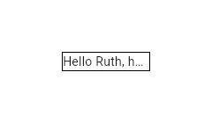
/// Container(
|
|
/// width: 100,
|
|
/// decoration: BoxDecoration(border: Border.all()),
|
|
/// child: Text(overflow: TextOverflow.ellipsis, 'Hello $_name, how are you?'))
|
|
/// ```
|
|
/// {@end-tool}
|
|
///
|
|
/// {@tool snippet}
|
|
///
|
|
/// Setting [maxLines] to `1` is not equivalent to disabling soft wrapping with
|
|
/// [softWrap]. This is apparent when using [TextOverflow.fade] as the following
|
|
/// examples show.
|
|
///
|
|
/// 
|
|
///
|
|
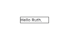
/// ```dart
|
|
/// Text(
|
|
/// overflow: TextOverflow.fade,
|
|
/// maxLines: 1,
|
|
/// 'Hello $_name, how are you?')
|
|
/// ```
|
|
///
|
|
/// Here soft wrapping is enabled and the [Text] widget tries to wrap the words
|
|
/// "how are you?" to a second line. This is prevented by the [maxLines] value
|
|
/// of `1`. The result is that a second line overflows and the fade appears in a
|
|
/// horizontal direction at the bottom.
|
|
///
|
|
/// 
|
|
///
|
|
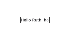
/// ```dart
|
|
/// Text(
|
|
/// overflow: TextOverflow.fade,
|
|
/// softWrap: false,
|
|
/// 'Hello $_name, how are you?')
|
|
/// ```
|
|
///
|
|
/// Here soft wrapping is disabled with `softWrap: false` and the [Text] widget
|
|
/// attempts to display its text in a single unbroken line. The result is that
|
|
/// the single line overflows and the fade appears in a vertical direction at
|
|
/// the right.
|
|
///
|
|
/// {@end-tool}
|
|
///
|
|
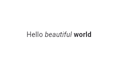
/// Using the [Text.rich] constructor, the [Text] widget can
|
|
/// display a paragraph with differently styled [TextSpan]s. The sample
|
|
/// that follows displays "Hello beautiful world" with different styles
|
|
/// for each word.
|
|
///
|
|
/// {@tool snippet}
|
|
///
|
|
/// 
|
|
///
|
|
/// ```dart
|
|
/// const Text.rich(
|
|
/// TextSpan(
|
|
/// text: 'Hello', // default text style
|
|
/// children: <TextSpan>[
|
|
/// TextSpan(text: ' beautiful ', style: TextStyle(fontStyle: FontStyle.italic)),
|
|
/// TextSpan(text: 'world', style: TextStyle(fontWeight: FontWeight.bold)),
|
|
/// ],
|
|
/// ),
|
|
/// )
|
|
/// ```
|
|
/// {@end-tool}
|
|
///
|
|
/// ## Interactivity
|
|
///
|
|
/// To make [Text] react to touch events, wrap it in a [GestureDetector] widget
|
|
/// with a [GestureDetector.onTap] handler.
|
|
///
|
|
/// In a Material Design application, consider using a [TextButton] instead, or
|
|
/// if that isn't appropriate, at least using an [InkWell] instead of
|
|
/// [GestureDetector].
|
|
///
|
|
/// To make sections of the text interactive, use [RichText] and specify a
|
|
/// [TapGestureRecognizer] as the [TextSpan.recognizer] of the relevant part of
|
|
/// the text.
|
|
///
|
|
/// ## Selection
|
|
///
|
|
/// [Text] is not selectable by default. To make a [Text] selectable, one can
|
|
/// wrap a subtree with a [SelectionArea] widget. To exclude a part of a subtree
|
|
/// under [SelectionArea] from selection, once can also wrap that part of the
|
|
/// subtree with [SelectionContainer.disabled].
|
|
///
|
|
/// {@tool dartpad}
|
|
/// This sample demonstrates how to disable selection for a Text under a
|
|
/// SelectionArea.
|
|
///
|
|
/// ** See code in examples/api/lib/material/selection_container/selection_container_disabled.0.dart **
|
|
/// {@end-tool}
|
|
///
|
|
/// See also:
|
|
///
|
|
/// * [RichText], which gives you more control over the text styles.
|
|
/// * [DefaultTextStyle], which sets default styles for [Text] widgets.
|
|
/// * [SelectableRegion], which provides an overview of the selection system.
|
|
class Text extends StatelessWidget {
|
|
/// Creates a text widget.
|
|
///
|
|
/// If the [style] argument is null, the text will use the style from the
|
|
/// closest enclosing [DefaultTextStyle].
|
|
///
|
|
/// The [overflow] property's behavior is affected by the [softWrap] argument.
|
|
/// If the [softWrap] is true or null, the glyph causing overflow, and those
|
|
/// that follow, will not be rendered. Otherwise, it will be shown with the
|
|
/// given overflow option.
|
|
const Text(
|
|
String this.data, {
|
|
super.key,
|
|
this.style,
|
|
this.strutStyle,
|
|
this.textAlign,
|
|
this.textDirection,
|
|
this.locale,
|
|
this.softWrap,
|
|
this.overflow,
|
|
@Deprecated(
|
|
'Use textScaler instead. '
|
|
'Use of textScaleFactor was deprecated in preparation for the upcoming nonlinear text scaling support. '
|
|
'This feature was deprecated after v3.12.0-2.0.pre.',
|
|
)
|
|
this.textScaleFactor,
|
|
this.textScaler,
|
|
this.maxLines,
|
|
this.semanticsLabel,
|
|
this.textWidthBasis,
|
|
this.textHeightBehavior,
|
|
this.selectionColor,
|
|
}) : textSpan = null,
|
|
assert(
|
|
textScaler == null || textScaleFactor == null,
|
|
'textScaleFactor is deprecated and cannot be specified when textScaler is specified.',
|
|
);
|
|
|
|
/// Creates a text widget with a [InlineSpan].
|
|
///
|
|
/// The following subclasses of [InlineSpan] may be used to build rich text:
|
|
///
|
|
/// * [TextSpan]s define text and children [InlineSpan]s.
|
|
/// * [WidgetSpan]s define embedded inline widgets.
|
|
///
|
|
/// See [RichText] which provides a lower-level way to draw text.
|
|
const Text.rich(
|
|
InlineSpan this.textSpan, {
|
|
super.key,
|
|
this.style,
|
|
this.strutStyle,
|
|
this.textAlign,
|
|
this.textDirection,
|
|
this.locale,
|
|
this.softWrap,
|
|
this.overflow,
|
|
@Deprecated(
|
|
'Use textScaler instead. '
|
|
'Use of textScaleFactor was deprecated in preparation for the upcoming nonlinear text scaling support. '
|
|
'This feature was deprecated after v3.12.0-2.0.pre.',
|
|
)
|
|
this.textScaleFactor,
|
|
this.textScaler,
|
|
this.maxLines,
|
|
this.semanticsLabel,
|
|
this.textWidthBasis,
|
|
this.textHeightBehavior,
|
|
this.selectionColor,
|
|
}) : data = null,
|
|
assert(
|
|
textScaler == null || textScaleFactor == null,
|
|
'textScaleFactor is deprecated and cannot be specified when textScaler is specified.',
|
|
);
|
|
|
|
/// The text to display.
|
|
///
|
|
/// This will be null if a [textSpan] is provided instead.
|
|
final String? data;
|
|
|
|
/// The text to display as a [InlineSpan].
|
|
///
|
|
/// This will be null if [data] is provided instead.
|
|
final InlineSpan? textSpan;
|
|
|
|
/// If non-null, the style to use for this text.
|
|
///
|
|
/// If the style's "inherit" property is true, the style will be merged with
|
|
/// the closest enclosing [DefaultTextStyle]. Otherwise, the style will
|
|
/// replace the closest enclosing [DefaultTextStyle].
|
|
final TextStyle? style;
|
|
|
|
/// {@macro flutter.painting.textPainter.strutStyle}
|
|
final StrutStyle? strutStyle;
|
|
|
|
/// How the text should be aligned horizontally.
|
|
final TextAlign? textAlign;
|
|
|
|
/// The directionality of the text.
|
|
///
|
|
/// This decides how [textAlign] values like [TextAlign.start] and
|
|
/// [TextAlign.end] are interpreted.
|
|
///
|
|
/// This is also used to disambiguate how to render bidirectional text. For
|
|
/// example, if the [data] is an English phrase followed by a Hebrew phrase,
|
|
/// in a [TextDirection.ltr] context the English phrase will be on the left
|
|
/// and the Hebrew phrase to its right, while in a [TextDirection.rtl]
|
|
/// context, the English phrase will be on the right and the Hebrew phrase on
|
|
/// its left.
|
|
///
|
|
/// Defaults to the ambient [Directionality], if any.
|
|
final TextDirection? textDirection;
|
|
|
|
/// Used to select a font when the same Unicode character can
|
|
/// be rendered differently, depending on the locale.
|
|
///
|
|
/// It's rarely necessary to set this property. By default its value
|
|
/// is inherited from the enclosing app with `Localizations.localeOf(context)`.
|
|
///
|
|
/// See [RenderParagraph.locale] for more information.
|
|
final Locale? locale;
|
|
|
|
/// Whether the text should break at soft line breaks.
|
|
///
|
|
/// If false, the glyphs in the text will be positioned as if there was unlimited horizontal space.
|
|
final bool? softWrap;
|
|
|
|
/// How visual overflow should be handled.
|
|
///
|
|
/// If this is null [TextStyle.overflow] will be used, otherwise the value
|
|
/// from the nearest [DefaultTextStyle] ancestor will be used.
|
|
final TextOverflow? overflow;
|
|
|
|
/// Deprecated. Will be removed in a future version of Flutter. Use
|
|
/// [textScaler] instead.
|
|
///
|
|
/// The number of font pixels for each logical pixel.
|
|
///
|
|
/// For example, if the text scale factor is 1.5, text will be 50% larger than
|
|
/// the specified font size.
|
|
///
|
|
/// The value given to the constructor as textScaleFactor. If null, will
|
|
/// use the [MediaQueryData.textScaleFactor] obtained from the ambient
|
|
/// [MediaQuery], or 1.0 if there is no [MediaQuery] in scope.
|
|
@Deprecated(
|
|
'Use textScaler instead. '
|
|
'Use of textScaleFactor was deprecated in preparation for the upcoming nonlinear text scaling support. '
|
|
'This feature was deprecated after v3.12.0-2.0.pre.',
|
|
)
|
|
final double? textScaleFactor;
|
|
|
|
/// {@macro flutter.painting.textPainter.textScaler}
|
|
final TextScaler? textScaler;
|
|
|
|
/// An optional maximum number of lines for the text to span, wrapping if necessary.
|
|
/// If the text exceeds the given number of lines, it will be truncated according
|
|
/// to [overflow].
|
|
///
|
|
/// If this is 1, text will not wrap. Otherwise, text will be wrapped at the
|
|
/// edge of the box.
|
|
///
|
|
/// If this is null, but there is an ambient [DefaultTextStyle] that specifies
|
|
/// an explicit number for its [DefaultTextStyle.maxLines], then the
|
|
/// [DefaultTextStyle] value will take precedence. You can use a [RichText]
|
|
/// widget directly to entirely override the [DefaultTextStyle].
|
|
final int? maxLines;
|
|
|
|
/// {@template flutter.widgets.Text.semanticsLabel}
|
|
/// An alternative semantics label for this text.
|
|
///
|
|
/// If present, the semantics of this widget will contain this value instead
|
|
/// of the actual text. This will overwrite any of the semantics labels applied
|
|
/// directly to the [TextSpan]s.
|
|
///
|
|
/// This is useful for replacing abbreviations or shorthands with the full
|
|
/// text value:
|
|
///
|
|
/// ```dart
|
|
/// const Text(r'$$', semanticsLabel: 'Double dollars')
|
|
/// ```
|
|
/// {@endtemplate}
|
|
final String? semanticsLabel;
|
|
|
|
/// {@macro flutter.painting.textPainter.textWidthBasis}
|
|
final TextWidthBasis? textWidthBasis;
|
|
|
|
/// {@macro dart.ui.textHeightBehavior}
|
|
final ui.TextHeightBehavior? textHeightBehavior;
|
|
|
|
/// The color to use when painting the selection.
|
|
///
|
|
/// This is ignored if [SelectionContainer.maybeOf] returns null
|
|
/// in the [BuildContext] of the [Text] widget.
|
|
///
|
|
/// If null, the ambient [DefaultSelectionStyle] is used (if any); failing
|
|
/// that, the selection color defaults to [DefaultSelectionStyle.defaultColor]
|
|
/// (semi-transparent grey).
|
|
final Color? selectionColor;
|
|
|
|
@override
|
|
Widget build(BuildContext context) {
|
|
final DefaultTextStyle defaultTextStyle = DefaultTextStyle.of(context);
|
|
TextStyle? effectiveTextStyle = style;
|
|
if (style == null || style!.inherit) {
|
|
effectiveTextStyle = defaultTextStyle.style.merge(style);
|
|
}
|
|
if (MediaQuery.boldTextOf(context)) {
|
|
effectiveTextStyle = effectiveTextStyle!.merge(const TextStyle(fontWeight: FontWeight.bold));
|
|
}
|
|
final SelectionRegistrar? registrar = SelectionContainer.maybeOf(context);
|
|
final TextScaler textScaler = switch ((this.textScaler, textScaleFactor)) {
|
|
(final TextScaler textScaler, _) => textScaler,
|
|
// For unmigrated apps, fall back to textScaleFactor.
|
|
(null, final double textScaleFactor) => TextScaler.linear(textScaleFactor),
|
|
(null, null) => MediaQuery.textScalerOf(context),
|
|
};
|
|
|
|
Widget result = RichText(
|
|
textAlign: textAlign ?? defaultTextStyle.textAlign ?? TextAlign.start,
|
|
textDirection: textDirection, // RichText uses Directionality.of to obtain a default if this is null.
|
|
locale: locale, // RichText uses Localizations.localeOf to obtain a default if this is null
|
|
softWrap: softWrap ?? defaultTextStyle.softWrap,
|
|
overflow: overflow ?? effectiveTextStyle?.overflow ?? defaultTextStyle.overflow,
|
|
textScaler: textScaler,
|
|
maxLines: maxLines ?? defaultTextStyle.maxLines,
|
|
strutStyle: strutStyle,
|
|
textWidthBasis: textWidthBasis ?? defaultTextStyle.textWidthBasis,
|
|
textHeightBehavior: textHeightBehavior ?? defaultTextStyle.textHeightBehavior ?? DefaultTextHeightBehavior.maybeOf(context),
|
|
selectionRegistrar: registrar,
|
|
selectionColor: selectionColor ?? DefaultSelectionStyle.of(context).selectionColor ?? DefaultSelectionStyle.defaultColor,
|
|
text: TextSpan(
|
|
style: effectiveTextStyle,
|
|
text: data,
|
|
children: textSpan != null ? <InlineSpan>[textSpan!] : null,
|
|
),
|
|
);
|
|
if (registrar != null) {
|
|
result = MouseRegion(
|
|
cursor: DefaultSelectionStyle.of(context).mouseCursor ?? SystemMouseCursors.text,
|
|
child: result,
|
|
);
|
|
}
|
|
if (semanticsLabel != null) {
|
|
result = Semantics(
|
|
textDirection: textDirection,
|
|
label: semanticsLabel,
|
|
child: ExcludeSemantics(
|
|
child: result,
|
|
),
|
|
);
|
|
}
|
|
return result;
|
|
}
|
|
|
|
@override
|
|
void debugFillProperties(DiagnosticPropertiesBuilder properties) {
|
|
super.debugFillProperties(properties);
|
|
properties.add(StringProperty('data', data, showName: false));
|
|
if (textSpan != null) {
|
|
properties.add(textSpan!.toDiagnosticsNode(name: 'textSpan', style: DiagnosticsTreeStyle.transition));
|
|
}
|
|
style?.debugFillProperties(properties);
|
|
properties.add(EnumProperty<TextAlign>('textAlign', textAlign, defaultValue: null));
|
|
properties.add(EnumProperty<TextDirection>('textDirection', textDirection, defaultValue: null));
|
|
properties.add(DiagnosticsProperty<Locale>('locale', locale, defaultValue: null));
|
|
properties.add(FlagProperty('softWrap', value: softWrap, ifTrue: 'wrapping at box width', ifFalse: 'no wrapping except at line break characters', showName: true));
|
|
properties.add(EnumProperty<TextOverflow>('overflow', overflow, defaultValue: null));
|
|
properties.add(DoubleProperty('textScaleFactor', textScaleFactor, defaultValue: null));
|
|
properties.add(IntProperty('maxLines', maxLines, defaultValue: null));
|
|
properties.add(EnumProperty<TextWidthBasis>('textWidthBasis', textWidthBasis, defaultValue: null));
|
|
properties.add(DiagnosticsProperty<ui.TextHeightBehavior>('textHeightBehavior', textHeightBehavior, defaultValue: null));
|
|
if (semanticsLabel != null) {
|
|
properties.add(StringProperty('semanticsLabel', semanticsLabel));
|
|
}
|
|
}
|
|
}
|